The Insidious Landscaping-Agricultural Complex

The Insidious Landscaping-Agricultural Complex
by Dr. Mark David Major, AICP, CNU-A, The Outlaw Urbanist contributor

President Dwight D. Eisenhower’s warning “against the acquisition of unwarranted influence, whether sought or unsought, by the military-industrial complex” in his farewell address of January 17, 1961 is well-known. What is less well-known is this echoed a similar warning President Eisenhower gave in a speech to the Akron Woman’s City Club in Ohio one year earlier, in which he railed against “the undue influence of the emerging landscaping-agricultural complex in American suburbia.” Many have discounted this lesser-known warning due to suspicions that President Eisenhower might have been suffering from an acute case of panophobia (fear of everything) in the last year of his presidency.

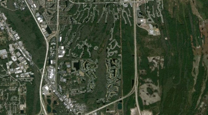
However, as we gaze across Suburbia today, we have reason to believe that President Eisenhower’s warning about the emerging Landscaping-Agricultural Complex was not without merit. In suburban sprawl hell, somewhere in Northeast Florida, mindless minions in service to the orthodoxy of the Landscaping-Agricultural Complex are mulching street signs, fire hydrants, overflow pipes, and electrical transformers. Why? NOTE: These photographs were lost during The Outlaw Urbanist website migration in 2017 but, rest assured, what the article describes about excessive mulching was very real.
Is there value in moisture retention for a road sign? Are the landscapers nurturing the ‘growth’ of this sign to a more adult height? Or perhaps additional moisture will enable the speed limit to grow above its current 15 MPH level? Is this what occurred with the overflow pipe? Was it originally only six inches in height and, over time, the additional moisture retention of mulching around the pipe enabled its growth an imposing height of two feet? Fire hydrants certainly require water in order to operate (upper right) but I’m pretty sure mulching has nothing to do with how they get water. Finally, why mulch around an electrical transformer (lower right)? It sits on a concrete pad, which is already well-hidden by the grass. Surely this was the point of painting them green in the first place, so they would be less noticeable. Personally, I didn’t even know they existed until they mulched around the base (read: sarcasm).

The only way I can rationalize this attribute of ‘mulching everything’ is the Landscaping-Agricultural Complex is artificially inflating the per square footage or volumetric costs of the amount of mulch used in this suburban community. Either that, or I am just not smart enough to understand the functional benefits of moisture retention in mulching inanimate objects.

Share the knowledge!
Share

Floating Towards Jerusalem | The City in Art

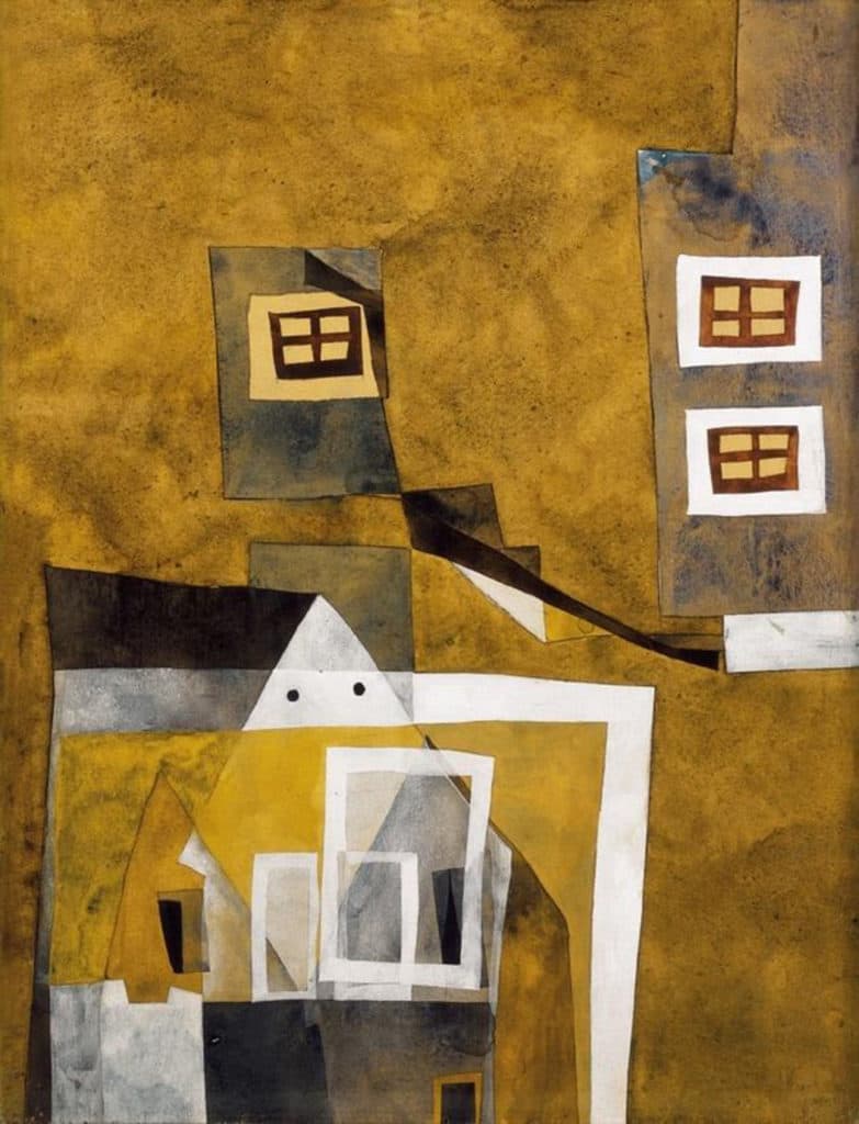
Lajos Vajda’s Floating Houses, 1937, 46 x 32 cm, tempera on paper (Private Collection).

Floating Towards Jerusalem | The City in Art
by Dr. Mark David Major, AICP, CNU-A

Lajos Vajda’s Floating Houses (1937) is a personal favorite. Some sources describe Floating Houses as a surrealist work, which actually seems a better description about Vajda’s artistic circle (see below) than the composition itself. Instead, Floating Houses is better characterized as an avant-garde abstract composition that represents its subject (a townscape) liberated of gravity and dimensionally.

The only concession to gravity lies at the edge of the composition (i.e. canvas). This can be seen in the overlapping houses at the bottom and the inverted house form depicted along the right edge. This ‘gravity of the edge’ abstracts an invariant characteristic of urban form. There is a type of gravity associated with settlement edges, which is both economic and resource-based in nature due to the availability of (cheap) land. By definition, settlements grow at their edges. Floating Houses represents this invariant in a wonderfully inventive and whimsical manner. The only concession to dimensionally emerges from the two-dimensional plane of the canvas itself, most evident in the overlapping house forms at the bottom right. Many artists have played with the two-dimensional plane of the canvas in this manner for depicting an urbanscape. We will see some additional examples in subsequent articles during this series.

Vajda’s use of color for this composition also represents something rich about human settlements. Though the houses have been liberated from gravity and dimensionally in a free-floating environment, the predominant use of earth tones reiterates the unbreakable relationship of the settlement to the land, or man-to-nature. The intermittent use of white, providing a beautiful contrast to the predominant earth tones, appears principally reserved for representing man-made structural elements (window frames, a roof peak, and foundations). This embeds Floating Houses with a dialogue about the man-nature didactic. Interesting, the use of white (a symbol of purity) for representing these man-man structural components may suggest a positivist perspective on this subject within the composition.

For an artist noted for his use of religious symbolism, this might appear to be lacking in Floating Houses…. at first glance. Vajda’s use of four-pane windows and the resulting depiction of a cross might be incidental. However, since these cross forms tend to be framed by the white man-made structural elements, it is rather a subtle comment about religion being primarily a product of man than nature. If we accept this interpretation, then the artist also appears to concede a component of religion to the natural by using the darker browns (of wood, or nature) for the three crosses. In this context, the symbolism of the three crosses becomes significant, i.e. the Holy Trinity, Christ was crucified with two others (criminals) at Golgotha, and he rose on the third day. This introduces a dark undercurrent in terms of purity (Christ) and criminality (those crucified with him) for this representation of a townscape. Vajda then reinforces the message with the depiction of three paneless framed windows in white (good) and three voids represented in black (evil) at the center bottom. Finally, the most central part of the composition (white roof peak with two round voids) takes on an anthropomorphic quality that watches over the town (perhaps God or some other force). Taken together, this embeds Lajos Vajda’s Floating Houses with multiple layers of meaning and symbolism about Man, nature, and religion, good and evil, and town and country.

About Lajos Vajda
Lajos Vajda (1908-1941) was a Hungarian avant-garde painter and a student at the Hungarian Academy of Fine Arts in 1927-30. He studied with Fernand Léger at Paris in 1930-34, where he was introduced to cubism and surrealism. Vajda collected folk art motifs for his artworks. He combined religious (Orthodox Christian, Roman Catholic, and Jewish) symbols, architectural and folk art motifs, abstract, figurative, and surrealistic elements on his art to create complex visionary images. He is considered the most distinctive artist of the Hungarian avant-garde movement. His art influenced generations of Hungarian artists including the members of the European School Art Group (1945-1948) and the Vajda Lajos Studio (est. 1972). Vajda died in a Jewish forced labor camp in the fall of 1941 at the age of 33 (Source: Wikipedia and American University).

The City in Art is a series by The Outlaw Urbanist. The purpose is to present and discuss artistic depictions of the city that can help us, as professionals, learn to better see the city in ways that are invisible to others. Before the 20th century, most artistic representations of the city broadly fell into, more or less, three categories: literalism, pastoral romanticism, and impressionism, or some variation thereof. Generally, these artistic representations of the city lack a certain amount of substantive interest for the modern world. The City in Art series places particular emphasis on art and photography from the dawn of the 20th century to the present day.

Share the knowledge!
Share

Preview | Poor Richard | An Almanac for Architects and Planners

COMING IN APRIL 2013! POOR RICHARD, AN ALMANAC FOR ARCHITECTS AND PLANNERS BY MARK DAVID MAJOR, AICP

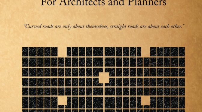
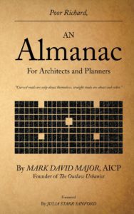
A high-resolution preview of the front cover is below.

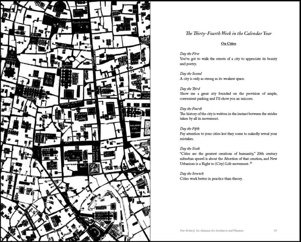
The witticisms and sayings of Poor Richard are organized by calendar weeks, one generic theme per week, and a single saying for each day of the week – plus one for “years in the state of leaping” – adding up to a full calendar year. Each week of the calendar week is accompanied by a high contrast, black and white illustration designed or selected to get people thinking differently about cities. A high-resolution preview of “On Cities” for pages 86-87 with an accompanying illustration (inverted detail of the Nolli map of Rome presenting civic space in black and blocks in white) is below.

“On Cities” for the 34th Week in the Calendar Year on pages 86-86. Click on the image to see a high resolution version.


Poor Richard, An Almanac for Architects and Planners also includes a foreword by Julia Starr Sanford, a preface from the author, an Introduction incorporating the “Declaration of Planning Independence” previously published on The Outlaw Urbanist, bibliography and illustration credits, and an Afterword featuring The Outlaw Urbanist manifesto.

Poor Richard, An Almanac for Architects and Planners by Mark David Major, AICP, Foreword by Julia Starr Sanford, Forum Books, an Imprint of Carousel Productions, 136 pages, 5.0″ x 8″, $9.99 (in print); also available in eBook, format and price TBD.

Share the knowledge!
Share

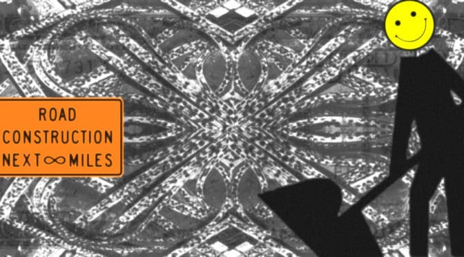
What do the ‘wet dreams’ of engineers and concrete-mixers look like?

The Outlaw Urbanist was able to gain access to this exclusive image, which accurately represents the dreaming state of members in the American Society of Civil Engineers (ASCE) and the American Concrete Institute (ACI). The image was compiled using the latest double-secret beta version of new Dreamscape Image Capture Technology (DIC-TEC 1.2) (you may assume from Apple). The subject matter of the dreamscape is fascinating. However, even more so was the remarkable degree of consistency found during the dreaming state for more than four dozen engineers and concrete-mixers, from which this composite image was created. Of course, being engineers and concrete-mixers they universally dream in black and white. Because of this, certain aspects of the composite image have been colorized using the ‘vibrancy’ function available in the DIC-TEC software.

Share the knowledge!
Share