The Evolution of Urban Planning
by Konstantin von der Schulenburg, Guest Contributor

Courtesy of Cantrell & Crowley
The Evolution of Urban Planning
by Konstantin von der Schulenburg, Guest Contributor

Courtesy of Cantrell & Crowley
There are few cities in the world more perplexing than Los Angeles. The reasons are many. The Outlaw Urbanist will take a closer look at some of those reasons in a multi-part, photo essay series. Today, we look at a small selection of Los Angeles architecture. There are hundreds of interesting, even gorgeous historical examples of Art Deco and Modernist buildings in Los Angeles. There are an equal number that can be simply described as curious. The sample in this photo essay is designed to be eclectic rather than exhaustive.
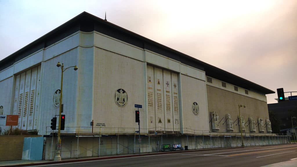
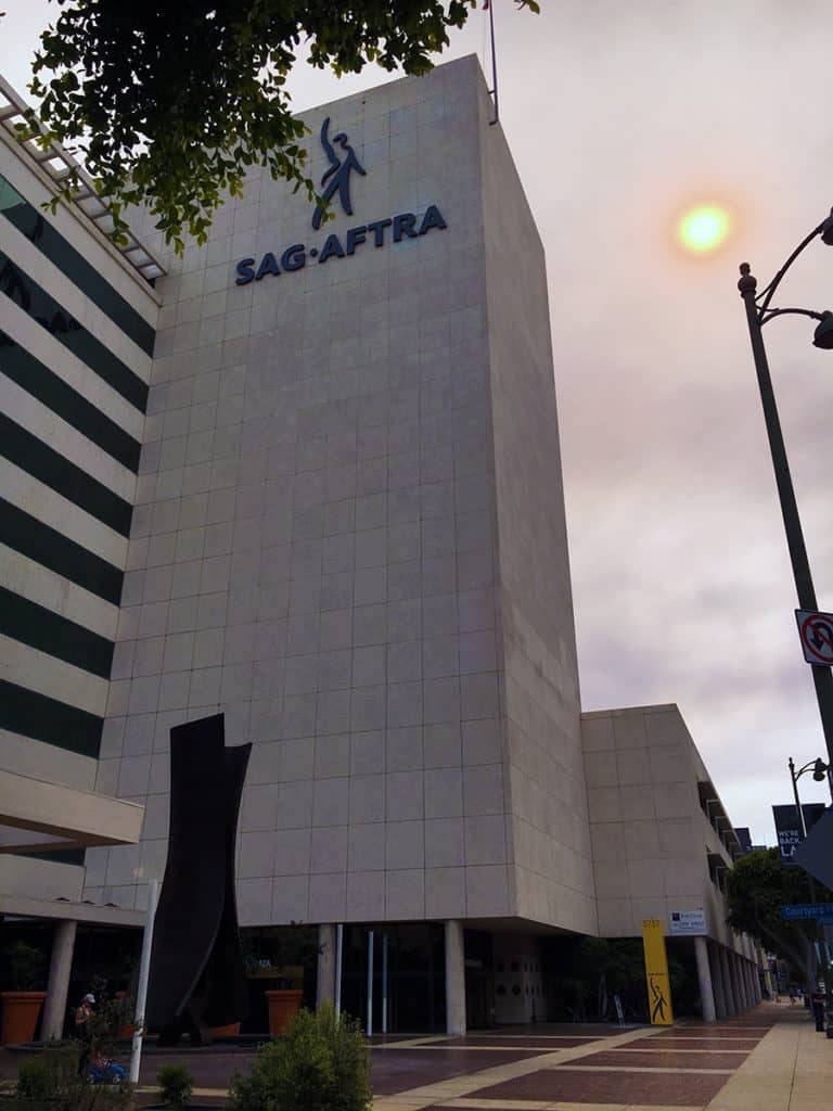
There is an odd, symbolic symmetry about the impenetrable, foreboding facades of the Scottish Rite Masonic Temple in Mid Wilshire/Central L.A. and the Screen Actors Guild Building down the road on the Miracle Mile. The architectural message could not be clearer: beware to all those who do not belong here (you know who you are).
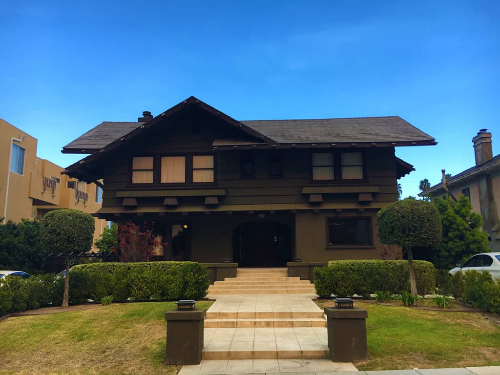
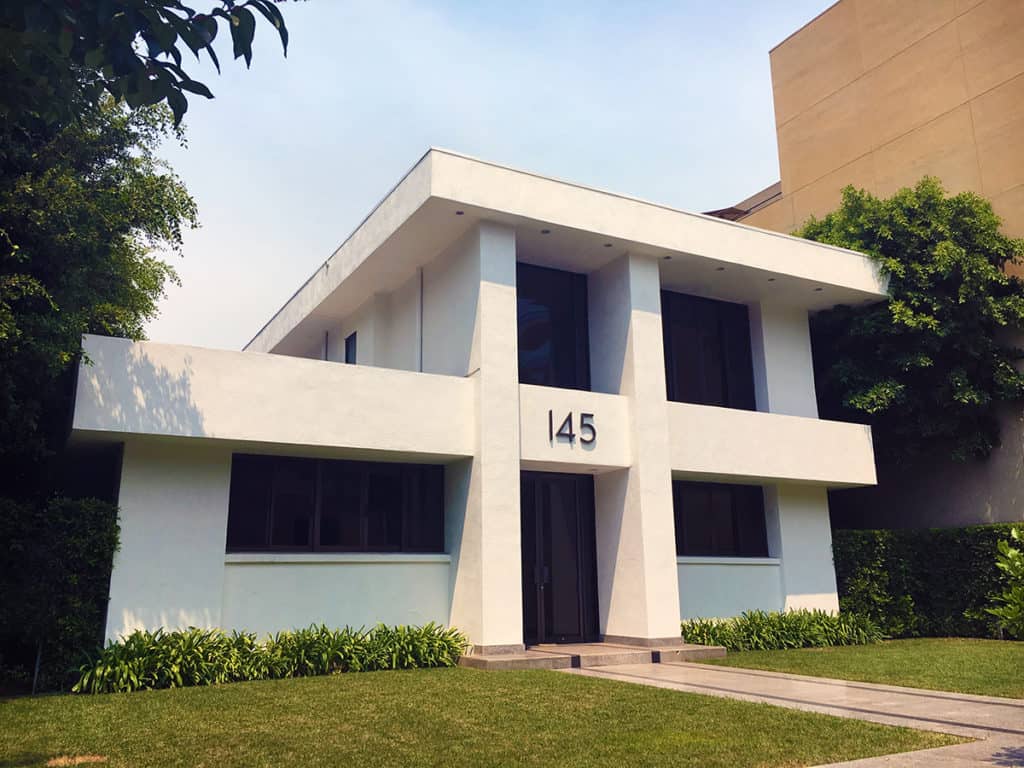
We interrupt this photo essay for something cool: an example of the classic California Style house or bungalow (depending on your definition of size) and a Modernist residential house, both located a few hundred feet south of Wilshire Boulevard in La Brea.
Based on quantity alone, the prototypical strip mall in Los Angeles has a L-shaped typology. Two-story buildings with double loading (at ground and above) of small retail units, connected by external stairwells and walkways, surrounding a small parking lot (see below). Who would go to L.A. and take photographs of ubiquitous strip malls? Probably only The Outlaw Urbanist. These strip malls have the architectural vocabulary of a proverbial bull in a china shop.
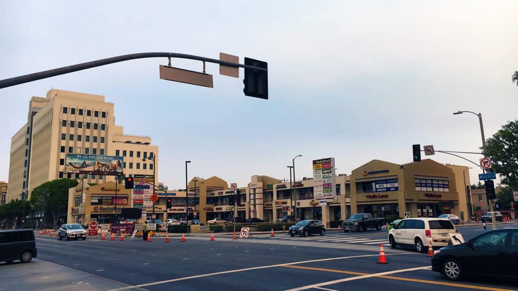
Truth in advertising at the American Cement Company Building (now the Concrete Studio Lofts) on Wilshire Boulevard at the western perimeter of MacArthur Park. Across the street is the ‘tent city’ of the homeless living in MacArthur Park. The homeless problem in Los Angeles might be the worst of any American city I’ve ever witnessed. It is disgraceful the City of Los Angeles/State of California has not capitalized on the ‘tiny house movement’ to tackle the homeless problem. The result is the distinctive urine aroma of MacArthur Park.
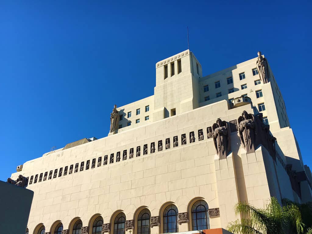
False advertising at the Park Plaza Hotel across the street at the northwestern corner of MacArthur Park in Los Angeles. Everything about this building screams ‘courthouse,’ the building envelope (absent the sculptures) echoes the classical architecture of the Hall of Justice in Downtown Los Angeles. However, the Art Deco building designed by Curlett & Beelman was originally for the Benevolent and Protective Order of Elks as Elks Lodge No. 99. Today, the hotel is a Los Angeles Historic-Cultural Monument.
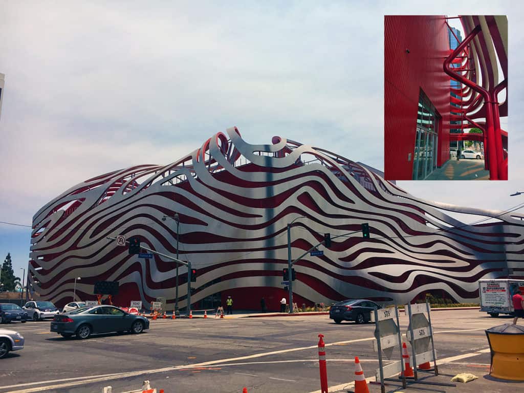
Pretend deconstructivism in Kohn Pedersen Fox’s facade design for the Petersen Automotive Museum along Museum Row of the Miracle Mile on Wilshire Boulevard in La Brea, Los Angeles. It is a big red box building with vertical, metal sliding covered by a false ‘piggly wiggly’ facade. The building is dramatic from faraway but extremely disappointing up close, especially the big red parking garage at the back, which creates a blank wall along the long length of a full urban block on South Fairfax Avenue.
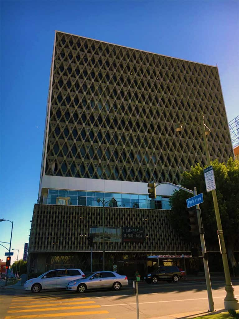
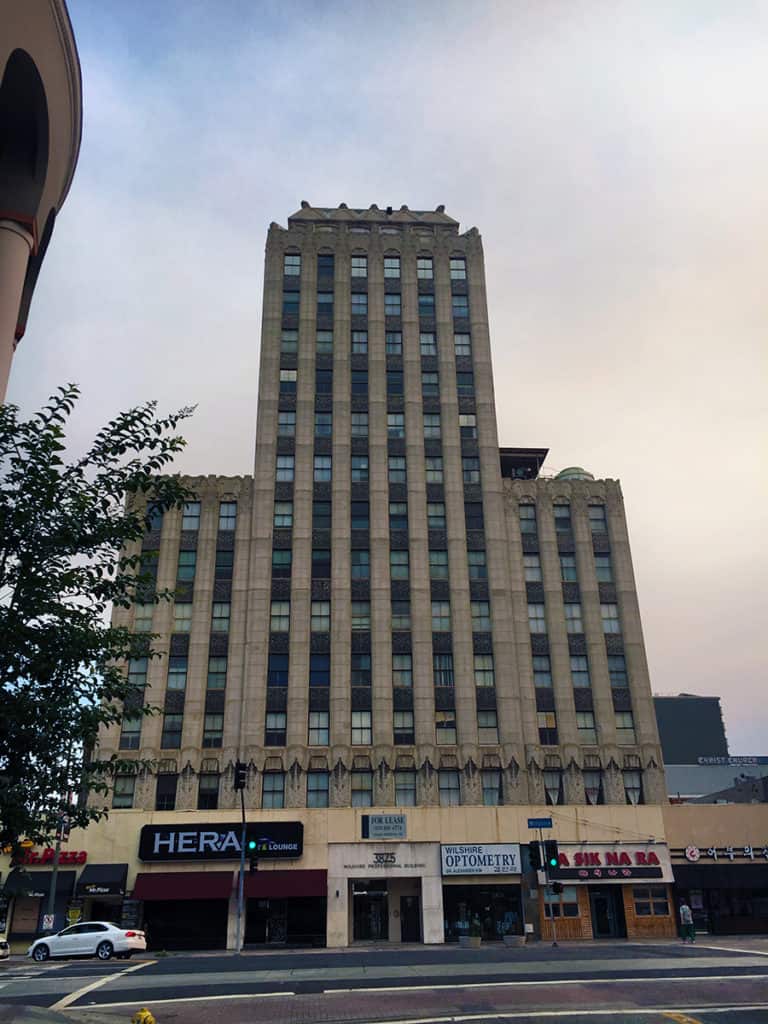
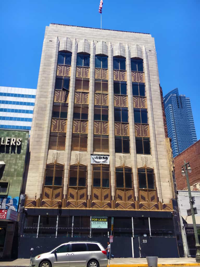
A common theme of historic buildings in Los Angeles is gorgeous (often Art Deco) high-rise buildings with converted or attached ground level retail units at the base. There is nothing wrong with the impulse but it is often accomplished so poorly (in terms of design) that it is akin to the most beautiful woman who ever lived (BTW, that would be Audrey Hepburn) garishly painting her toe nails like a common street whore. There is a lot of this type of ‘architectural whoring’ going on in Los Angeles.
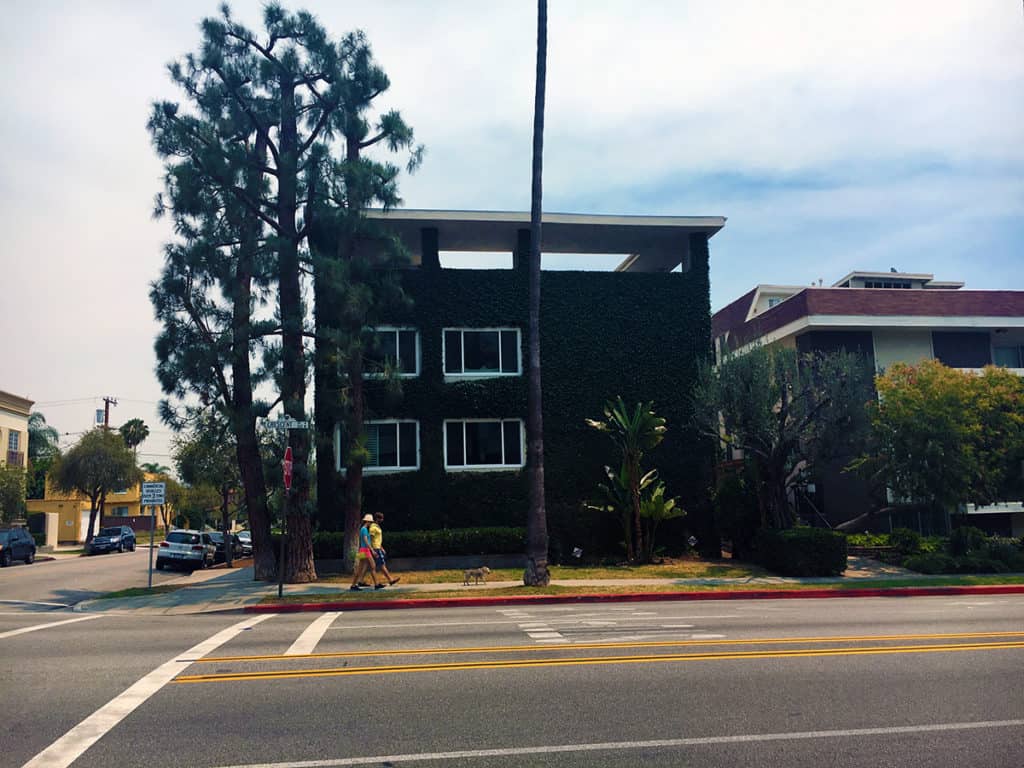
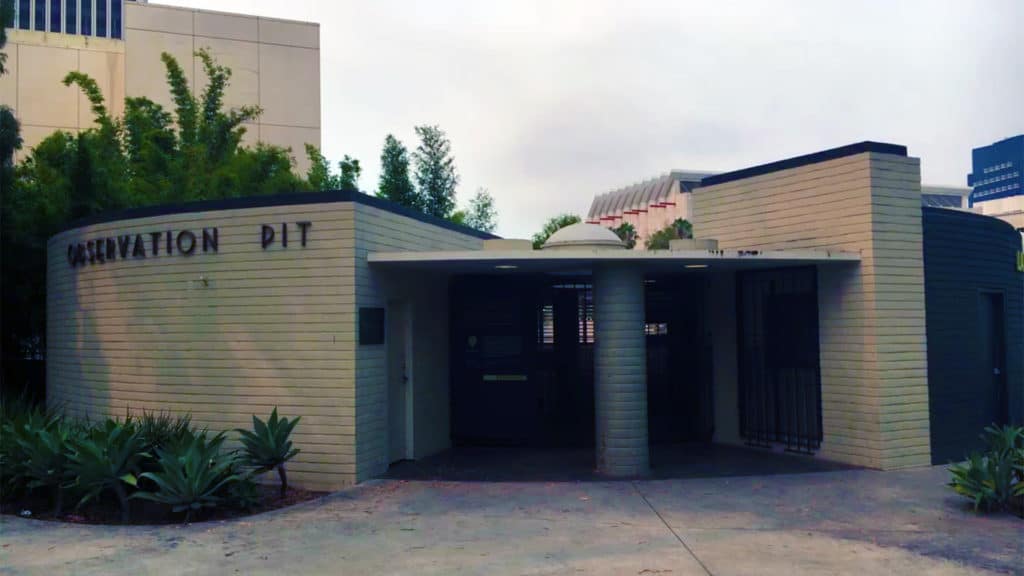
We conclude this eclectic photo essay of Los Angeles Architecture with some cools things: a ‘green wall’ along the street facade of an Modernist apartment building in Beverly Hills and the Art Deco styling of the building typology for the Observation Pit Building at the La Brea Tar Pits, which was recently reopened after being closed for twenty years.
There are few cities in the world more perplexing than Los Angeles. The reasons are many. The Outlaw Urbanist will take a closer look at some of those reasons in a multi-part, photo essay series. Today, we begin with Downtown L.A., which uniquely combines fascination and frustration for any architect, urban designer, and planner with a good conscience.
Downtown L.A. could be incredible urbanism. In fact, it should be incredible urbanism. Instead, it comes across as lazy. Downtown L.A. is alive but not necessarily well. It has ‘good bones’ including some stunning pre-World War II buildings. However, Downtown L.A. desperately needs large doses of TLDC (tender, loving design care), which appears somewhat lacking at the moment.
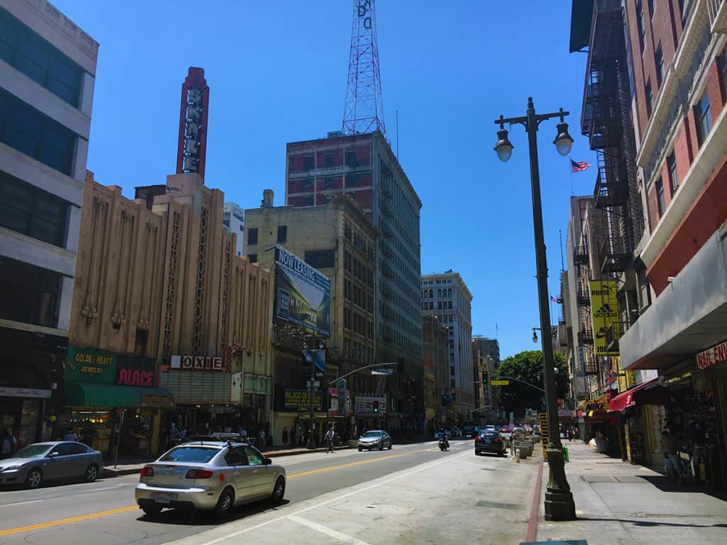
There were actually a LOT of people in Downtown L.A. on a sunny, warm Sunday afternoon, especially to the south in the Jewelry District. The street level of many buildings has been converted into small, retail units. However, it is haphazardly done for the most part. On one hand, it is good to see the people and retail units. On the other hand, it is such low rent quality that it deters from the innate advantages of the building space above. There are a lot of historic buildings in Downtown L.A. BEGGING for rehabilitation. A few renovations are progressing but not nearly enough. It is deeply frustrating. A lot of the new buildings are design disasters that most often successfully promulgate blank walls in downtown.
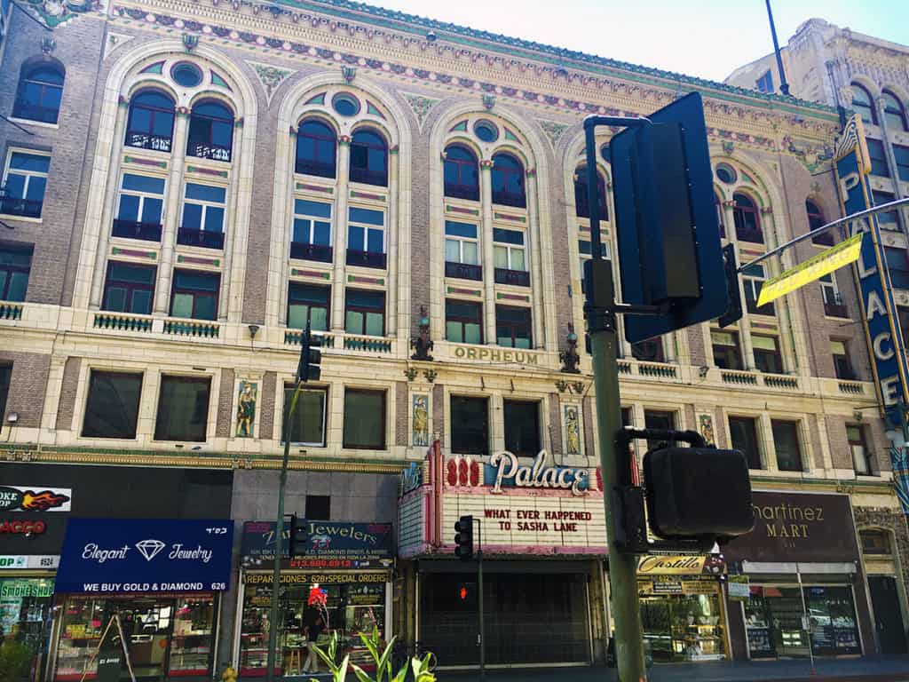
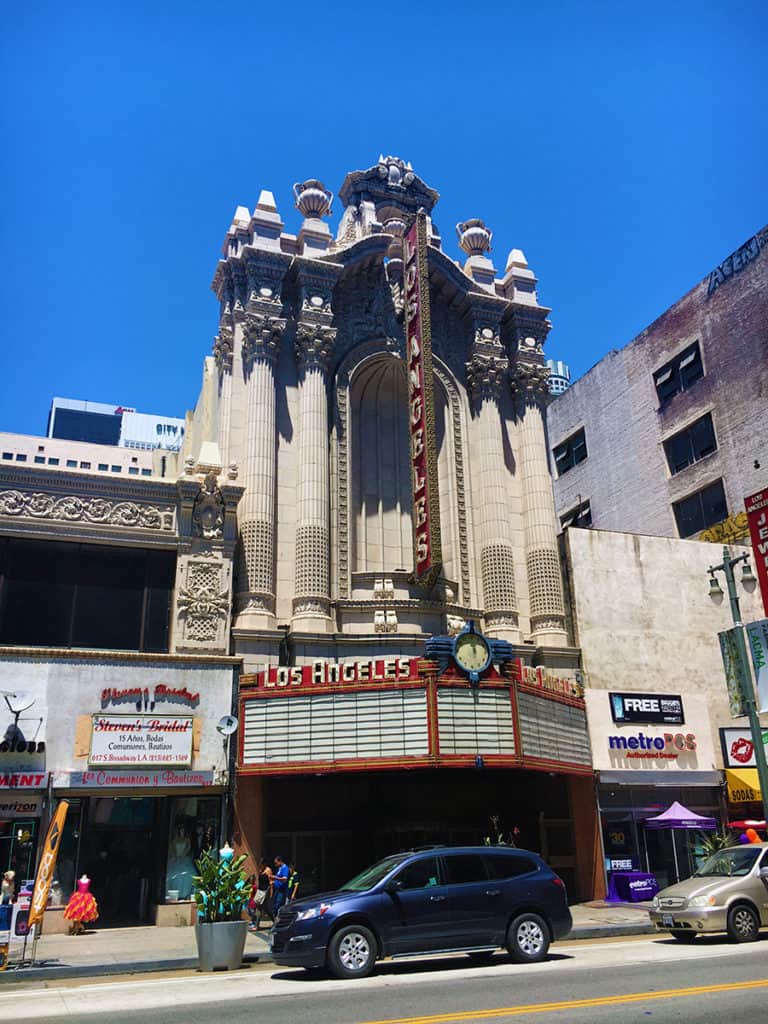
Given the history and money surrounding the film industry in Los Angeles, you would think residents and the city would take more care in rehabilitating the plenitude of old historic movie theaters but most often it appears to have been mindlessly done (e.g. Palace Theater above and Los Angeles Theater below) on a ‘cash in’ basis only.
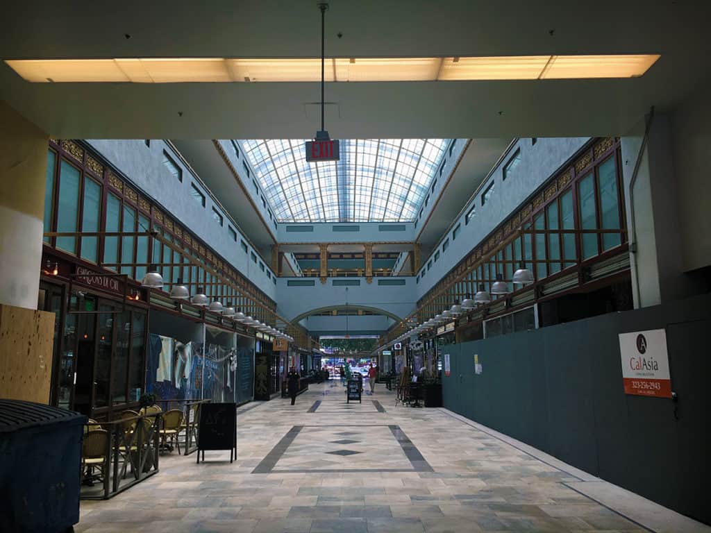
The gorgeous Bradbury Building (below) in Downtown L.A. was designed by Sumner Hunt and designated an architectural landmark in 1977. Its interior and rooftop were the settings for the climatic scenes of Ridley Scott’s science fiction classic Blade Runner (1982).
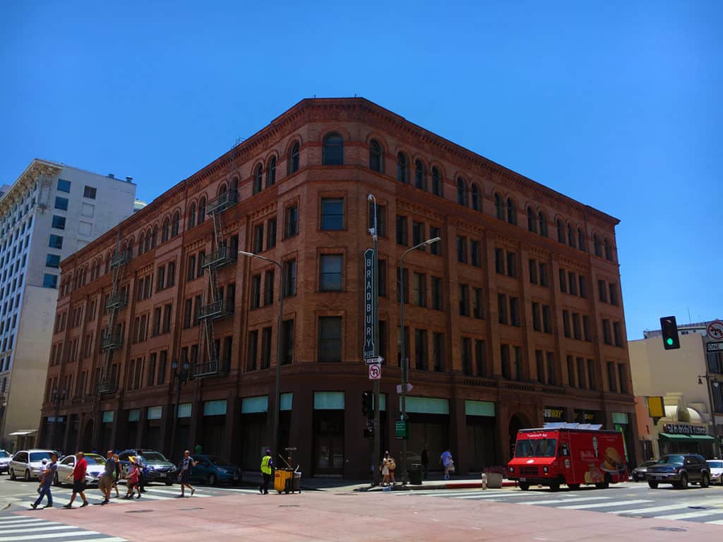
The government sector to the north in Downtown L.A. effectively demonstrates the danger of single-use districts. Whereas the Jewelry District was populated and lively on a Sunday afternoon, the government sector was deader than a graveyard, except for the cars racing through the area.
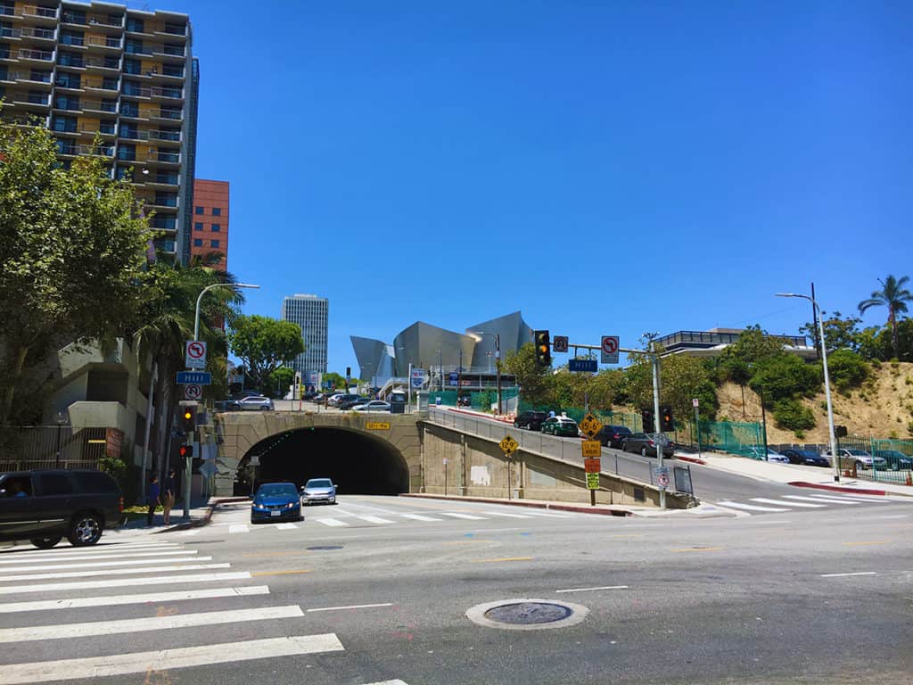
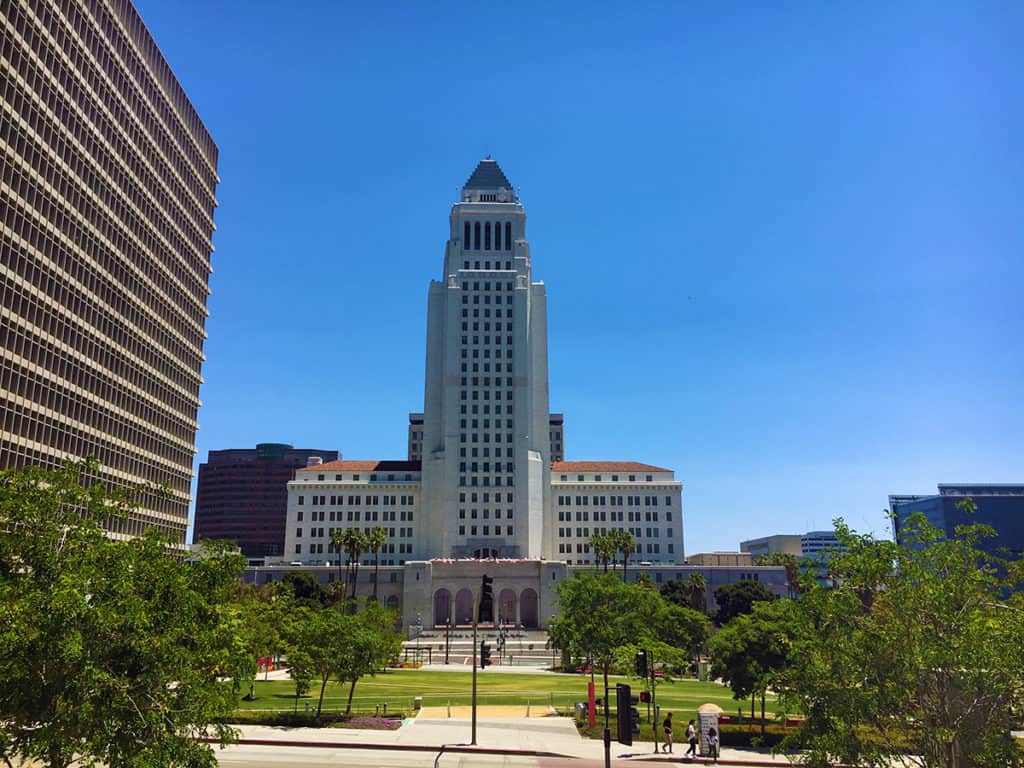
Los Angeles City Hall (above) was the exterior for the Daily Planet in the old Adventures of Superman series from the 1950s. The O.J. Simpson criminal trial occurred in the building to the left in 1994-95.
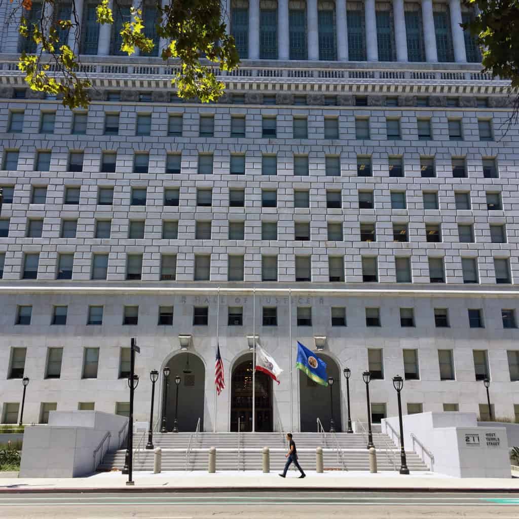
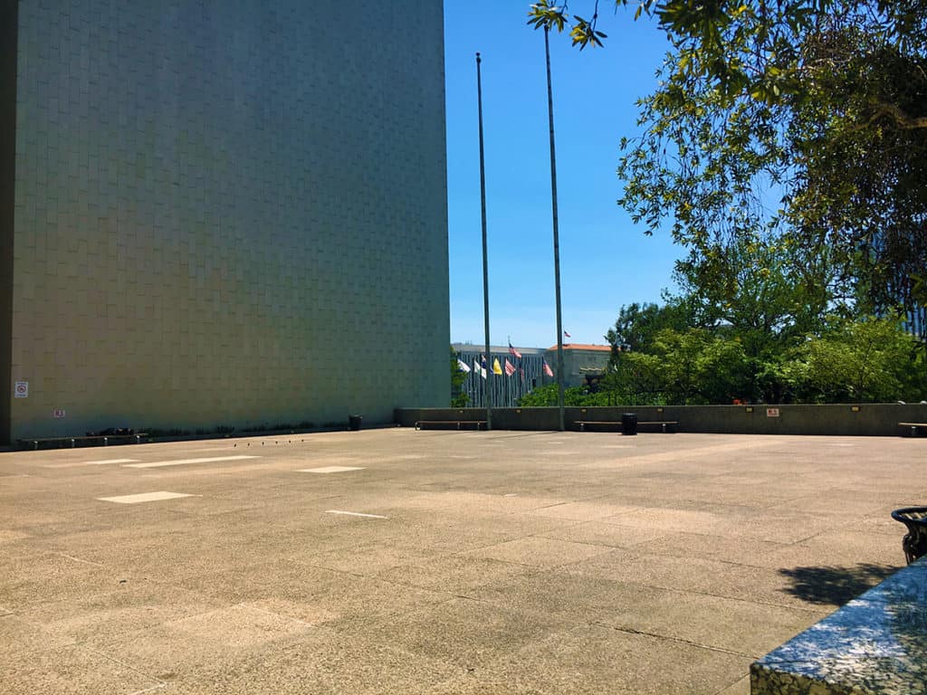
The Modernist building where the Los Angeles County Department of Regional Planning is housed in the government sector has a plaza attached to it, working hard at being as empty as the day it first opened, no doubt. The ironic symbolism seems appropriate.
The Biblical City, Part I – The Tanakh covers in detail more than two-dozen biblical references to the city in the Old Testament. It is commonly accepted there is anti-urban religious stereotype with origins in the earliest suburbs, the social reform movement of cities in the late 19th century, and mass suburbanization in the post-war period, which has radically remade our cities over the last 200 years. But is God really anti-urban? There are over 700 generic references to the ‘city’ in The Tanakh or Old Testament.  Can they tell us anything about urbanism today, given the innumerable problems of language, translation, interpretation and our own evolving conception of the city over time? This course examines this in more detail in an attempt to answer these questions. In the Old Testament, God is not anti-urban. Quite the opposite, there is evidence of God as the architect, designer, and planner. The city itself is often seen as a symbol of strength and an ideal to achieve, because God’s plan for humanity begins in a garden without sin but concludes in a redeemed city (1.5 hour course).
Key concepts: city, strength, metaphor, Old Testament, Tanakh, urban, and wisdom.
Instructor: Dr. Mark David Major, AICP, CNU-A
Check here to purchase this course ($12.49), which includes an one-and-a-half hour video presentation and PDFs of the course notes and slide handout.
Note: We are beta-testing with these our course offerings so if you have any issues accessing the course material, please do not hesitate to contact us at [email protected]. Thank you!
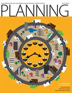 Planning Naked | July 2016
by Dr. Mark David Major, AICP, CNU-A, The Outlaw Urbanist contributor
Your (hopefully) hilarious guide to everything about the latest issue of APA’s Planning Magazine
Note: In all likelihood, one of the better issues of Planning Magazine in the last 15 years from the point of view of objective reporting and displays of good old-fashioned, common sense… or, at least, the first half of the issue. Things start to spectacularly fall apart beginning on page 27.
In the words of Marvin Gaye, what’s going on? Is there a new editor at Planning Magazine? Has Planning Magazine adopted new editorial guidelines? There’s little objectionable content about the first 12 pages of the July 2016 issue (From the Desk of APA’s Executive Director and News sections). It’s almost reading bliss.
I come not to bury Planning Magazine but to (in part) praise it. “It’s Time to Rethink Temporary Use” by David S. Silverman in the Legal Lessons section (pp. 13) is praiseworthy. “Traditional zoning is often a clumsy tool to address the regulatory land-use issues raised by” alternative, often temporary uses. If this sanity continues, I may have to retire the “Planning Naked” column on The Outlaw Urbanist.
Leave it to Rio. “Rio Gets Ready by Michael Kavalar (pp. 14-18) reports on Brazil’s preparations for the 2016 Olympics next month and pacification; “an official government policy of structured military occupation of informal communities with the intent of fully incorporating them into the formal city.” This is a well-written, informative piece that balances the positives of legacy projects associated due to the Olympics with local tensions arising from a pacification policy that predates these legacy projects.  The article successfully touches on these topics, giving them some context, without losing sight of their complexities (for good and ill) in terms of politics and planning.
Taking the long view. “Winning at Their Own Games” by Kristen Pope (pp. 19) takes a brief look at adaptive reuse of facilities in Lake Placid, New York and Park City, Utah after the Olympics left town. “London’s Olympic Legacy” by Ben Plowden (pp. 20-21) follows the same story in a little more detail after the London Olympics with particular focus on London Transport. Both are interesting, informative pieces lacking the soapbox of Planning Magazine’s usually hidden agenda in the past. Again, what’s going on?
To Shop or Not to Shop, that is the Question. “From Bricks to Clicks” by Daniel G. Haake, Jeffrey M. Wojtowicz, and Johanna Amaya” (pp. 22-24) provides the ‘meat’ of this issue about the effects of e-commerce on neighborhoods, which was touched on by James Drinan in the From the Desk of APA’s Executive Director section. The piece is a thoughtful consideration of the issues surrounding increased freight deliveries of e-commerce without resorting to the standard ‘default’ answer of larger road widths and bigger floor plates in the post-war period. The creeping evidence of planning sanity is a blessed relief to this long-time victim. This article is well worth the read for planners.
It’s the business model, business model, business model. “Big Box Bust?” by Andrew Starr covers Wal-Mart’s announced closure of 154 locations nationwide, 102 of which are Wal-Mart Express stores experimenting with smaller floor plates and pared down merchandising serving a smaller (usually poorer) customer base. Starr correctly points out that ‘mindless’ application of Wal-Mart’s long-term business model for its big box stores (‘but that’s the way we’ve always done it’) on the site selection process was a likely culprit for the retailing giant incorrectly siting its Express stores; not that a ‘big box’ floor plate is necessary to survive and thrive in retail in today’s world. He points to the success of the Dollar General and Dollar Tree brands in fighting off competition from Wal-Mart Express stores as a counter example. Again, another good article; concise, objective, and spot-on.
Sigh, and there it is… mo’ money, mo’ money, mo’ money. The highlight box for “The Road to Quito” by Greg Scruggs (pp. 27-33) states “Habitat III is a ‘clarion call for planning’ that planners will pay more dividends for the profession” (our emphasis), which sounds so self-serving as to be repulsive. I don’t even want to read this article but, for anyone who might enjoy reading Planning Naked, I will. “In 1976, a bunch of Hippies…” Oh. My. God. Not a good start. Now the name-dropping, legitimacy by association. Sheesh. Now a list of pleasant sounding, meaningless bullet points using ‘synergy words.’ I can’t… go… on. This article has everything that is wrong with planning masturb… excuse me, the planning profession. The July 2016 issue of Planning Magazine was going so well until this stink bomb was dropped into the middle of the issue. Guess I don’t have to worry about retiring this column yet.
Hard core issues through a soft core lens. “One Size Does Not Fit All” by Katy Tomasulo (pp. 32-36) does have some interesting information about the housing recovery and statistical trends in the housing market. However, the author is too lackadaisical about filtering through the developer/homebuilder ‘post-war’ paradigm (e.g. suburbanization) to get at the real core of the issue. For example, NHB states they know Millennials want to become homeowners eventually (true) but that does not necessarily translate into big suburban homes (implied but false). The ‘smaller’ lot sizes discussed are still too big and don’t capitalize on the small house movement to increase affordability, etc. There’s some informative stuff in this article but the reader needs deploy critical thought to really dig for the takeaways. Good intentions but soft focus… and we all know the preferred pavement material for the road to hell.
With apologies. “Whatever Happened to HAMP and HARP?” by Jake Blumgart (pp. 36-37) is informative about the failure of the Federal programs, HAMP and HARP, established in the aftermath of the 2008 Financial Crisis to assist homeowners, but blatant in excusing the Obama Administration, Democratic Congress, and the banks for the failure of these programs by laying the blame at the feet of those very same homeowners (“If a financial institution was promising you something too good to be true, most families—after having been through what they had been through—said, ‘I’m not touching this…”). Right about the symptoms, wrong about the cause, so the conclusions are counter-productive.
More softer core. “Ever Green: Connecting to Nature in a Digital Age” by Tim Beatley (pp. 38-39) is interesting but harmless news fluff. Of course, most extinctions these days are due to the unprecedented growth of the world’s population in the post-war period. Extraterrestrial colonization and/or a massive, human depopulation event are the only substantive answers to the problem. It’s very scary that the second seems far more likely than the first.
In defense of fast food. I’m not sure about the purpose of Bobby Boone’s Viewpoint article “Fast Food’s Bad Rap” (pp. 44). Is ‘persecution of fast food’ even a thing? Sounds like a ‘first-world’ problem.
Planning Naked is an article with observations and comments about a recent issue of Planning: The Magazine of the American Planning Association.