Category Archives: Housing

PHOTO ESSAY | Los Angeles Architecture

There are few cities in the world more perplexing than Los Angeles. The reasons are many. The Outlaw Urbanist will take a closer look at some of those reasons in a multi-part, photo essay series. Today, we look at a small selection of Los Angeles architecture. There are hundreds of interesting, even gorgeous historical examples of Art Deco and Modernist buildings in Los Angeles. There are an equal number that can be simply described as curious. The sample in this photo essay is designed to be eclectic rather than exhaustive.

Scottish Rite Masonic Temple on Wilshire Boulevard in Mid Wilshire/Central LA (Photo: Mark David Major).

There is an odd, symbolic symmetry about the impenetrable, foreboding facades of the Scottish Rite Masonic Temple in Mid Wilshire/Central L.A. and the Screen Actors Guild Building down the road on the Miracle Mile. The architectural message could not be clearer: beware to all those who do not belong here (you know who you are).

Screen Actors Guild Building on the Miracle Mile of Wilshire Boulevard in Los Angeles (Photo: Mark David Major).

We interrupt this photo essay for something cool: an example of the classic California Style house or bungalow (depending on your definition of size) and a Modernist residential house, both located a few hundred feet south of Wilshire Boulevard in La Brea.
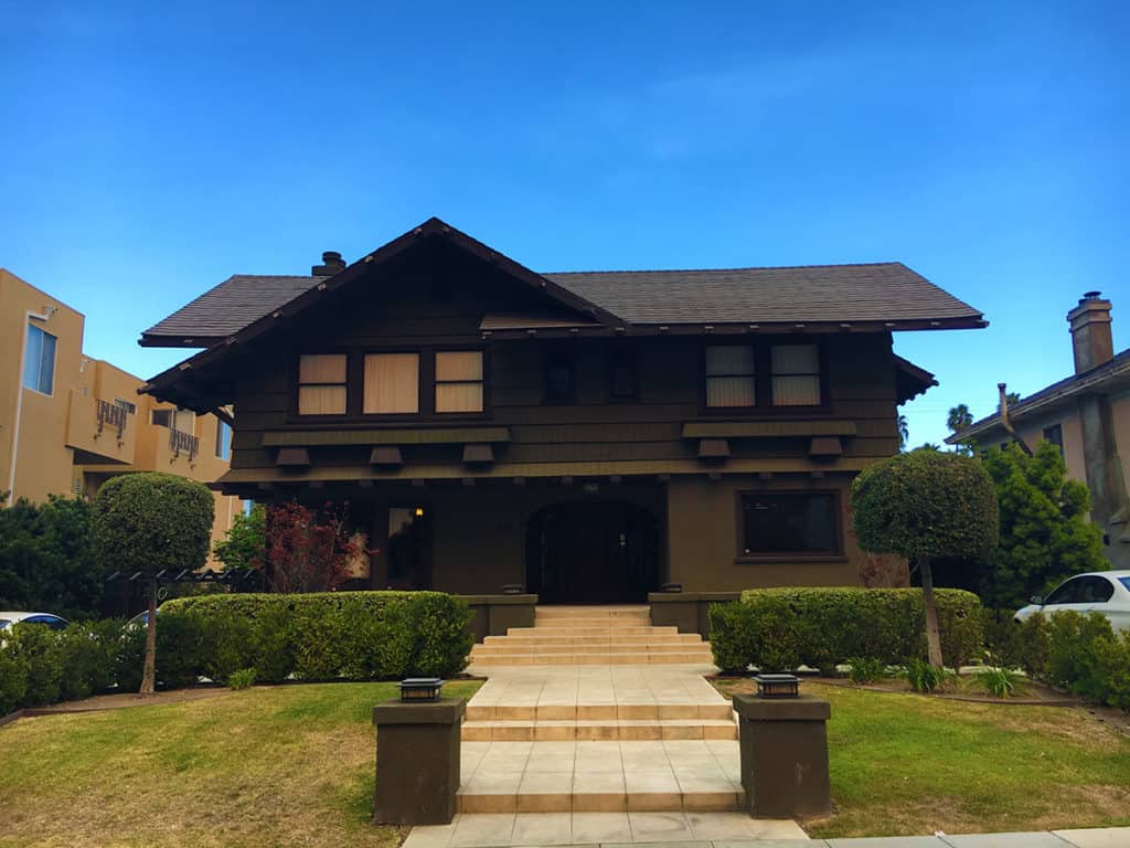
A classic California style house in La Brea (Photo: Mark David Major).
A Modernist house in La Brea (Photo: Mark David Major).

Based on quantity alone, the prototypical strip mall in Los Angeles has a L-shaped typology. Two-story buildings with double loading (at ground and above) of small retail units, connected by external stairwells and walkways, surrounding a small parking lot (see below). Who would go to L.A. and take photographs of ubiquitous strip malls? Probably only The Outlaw Urbanist. These strip malls have the architectural vocabulary of a proverbial bull in a china shop.

A example of the prototypical Los Angeles strip mall on Wilshire Boulevard in Koreatown (Photo: Mark David Major).

Truth in advertising at the American Cement Company Building (now the Concrete Studio Lofts) on Wilshire Boulevard at the western perimeter of MacArthur Park. Across the street is the ‘tent city’ of the homeless living in MacArthur Park. The homeless problem in Los Angeles might be the worst of any American city I’ve ever witnessed. It is disgraceful the City of Los Angeles/State of California has not capitalized on the ‘tiny house movement’ to tackle the homeless problem. The result is the distinctive urine aroma of MacArthur Park.

American Cement Company Building (now Concrete Studio Lofts) on Wilshire Boulevard in MacArthur Park area (Photo: Mark David Major).

False advertising at the Park Plaza Hotel across the street at the northwestern corner of MacArthur Park in Los Angeles. Everything about this building screams ‘courthouse,’ the building envelope (absent the sculptures) echoes the classical architecture of the Hall of Justice in Downtown Los Angeles. However, the Art Deco building designed by Curlett & Beelman was originally for the Benevolent and Protective Order of Elks as Elks Lodge No. 99. Today, the hotel is a Los Angeles Historic-Cultural Monument.

Park Plaza Hotel in MacArthur Park area of Los Angeles (Photo: Mark David Major).

Pretend deconstructivism in Kohn Pedersen Fox’s facade design for  the Petersen Automotive Museum along Museum Row of the Miracle Mile on Wilshire Boulevard in La Brea, Los Angeles. It is a big red box building with vertical, metal sliding covered by a false ‘piggly wiggly’ facade. The building is dramatic from faraway but extremely disappointing up close, especially the big red parking garage at the back, which creates a blank wall along the long length of a full urban block on South Fairfax Avenue.
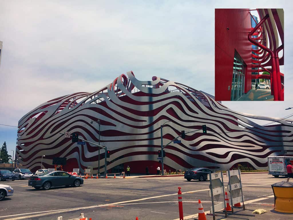
Petersen Automotive Museum on Museum Row of the Miracle Mile of Wilshire Boulevard in La Brea, Los Angeles (Photo: Mark David Major).

A common theme of historic buildings in Los Angeles is gorgeous (often Art Deco) high-rise buildings with converted or attached ground level retail units at the base. There is nothing wrong with the impulse but it is often accomplished so poorly (in terms of design) that it is akin to the most beautiful woman who ever lived (BTW, that would be Audrey Hepburn) garishly painting her toe nails like a common street whore. There is a lot of this type of ‘architectural whoring’ going on in Los Angeles.

Art Deco building on Wilshire Boulevard in Koreatown (Photo: Mark David Major).

We conclude this eclectic photo essay of Los Angeles Architecture with some cools things: a ‘green wall’ along the street facade of an Modernist apartment building in Beverly Hills and the Art Deco styling of the building typology for the Observation Pit Building at the La Brea Tar Pits, which was recently reopened after being closed for twenty years.
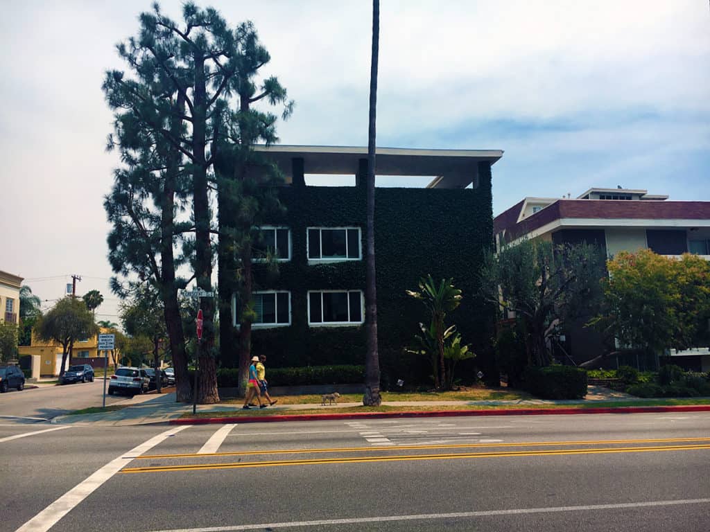
‘Green wall’ along the street facade of an apartment building in Beverly Hills (Photo: Mark David Major).
Art Deco styling of the building typology for the Observation Pit Building at the La Brea Tar Pits (Photo: Mark David Major).
Share the knowledge!
Share

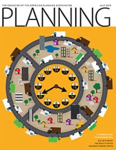
Planning Naked | July 2016

Planning Naked | July 2016
by Dr. Mark David Major, AICP, CNU-A, The Outlaw Urbanist contributor

Your (hopefully) hilarious guide to everything about the latest issue of APA’s Planning Magazine


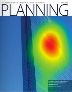
Note: In all likelihood,  one of the better issues of Planning Magazine in the last 15 years from the point of view of objective reporting and displays of good old-fashioned, common sense… or, at least, the first half of the issue. Things start to spectacularly fall apart beginning on page 27.

In the words of Marvin Gaye, what’s going on? Is there a new editor at Planning Magazine? Has Planning Magazine adopted new editorial guidelines? There’s little objectionable content about the first 12 pages of the July 2016 issue (From the Desk of APA’s Executive Director and News sections). It’s almost reading bliss.

I come not to bury Planning Magazine but to (in part) praise it. “It’s Time to Rethink Temporary Use” by David S. Silverman in the Legal Lessons section (pp. 13) is praiseworthy. “Traditional zoning is often a clumsy tool to address the regulatory land-use issues raised by” alternative, often temporary uses. If this sanity continues, I may have to retire the “Planning Naked” column on The Outlaw Urbanist.

Leave it to Rio. “Rio Gets Ready by Michael Kavalar (pp. 14-18) reports on Brazil’s preparations for the 2016 Olympics next month and pacification; “an official government policy of structured military occupation of informal communities with the intent of fully incorporating them into the formal city.” This is a well-written, informative piece that balances the positives of legacy projects associated due to the Olympics with local tensions arising from a pacification policy that predates these legacy projects. The article successfully touches on these topics, giving them some context, without losing sight of their complexities (for good and ill) in terms of politics and planning.
Taking the long view. “Winning at Their Own Games” by Kristen Pope (pp. 19) takes a brief look at adaptive reuse of facilities in Lake Placid, New York and Park City, Utah after the Olympics left town. “London’s Olympic Legacy” by Ben Plowden (pp. 20-21) follows the same story in a little more detail after the London Olympics with particular focus on London Transport. Both are interesting, informative pieces lacking the soapbox of Planning Magazine’s usually hidden agenda in the past. Again, what’s going on?

To Shop or Not to Shop, that is the Question. “From Bricks to Clicks” by Daniel G. Haake, Jeffrey M. Wojtowicz, and Johanna Amaya” (pp. 22-24) provides the ‘meat’ of this issue about the effects of e-commerce on neighborhoods, which was touched on by James Drinan in the From the Desk of APA’s Executive Director section. The piece is a thoughtful consideration of the issues surrounding increased freight deliveries of e-commerce without resorting to the standard ‘default’ answer of larger road widths and bigger floor plates in the post-war period. The creeping evidence of planning sanity is a blessed relief to this long-time victim. This article is well worth the read for planners.

It’s the business model, business model, business model. “Big Box Bust?” by Andrew Starr covers Wal-Mart’s announced closure of 154 locations nationwide, 102 of which are Wal-Mart Express stores experimenting with smaller floor plates and pared down merchandising serving a smaller (usually poorer) customer base. Starr correctly points out that ‘mindless’ application of Wal-Mart’s long-term business model for its big box stores (‘but that’s the way we’ve always done it’) on the site selection process was a likely culprit for the retailing giant incorrectly siting its Express stores; not that a ‘big box’ floor plate is necessary to survive and thrive in retail in today’s world. He points to the success of the Dollar General and Dollar Tree brands in fighting off competition from Wal-Mart Express stores as a counter example. Again, another good article; concise, objective, and spot-on.

Sigh, and there it is… mo’ money, mo’ money, mo’ money. The highlight box for “The Road to Quito” by Greg Scruggs (pp. 27-33) states “Habitat III is a ‘clarion call for planning’ that planners will pay more dividends for the profession” (our emphasis), which sounds so self-serving as to be repulsive. I don’t even want to read this article but, for anyone who might enjoy reading Planning Naked, I will. “In 1976, a bunch of Hippies…” Oh. My. God. Not a good start. Now the name-dropping, legitimacy by association. Sheesh. Now a list of pleasant sounding, meaningless bullet points using ‘synergy words.’ I can’t… go… on. This article has everything that is wrong with planning masturb… excuse me, the planning profession. The July 2016 issue of Planning Magazine was going so well until this stink bomb was dropped into the middle of the issue. Guess I don’t have to worry about retiring this column yet.

Hard core issues through a soft core lens. “One Size Does Not Fit All” by Katy Tomasulo (pp. 32-36) does have some interesting information about the housing recovery and statistical trends in the housing market. However, the author is too lackadaisical about filtering through the developer/homebuilder ‘post-war’ paradigm (e.g. suburbanization) to get at the real core of the issue. For example, NHB states they know Millennials want to become homeowners eventually (true) but that does not necessarily translate into big suburban homes (implied but false). The ‘smaller’ lot sizes discussed are still too big and don’t capitalize on the small house movement to increase affordability, etc. There’s some informative stuff in this article but the reader needs deploy critical thought to really dig for the takeaways. Good intentions but soft focus… and we all know the preferred pavement material for the road to hell.

With apologies. “Whatever Happened to HAMP and HARP?” by Jake Blumgart (pp. 36-37) is informative about the failure of the Federal programs, HAMP and HARP, established in the aftermath of the 2008 Financial Crisis to assist homeowners, but blatant in excusing the Obama Administration, Democratic Congress, and the banks for the failure of these programs by laying the blame at the feet of those very same homeowners (“If a financial institution was promising you something too good to be true, most families—after having been through what they had been through—said, ‘I’m not touching this…”). Right about the symptoms, wrong about the cause, so the conclusions are counter-productive.

More softer core. “Ever Green: Connecting to Nature in a Digital Age” by Tim Beatley (pp. 38-39) is interesting but harmless news fluff. Of course, most extinctions these days are due to the unprecedented growth of the world’s population in the post-war period. Extraterrestrial colonization and/or a massive, human depopulation event are the only substantive answers to the problem. It’s very scary that the second seems far more likely than the first.

In defense of fast food. I’m not sure about the purpose of Bobby Boone’s Viewpoint article “Fast Food’s Bad Rap” (pp. 44). Is ‘persecution of fast food’ even a thing? Sounds like a ‘first-world’ problem.

Planning Naked is an article with observations and comments about a recent issue of Planning: The Magazine of the American Planning Association.

Share the knowledge!
Share

Planning Naked | June 2016

Planning Naked | June 2016
by Dr. Mark David Major, AICP, CNU-A, The Outlaw Urbanist contributor

Your (hopefully) hilarious guide to everything about the latest issue of APA’s Planning Magazine.


The Rise of the Aqua Planner. “Water Everywhere” in From the Desk of APA’s Executive Director section by James M. Drinan (pp. 3) discusses the intense focus on water issues during sessions of the recent APA National Conference. While the subject of water management and resources is, of course, important, especially in light of rapid urbanization and population growth around the world, I can’t figure out if the APA was being intentionally ironic, cleverly subversive, or just plain clueless by setting this conversation in Phoenix, Arizona. A city on the edge of an arid desert that gets a lot of its water from the Colorado River and probably should not exist at all based the precepts of generic function. It suspiciously sounds like APA is more interested in creating another specialized planning silo – the Aqua Planner.

June. 2016. A date. Which will live. In infamy. APA is finally forced to publish the obituary of Robert Moses’ ideas in “Farewell, Robert Moses Parkway North” by Tara Nurin (pp. 6). More like ‘good riddance’ since the real infamy is it took a quarter of a century for this project to get off the ground.

The Advance of Shared Space. “Chicago Neighborhood Puts Pedestrians First” by Allen Zeyher (pp. 7) details the shared space conversion of a three-block stretch of Argyle Street in Chicago. Pedestrians First? Isn’t that slogan some sort of right-wing synthesis of vehophobia (“fear of driving”) and xenophobia (“fear of outsiders”)? Brad McCauley at Site Design Group, Ltd. offers the absolutely priceless quote of the article: “in pedestrian-heavy corridors, it’s a no-brainer to reclaim space that was formerly given over to cars,” which implicitly confirms our suspicion that the overwhelming majority of urban planners do not possess a brain. Perhaps a trip to Emerald City to see the Wizard is in order?

States lead. Federal hampers. Oh wait, State hampers, too. At first glance, there is more evidence in the News Brief section (pp. 7) that there isn’t any problem the Federal government won’t try to regulate its way out of (e.g. more EPA requirements) whereas it is the States that are really leading (e.g. Colorado Supreme Courts overturns local fracking ban)… except for the last news item about the Texas Department of Transportation adding ‘informal’ lanes by using inside shoulders during rush hour for motorists to double average speeds and produce “smooth sailing.” That’s called medicating the symptoms, not curing the disease. At least, TexDOT have their ‘evidence’ for another costly lane widening project. Let’s be honest, motorists were probably already using the inside shoulders and TexDOT merely acknowledged the fait accompli.

Speaking of fait accompli. “Tactical Urbanism Goes Mainstream” by Jake Blumgart in the News and Legal Lessons section (pp. 8) seems to stamp tactical urbanism with APA’s approval because the brand has now been proven capable of securing money for things that don’t, in fact, have anything to do with tactical urbanism. The Philadelphia example cited in the article is for pool amenity improvements, not tactical urbanism. The $184,080 granted in Detroit isn’t for tactical urbanism, it’s nominally ‘planning for tactical urbanism’ but the first project discussed is – yes, you guessed it – pool amenity improvements. It’s disturbing how concepts get twisted to mean almost anything you want when the money gets involved in the United States.

Real Reporting. In “Scalia’s Land-Use Legacy,” William Fulton briefly reviews the legacy of the recently deceased Supreme Court justice Antonin Scalia on land use law for the Legal Lessons section (pp. 9). It is a well-written, objective piece about, primarily, the Nollan and Lucas decisions. Fulton discusses their legal importance and Scalia’s intellectual role in crafting the majority decisions. The article is informative while blessedly free of ‘hidden’ agendas or positions. Ah, real reporting!

Tsk-tsk. Aaaaaarrrrrrrggggggghhhhhh. “Mixed Income, Mixed Results” by Craig Guillot (pp. 10-17) discusses the combination, for good or ill, of market rate and targeted affordable housing in developments. Housing policies in the United States from the Federal level to State and local government has been completely ass-backwards ever since the 1949 Housing Act and APA has been – and continues to be – complicit in perpetuating this ass-backwardness. All of the evidence you need is this quote, “Brennan says funding has been a barrier,” which again boils everything down to ‘give us more money.’ Giullot’s article therefore ably covers all of the problems this ass-backwards approach entails and reaps without ever addressing the core problem that everyone is basically talking out of their ass when it comes to housing. The short answer is found in the scale of developments, build-out times, land appreciation, and recognizing that a city does not ever, ever, ever remain statically frozen in time or character. The purposeful convolution of this issue is frustrating beyond belief and a direct consequence of early 20th century Euclidean zoning and suburban land tenure theories. But, by all means, continue to fiddle with market and affordable housing percentages and waste the next 50 years as well.

Here’s Your Consolidation Prize. “Separated City” by Lee R. Epstein (pp. 18-23) about Capetown in South Africa is actually a really interesting, informative article. Epstein seems to skip over the fact (or maybe, I missed it) that cities like Capetown actually represent traditional urban patterns in most of the world where lower income people live at the edges (e.g. suburbs) and higher income people live in the center. In contrast, the American urban model became inverted due to suburbanization during the post-war period. However, what’s really suspicious is how this story on Capetown immediately follows Guillot’s article about mixed income neighborhood planning efforts in US cities. Am I being paranoid that this article represents a consolidation prize to make American urban planners feel better about themselves (“See, it could be worse. Just look at Capetown, South Africa”)? Maybe, maybe not.

My God! Real Science in Planning Magazine! The use of biometrics to track human eye movement in the built environment is not new (perhaps it’s new to the APA and/or Americans). It’s been around for a while now – being worked on at University College London using virtual reality 20 years ago – in one form or another. It’s a fascinating area of research about the built environment but we need to be careful to fully appreciate the implications and not assume it’s an issue of quantity [“No wonder visitors from around the world like walking through Venice or Copenhagen — there’s so much (our emphasis) there to stimulate our sensory system, no matter one’s native language, culture, or personal history”]. There is a LOT of meat in this subject, too much to go into here but you can look at some of the work of Dr. Ruth Conroy Dalton at the Northumbria University and Dr. Beatrix Emo, Cahir of Cognitive Science at ETH Zurich. The key takeaway from the article for architects and planners right now is this quote: “I realized how people are really attracted to people.”

My God! Housing Sanity in Planning Magazine! Finally, someone articulates a reasonable perspective about the issues of housing in the Viewpoint section, “The New Home Ownership Reality” by Professor Anthony Nelson (pp. 48) of the University of Arizona. Professor Nelson does not implicitly tackle the house size part of the equation (e.g. tiny houses/small house movement) but any discussion about affordability has to begin with rental housing and ownership of affordably sized homes. Professor Nelson’s Viewpoint article is a good place to start.

Planning Naked is an article with observations and comments about a recent issue of Planning: The Magazine of the American Planning Association.

Share the knowledge!
Share

FROM THE VAULT | Bourgeois Utopias | Robert Fishman

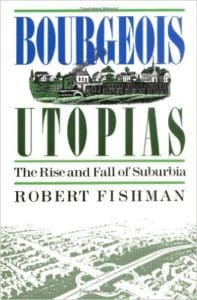
FROM THE VAULT | Bourgeois Utopias: The Rise and Fall of Suburbia by Robert Fishman
Review by Dr.  Mark David Major, AICP, CNU-A, The Outlaw Urbanist contributor

I’ve been an admirer of historian Robert Fishman ever since reading Urban Utopias in the Twentieth Century (MIT Press, 1982) in the early 90s but especially after hearing him speak at CNU20 in West Palm Beach, FL in 2012. Given this, I was a naturally excited to read this book when I came across it many years after its publication. However, I have to begrudgingly admit I was mostly underwhelmed by Bourgeois Utopias: The Rise and Fall of Suburbia (Basic Books, 1987). Partially, this is a matter of timing. When Fishman wrote and published this book in the late 1980s, it seemed like the cumulative apex of suburban expansion and urban decline in the United States. In hindsight, Fishman’s history of suburbia come across as a dated, unconditional surrender to what must have seemed to many people at the time as the inevitable (despite the ‘fall’ mentioned in book’s title). Of course, we now realize there was still a significant part of the story waiting to play out over the subsequent three decades (see New Urbanism/Smart Growth, collapse of the mortgage bond market, and 2008 Financial Crisis).

However, it is not all a matter of timing. Fishman is so determined to fit his subject into the thematic structure began in Urban Utopias in the Twentieth Century that he tends to cast aside any evidence contrary to his central thesis, especially when it comes to the American experience of suburbia. For example, you will not find the phrases ‘exclusionary zoning’ or ‘restrictive covenants’ anywhere in Bourgeois Utopias, which seems like an odd oversight for a purported history of suburbia. Fishman also oddly ignores ample evidence in the historical record (as well as John Reps’ seminal histories The Making of Urban America: A History of City Planning in the United States and Cities of the American West: A History of Frontier Urban Planning) that there were, in fact, only a few examples of the modern American suburb type (Llewellyn Park, New Jersey and Frederick Law Olmsted’s Riverside, Illinois being the most obvious 19th century forerunners) before World War II because the regular grid dominated in American land speculation activities until the onset of the Great Depression in 1929.

Riverside, Illinois (Photo: Wikipedia).

This creates a problem because Fishman has to, more or less, cast aside the narrow, formal definition of suburbia he adopts at the start of the book when discussing early suburbs in London and Manchester, England  for a much looser definition (basically, any single family home with front yard setbacks) when approaching the American experience, especially in Los Angeles. In fact, Fishman’s entire chapter on Los Angeles reads as a regurgitation of Reyner Banham’s arguments in Los Angeles: The Architecture of Four Ecologies (1971) so both have the same flaws in underestimating the power of the urban grid. It is also another case in bad timing since Mike Davis’ City of Quartz: Excavating the Future in Los Angeles was published only a few years later in 1990. Davis’ book has its own flaws but it is an invaluable resource for understanding the historical development of urban form in Los Angeles including the role of water pilfering in that city as well as the insidious role of the automobile industry in the Red Car’s demise.

By far, the best and most compelling part of Bourgeois Utopias is Fishman’s research on early suburbs in England during 18th and 19th century and Olmsted’s mid-19th century plan for Riverside, Illinois (basically, pages 1-148). Indeed, any reader should be able to sense the author’s greater interest in these pre-20th century examples compared to the amalgamated cancer of 20th century suburbanization in the United States, when it seems as if Fishman is trying to ‘run out the clock’ on the book. In fact, if Fishman wasn’t so determined to ambitiously fit this topic into the ‘utopia’ theme, he might have been better served to limit his historical research to these pre-20th century examples. Fishman astutely identifies the changing nature of family related to longer life expectancy during the 18th and 19th century in England as the social origins for suburbia. Fishman briefly mentions life expectancy (which seems far more important than the words given in this book) before devoting most of his time to the evolution of familial relations in the workplace and/or home. Fishman also makes an important, useful distinction between the productive and consumptive suburb that has broader implications than spelled out in the book. It is fascinating research, which alone makes the book worth the effort. In the end, though, there are some good parts (Anglo examples) and some head-scratching parts (American examples) in Bourgeois Utopias: The Rise and Fall of Suburbia so the book deserves, at best, only a 3-star rating.

Bourgeois Utopias: The Rise and Fall of Suburbia
by Robert Fishman
Basic Books, 1987
Paperback, 272 pages, English
ISBN-10: 0465007473
ISBN-13: 978-0465007479

You can purchase Bourgeois Utopias: The Rise and Fall of Suburbia from Amazon here.

From the Vault is a series from the Outlaw Urbanist in which we review art, architectural and urban design texts, with an emphasis on the obscure and forgotten, found in second-hand bookstores.

Share the knowledge!
Share

PHOTO ESSAY | Dana-Thomas House | Frank Lloyd Wright

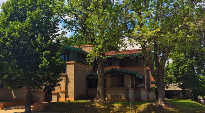
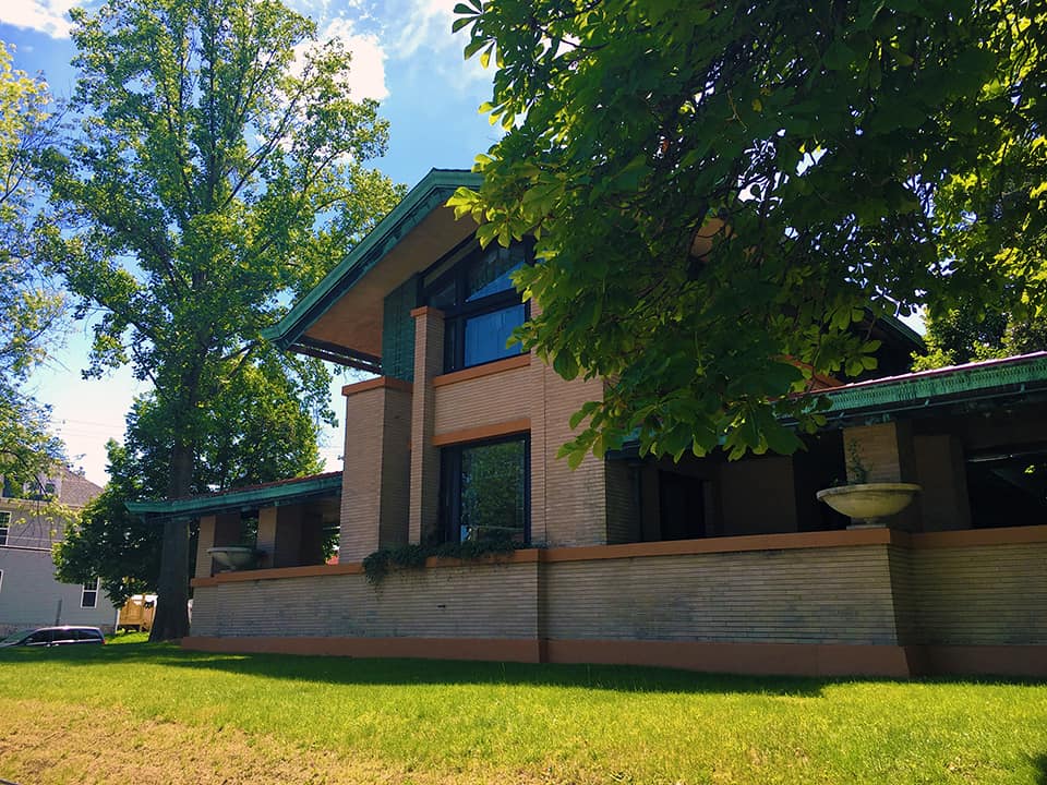
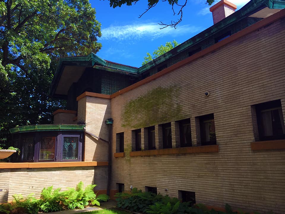
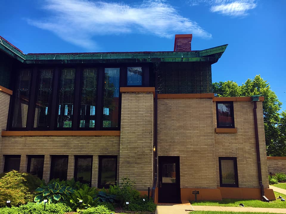
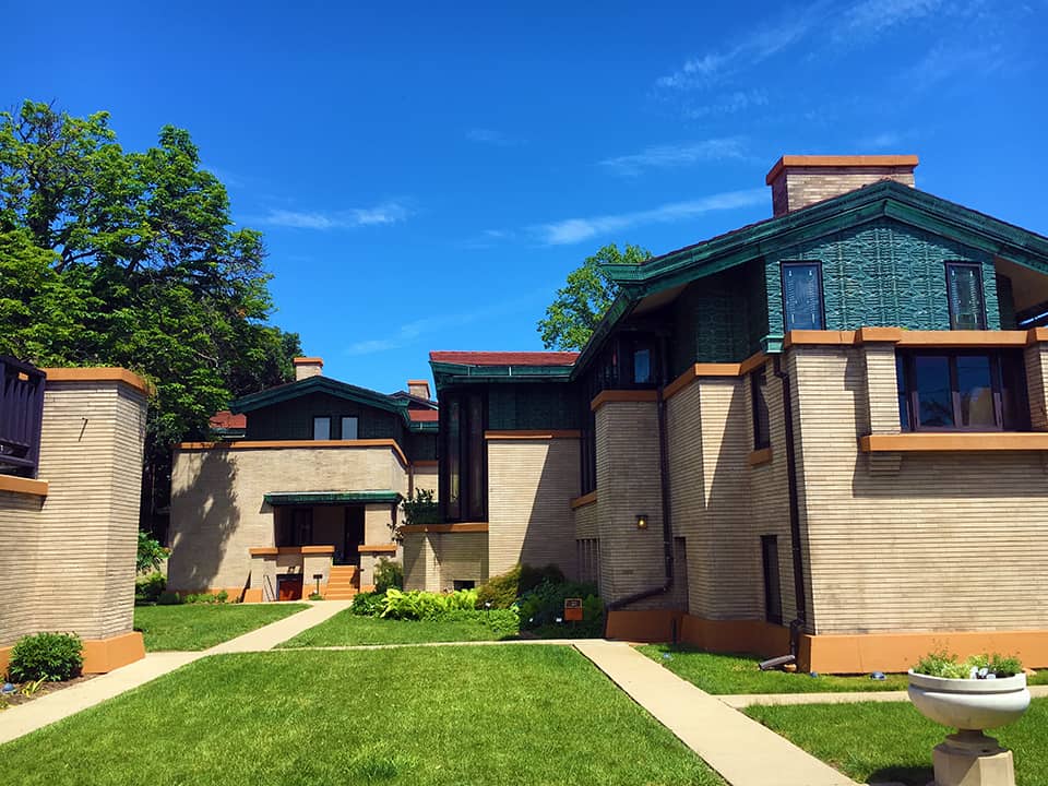
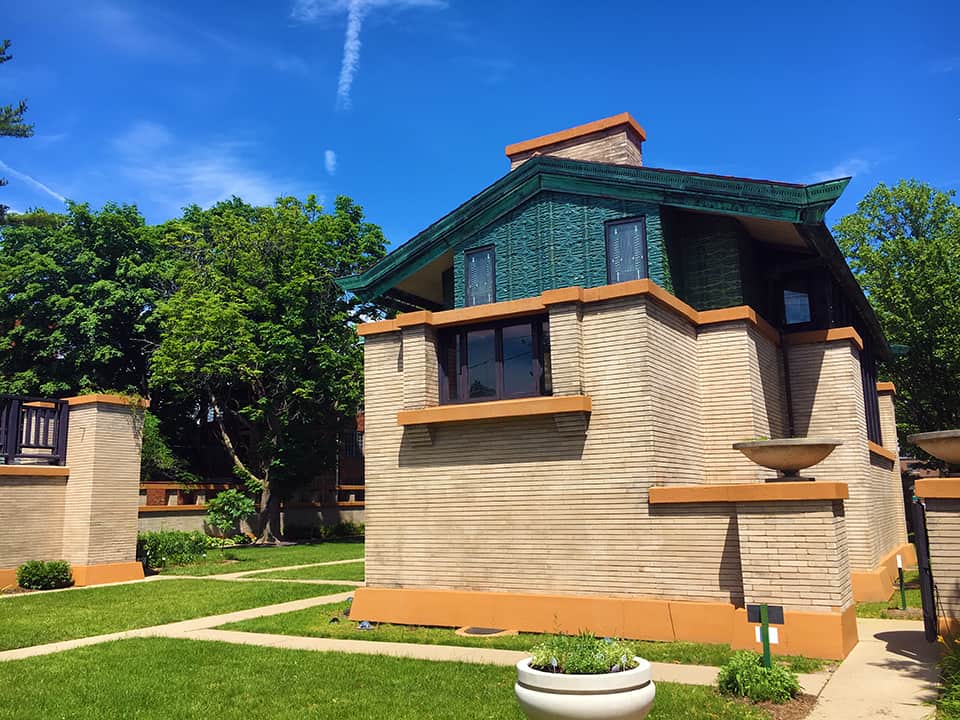
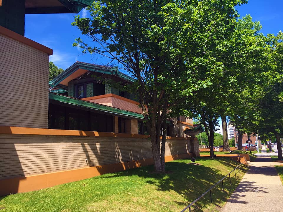
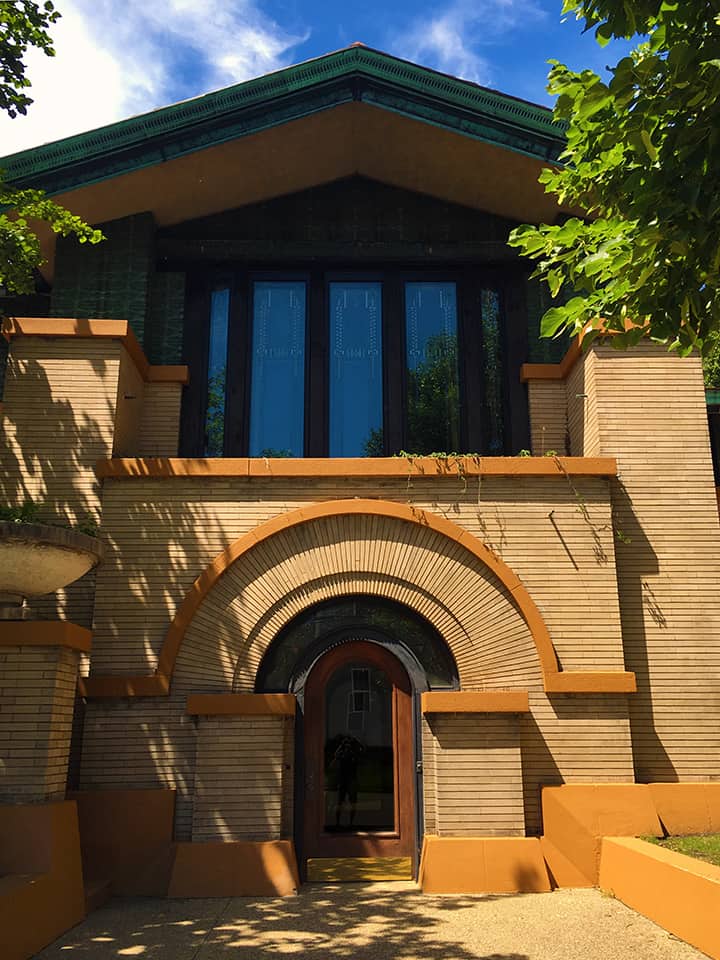
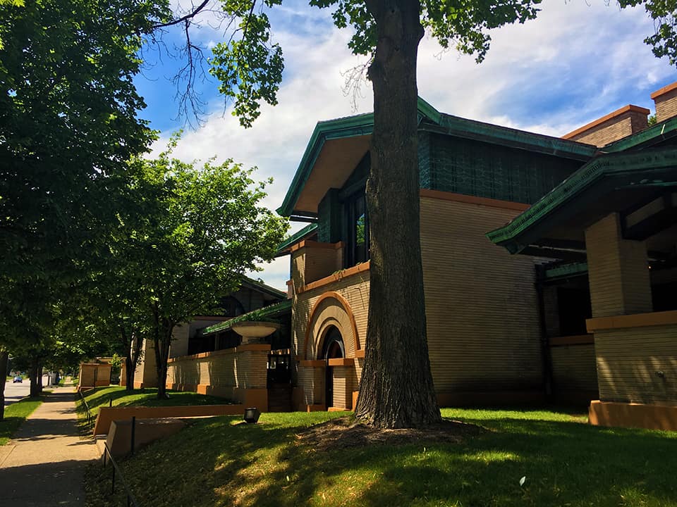
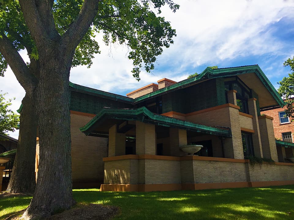
Dana-Thomas House located on East Lawrence Avenue in Springfield, Illinois is one of the earliest examples of the Modernist Prairie Style of architecture designed by its leading advocate, American architect Frank Lloyd Wright, circa 1902-04. The State of Illinois bought the house in 1981 and it became a historic site under the Illinois Historic Preservation Agency, which led a restoration effort in 1987-1990 to refit the house to its appearance in 1910. It is believed to contain one of the most intact Frank Lloyd Wright architectural interiors in the United States (Source: Wikipedia).

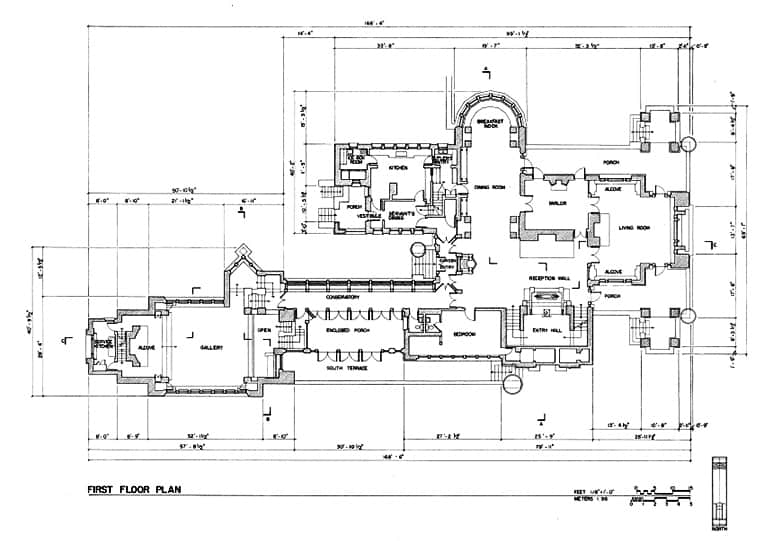
There is an interesting, contradictory dynamic at work in the scale of the house in the horizontal and vertical dimension. Simply put, this house has a gigantic footprint! The house is 12,600 square feet, with thirty-five rooms and sixteen major spaces (Source: Illinois Historic Preservation Agency). This square footage is so far over-the-top that the top “is a dot to you” and me. This is the equivalent of five houses for the average American homeowner today! The horizontal emphasis in the designed elevations of the house (especially adjacent to busiest, public streets) allows this house to somewhat sit comfortably in the Springfield neighborhood in the vertical dimension of the elevation of the houses. However, the footprint of the house is equal to the size of four lots either immediately across the street or adjacent to the house. I suppose it is a testament to horizontal emphasis in Wright’s elevation designs that the house fooled me into thinking it was (only) around 6,000 square feet; itself, a extremely large house (and perhaps the footprint of only the first floor without the accessory structure/courtyard to the rear is around this number). The more you move around the house, the more conscious you become of how out-of-scale the Dana-Thomas House is to the surrounding urban context in the horizontal dimension of the plan.

First floor plan for Frank Lloyd Wright’s Dana Thomas House in Springfield, Illinois, USA (Source: Wikipedia).
Dana-Thomas House in Springfield, Illinois from 4th Street (Photograph: Mark David Major).
Dana-Thomas House in Springfield, Illinois from sideyard (Photograph: Mark David Major).
Dana-Thomas House in Springfield, Illinois from interior courtyard (Photograph: Mark David Major).
Dana-Thomas House in Springfield, Illinois from East Lawrence Avenue looking toward 4th Street (Photograph: Mark David Major).
Detail of Dana-Thomas House in Springfield, Illinois side entrance from East Lawrence Avenue (Photograph: Mark David Major).
Dana-Thomas House in Springfield, Illinois from corner of 4th Street and East Lawrence Avenue at side elevation of the house (Photograph: Mark David Major).
Dana-Thomas House in Springfield, Illinois from corner of 4th Street and East Lawrence Avenue at front elevation of the house (Photograph: Mark David Major).
Share the knowledge!
Share