The Evolution of Urban Planning
by Konstantin von der Schulenburg, Guest Contributor

Courtesy of Cantrell & Crowley
The Evolution of Urban Planning
by Konstantin von der Schulenburg, Guest Contributor

Courtesy of Cantrell & Crowley
 Planning Naked | April 2016
by Dr. Mark David Major, AICP, CNU-A, The Outlaw Urbanist contributor
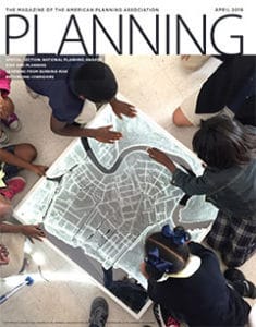
1. What is this? An actual plan on the cover of Planning Magazine! Well, that is promising. However, it would be wise to not hold our breath. Some things in this issue should illicit anger.
2. The first 12 pages are advertisements. I guess it could be worse, see Cosmopolitan or GQ Magazine.
3. “Granny Flats Gaining Ground” by Brian Barth (pp. 16-17) is an important article. You can tell because the editors of Planning Magazine barely contain their disgust by using lukewarm, halting language, especially in comparison to the urgent, positive word choices in the “U.S. Broadband Lags Behind” article on pp. 17. The title of this article should probably be “Granny Flats Recover Stolen Ground.”
4. “‘CEQA in Reverse’ Curtailed” by Ron Bass in the Legal Lessons section (pp. 19) tries to downplay what could prove to be a truly monumental court ruling for future land development in California.
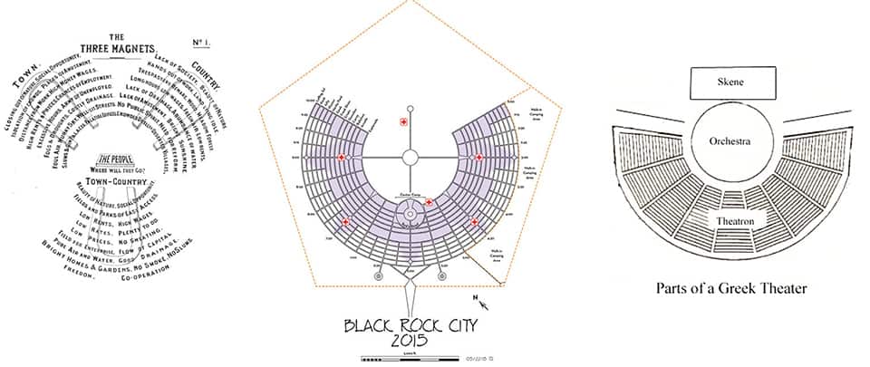
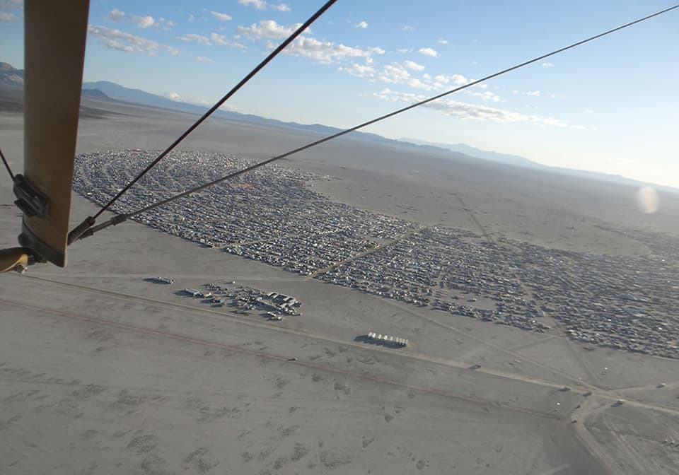
5. “Welcome to Black Rock City” by Dr. Thomas Sullivan (pp. 20-27) tries to conflate the annual Burning Man Festival in Nevada into something it is not by tying the festival layout to Ebenezer Howard’s Garden Cities of Tomorrow plan model (see images below). It doesn’t have anything to do with Howard’s Utopian ideals. The festival layout is based on an Ancient Greek amphitheater, which crystallizes what the Burning Man festival is really all about: theater. It doesn’t undercut what is interesting about people participating in the festival, how they conduct themselves or they are managed (they are, it’s buried in Sullivan’s text and reeks of the kind of authoritarianism associated with the political left, see political correctness, safe space, muting opposition, etc.). However, the reality of layout does ably illustrate the fallacy of Sullivan’s argument. Get real, man.

 6. “Future Plans” by William Atkinson (pp. 28-31) is disturbing. There is nothing wrong with the aspirations of the content, e.g. involving young people in the planning process. It is the utter condescension on display in the article. There is not one high school student quoted in the article. As far as I can tell, there is not one Millennial quoted in the article. This is Baby Boomers/GenXers talking about how they are involving youth in the planning process. How magnanimous of you! However, the article does not allow any young person to be heard. Any young person who happens to read the article should be angry. It made me angry. The message could not be clearer: young people are to be involved (check that off the list) but not actually listened to or allowed to be heard.
 7. “Flipping the Strip” by Randall Arendt for the Planning Practice section (pp. 32-35) is, by far, the most important article in this month’s issue. Naturally, it is an editorial/layout nightmare as the editors of Planning Magazine almost seem to be going out of their way to undercut the content, which transforms a relatively straightforward, clear, and concise argument into a confusing presentation for the readers to follow. Mr. Arendt should be upset about how his content was butchered by the editors.
8. 2016 National Planning Awards section (pp. 37-48)… Well, let’s see: an award for a comprehensive plan, which is not shown; the most interesting thing shown about Resilient New Orleans is on the cover; photo for Grand Rapids Downtown Market appears to be architecture, not planning; an urban design award for a Landscape Urbanism project in Chicago; and a JAPA award for a climate change article. This entire section only raises a lot of questions about what is the American Planning Association really hiding from us? Then, depression set in…
9. “Use Story Mapping for Better Reports” by Emily Pasi in The Commissioner section (pp. 49-50) was published 20 years too late. “Infrastructure Planning” in Carolyn Thomas in the same section (pp. 51-52) was published 60 years too late.
10. “The ‘Gayborhood’ Solution?” by Cade Hobbick in the Viewpoint section (pp. 60) is a perfect example about how identity politics almost inevitably leads to the wrong conclusion, especially in urban planning. Read the article once as is, then read the article again but generalize the identity politics terminology (so “LGBTQ community” becomes ‘community’, “gayborhood” becomes ‘neighborhood’, “homeless LGBTQ youth” becomes ‘homeless youth’, etc.). This is pretty easy to do for the entire article except for the 7th paragraph, which is specifically about the AIDS crisis during the 1980s/1990s. When you do this, you’ll see Hobbick’s proposed solution (we need to build more community centers, i.e. a public, architectural solution) is not only wrong but he discounts the actual solution. If you generalize the language, then it comes down to this: we do need to build better neighborhoods; identity politics is irrelevant because common problems demand common solutions for everyone (see “Universal Design” in last month’s issue of Planning Magazine).
Note: this month’s cover photo honors the title of this running series, i.e. Planning Naked.
Planning Naked is a regular feature with observations and comments about a recent issue of Planning: The Magazine of the American Planning Association.