Tag Archives: Los Angeles

PHOTO ESSAY | Oddballs and Curiosities in Los Angeles

There are few cities in the world more perplexing than Los Angeles. The reasons are many. The Outlaw Urbanist will take a closer look at some of the reasons in a multi-part, photo essay series. Today, we look at oddballs and curiosities in Los Angeles. If you dare to walk in Los Angeles (let’s face it: if you dare, you will have to walk a lot as the price paid), you never know what you might find in the City of Angels.

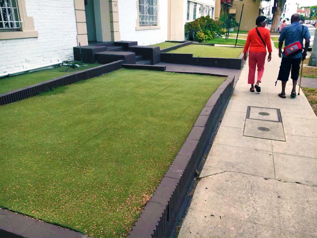
Los Angeles has been in the midst of a drought for nearly five years now. The evidence of ‘brown lawns’ is everywhere as well as a few, industrious solutions such as in front of this apartment building where AstroTurf serves as a grass substitute.
IMG_2866
‘Forever green’ AstroTurf law in front of a Los Angeles apartment building (Photo: Mark David Major).

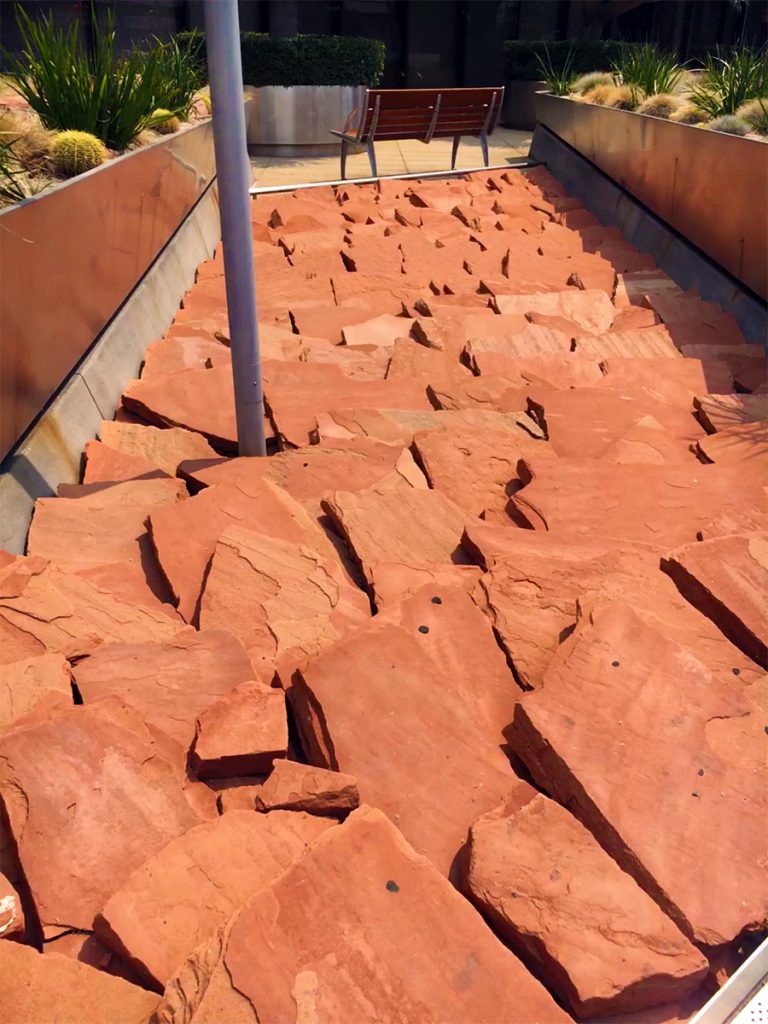
By all appearances, this ‘rock garden’ in front of a Wells Fargo building on Wilshire Boulevard is not in response to the long-term California drought but represents a purposeful landscape design choice. To say it is ugly is an understatement. You can also physically feel the temperature increase in proximity to this rock garden (which is much bigger than shown here). It should be filed under “What Were You Thinking?”
IMG_2919
Rock garden (courtesy of Home Depot?) in front of a Wells Fargo building on Wilshire Boulevard, Los Angeles (Photo: Mark David Major).

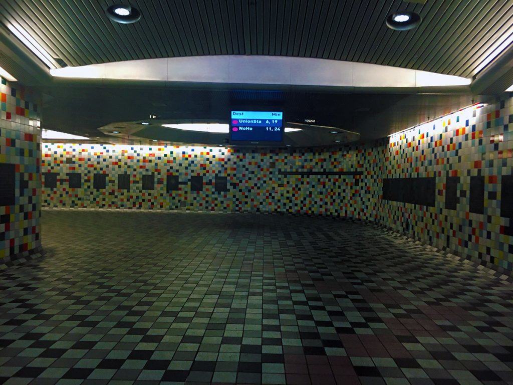
For the most part, the Los Angeles Metro is impressive and growing. This seems to include putting in the hard work of stations in the right locations as opposed to only conveniently available ones. However, there were a few, odd things about the L.A. Metro. The stations I used did not have above-ground buildings but rather large stairways/escalators opening up to street level with associated signage. This makes the station entrances difficult to see from a distance, for example compared to the distinctive, red tile buildings of the traditional London Underground stations or the most flamboyant designs of its newer stations. The lighting in these underground stations is incredibly subdued. The purpose of the ‘romantic lighting’ is unclear since it tends to render a somewhat unsafe feeling to these underground spaces  (even though the stations seemed perfectly safe). I noticed the same subdued lighting at some downtown underground stations on the St. Louis MetroLink. The brighter lighting in stations on the London Underground is preferable in my opinion.
IMG_3056
East Hollywood Metro station in Los Angeles (Photo: Mark David Major).

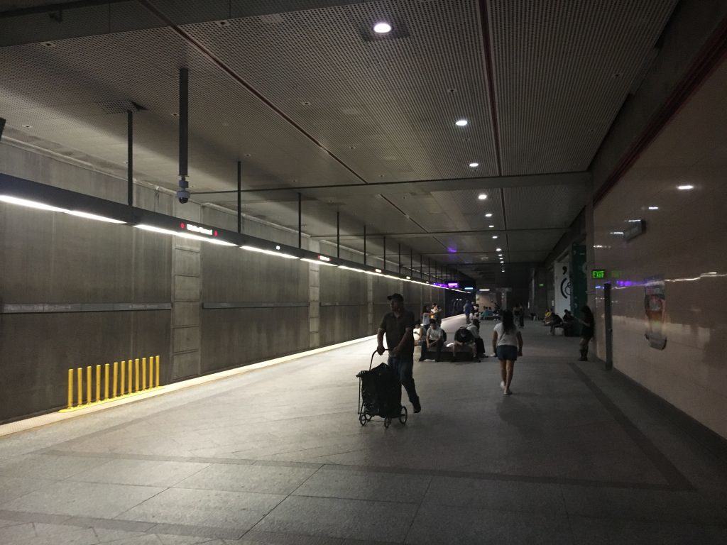
The other noticeable thing about these L.A. Metro stations is the manifest lack of advertising on the walls. There are gobs and gobs of wall space, which are left completely unused. It is unclear why the L.A. Metro would forego the additional revenue stream of advertising in their stations to help offset the operating costs, especially if they control where and how that advertising is located. It is a bizarre choice, especially in a city where the film industry thrives (e.g. movie posters). London Underground generates significant revenue from advertising in their stations, on platforms and along escalators. Why leave all of that money on the table in L.A.? It doesn’t make any sense to me.
IMG_3025
Wilshre Boulevard Metro station in Los Angeles (Photo: Mark David Major).

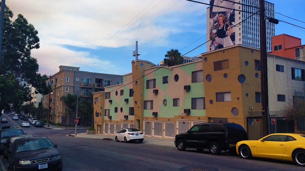
Nothing destroys the street frontage quicker than a continuous row of garage doors such as this recently constructed apartment/condominium building in Mid Wilshire. Ahem.
IMG_3024
A row of garage doors for a newer apartment building in Mid Wilshire, Los Angeles (Photo: Mark David Major).

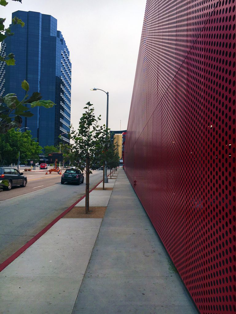
Or the continuous blank wall of a massive parking garage such as this one behind the Petersen Automotive Museum along South Fairfax Avenue. The pitiful – almost apologetic – street trees do very little to mediate for this massive blank wall. Walking around L.A., I reached the point where I swore “if I see one more insensitively designed parking garage, I’m going to scream.” I was screaming a lot after that ill-advised vow.
IMG_2910
The blank wall along South Fairfax Avenue is a massive parking garage behind the Petersen Automotive Museum on Wilshire Boulevard in Los Angeles (Photo: Mark David Major).

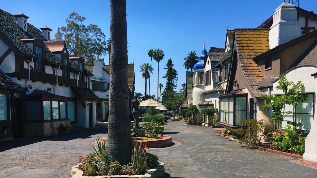
There are some interesting (current and past) rehabilitation projects in Los Angeles. For example, this conversion of what appears to be an extremely old motor inn (or perhaps hotel bungalows) into an apartment/condominium complex one block south of Hollywood Boulevard in Hollywood.
IMG_3036
Apartment/condominium complex one block south of Hollywood Boulevard in Hollywood, Los Angeles (Photo: Mark David Major).

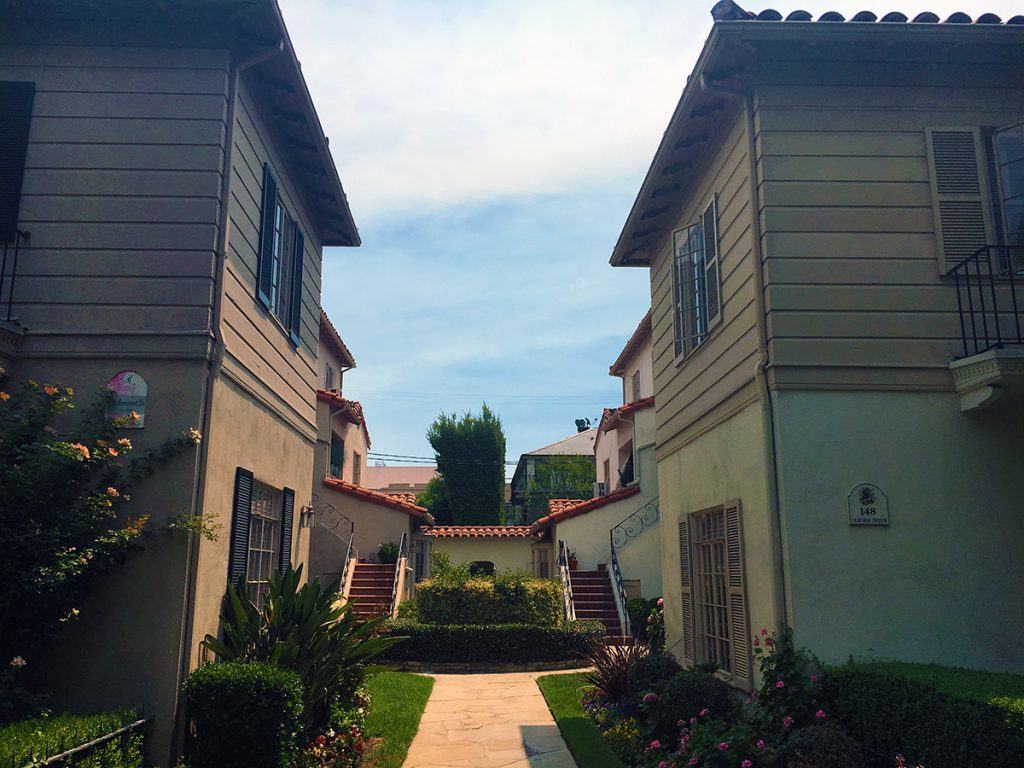
This adaptive re-use serves as quite a contrast to the standard, courtyard apartment building typology found in many neighborhoods of Los Angeles such as this one in La Brea.
IMG_2947
Typical courtyard apartment building in La Brea, Los Angeles (Photo: Mark David Major).

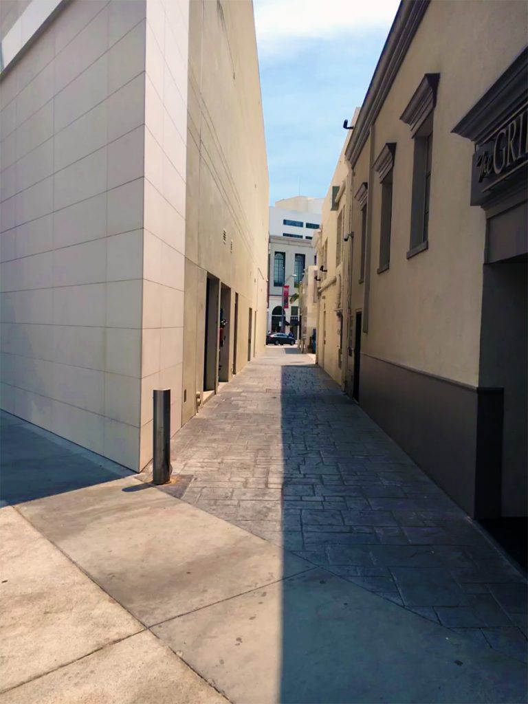
The coolest alley in Beverly Hills (yes, they have alleys in Beverly Hills, quite a lot of them) is located between Dayton Place and Rodeo Drive (at the far end of this photograph). This alley is called Fred Hayman Place. Fred Hayman was known as the ‘Godfather of Rodeo Drive.’ To the right, is The Grill on the Alley restaurant.
IMG_2951
Fred Hayman Place alley between Dayton Place and Rodeo Drive (Photo: Mark David Major).

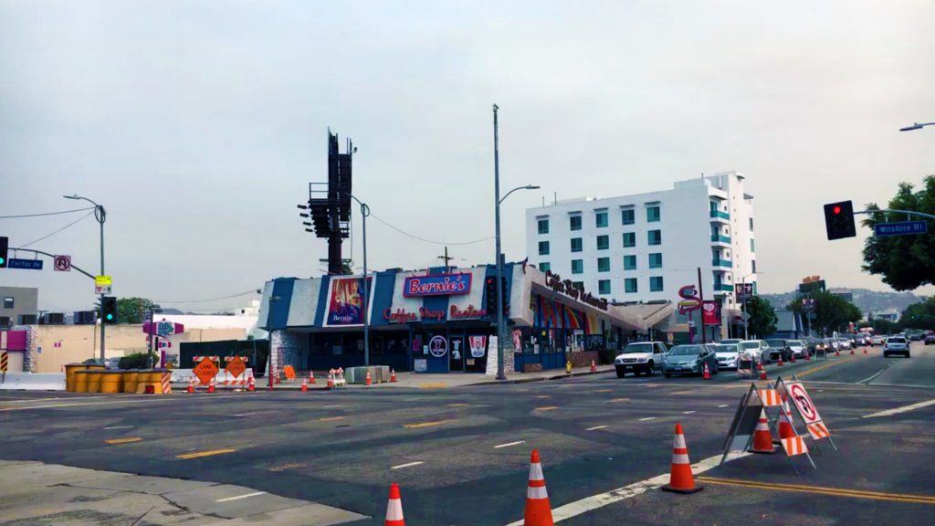
One of the most charming buildings along Wilshire Boulevard is Bernie’s Coffee Shop (formerly Johnie’s Coffee Shop) at the northwest corner of South Fairfax Avenue. It is more interesting than the Peterson Automotive Museum sitting on the opposite corner. Wikipedia even attributes a style to this type of building called Googie architecture, described as a form of modern architecture, which is a subcategory of futurist architecture influenced by car culture, jets, the Space Age, and the Atomic Age (Source: Wikipedia). Personally, I’ve never heard of this architectural style. It only looks like an old Denny’s Restaurant. In any case, it is listed as a Los Angeles Historic-Cultural Monument. The building has appeared in several movies including Volcano, The Big Lebowski, Reservoir Dogs, American History X and Gone in 60 Seconds. You might be able to tell from this photo the owners of Bernie’s Coffee Shop were ‘feeling the bern’ for Democrat Bernie Sanders at the time.
IMG_2909
Bernie’s Coffee Shop (formerly Johnie’s Coffee Shop) at the northwest corner of South Fairfax Avenue and Wilshire Boulevard in Los Angeles (Photo: Mark David Major).

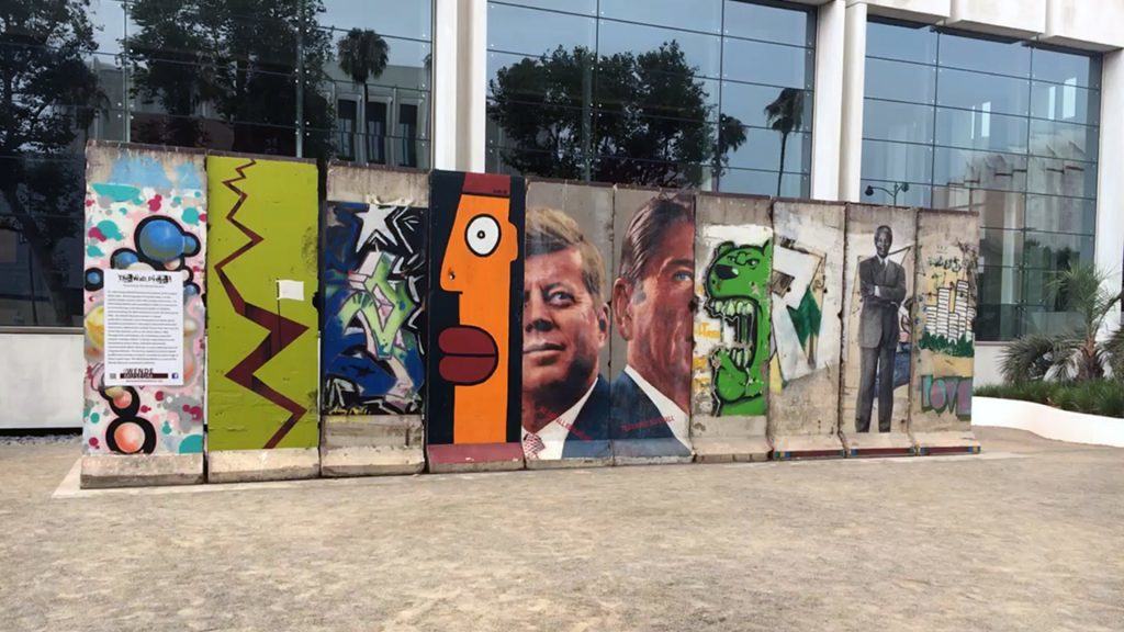
We conclude today’s essay with a great find, a discovery made only possible by doing the unthinkable: walking a lot. The largest section of the Berlin Wall outside of Germany is located in Los Angeles in front of the Sprüth Magers Art Gallery on Wilshire Boulevard. You would think its proximity across the street from the heavily-visited Los Angeles County Museum of Art would mean this section of the Berlin Wall was easily-found and visited a lot. However, it was deserted most of the day. Most everyone ignored the history located a short walk just across the street from them.


IMG_2898


Share the knowledge!
Share

PHOTO ESSAY | Los Angeles Architecture

There are few cities in the world more perplexing than Los Angeles. The reasons are many. The Outlaw Urbanist will take a closer look at some of those reasons in a multi-part, photo essay series. Today, we look at a small selection of Los Angeles architecture. There are hundreds of interesting, even gorgeous historical examples of Art Deco and Modernist buildings in Los Angeles. There are an equal number that can be simply described as curious. The sample in this photo essay is designed to be eclectic rather than exhaustive.

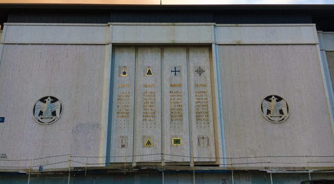
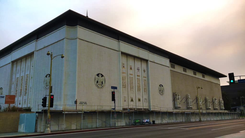
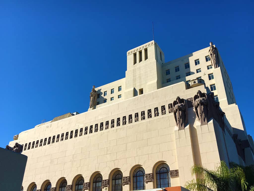
Scottish Rite Masonic Temple on Wilshire Boulevard in Mid Wilshire/Central LA (Photo: Mark David Major).

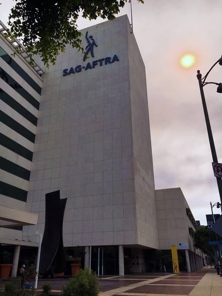
There is an odd, symbolic symmetry about the impenetrable, foreboding facades of the Scottish Rite Masonic Temple in Mid Wilshire/Central L.A. and the Screen Actors Guild Building down the road on the Miracle Mile. The architectural message could not be clearer: beware to all those who do not belong here (you know who you are).

Screen Actors Guild Building on the Miracle Mile of Wilshire Boulevard in Los Angeles (Photo: Mark David Major).

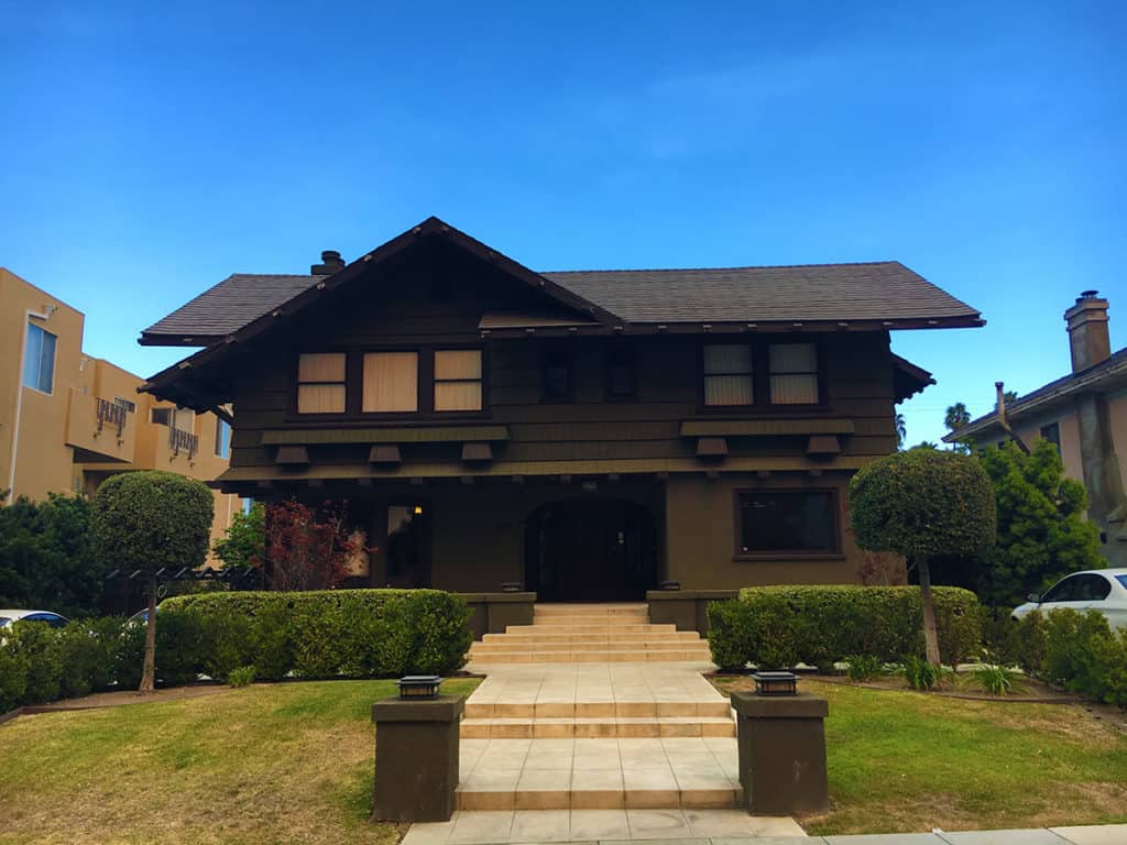
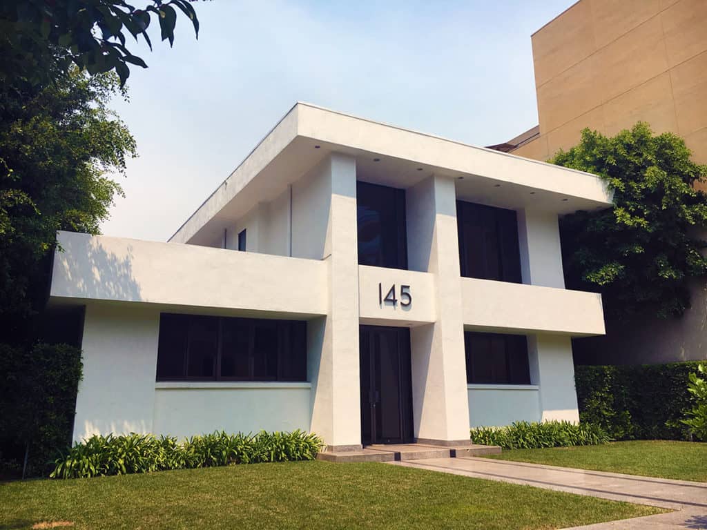
We interrupt this photo essay for something cool: an example of the classic California Style house or bungalow (depending on your definition of size) and a Modernist residential house, both located a few hundred feet south of Wilshire Boulevard in La Brea.

A classic California style house in La Brea (Photo: Mark David Major).
A Modernist house in La Brea (Photo: Mark David Major).

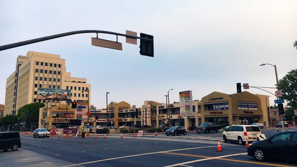
Based on quantity alone, the prototypical strip mall in Los Angeles has a L-shaped typology. Two-story buildings with double loading (at ground and above) of small retail units, connected by external stairwells and walkways, surrounding a small parking lot (see below). Who would go to L.A. and take photographs of ubiquitous strip malls? Probably only The Outlaw Urbanist. These strip malls have the architectural vocabulary of a proverbial bull in a china shop.

A example of the prototypical Los Angeles strip mall on Wilshire Boulevard in Koreatown (Photo: Mark David Major).

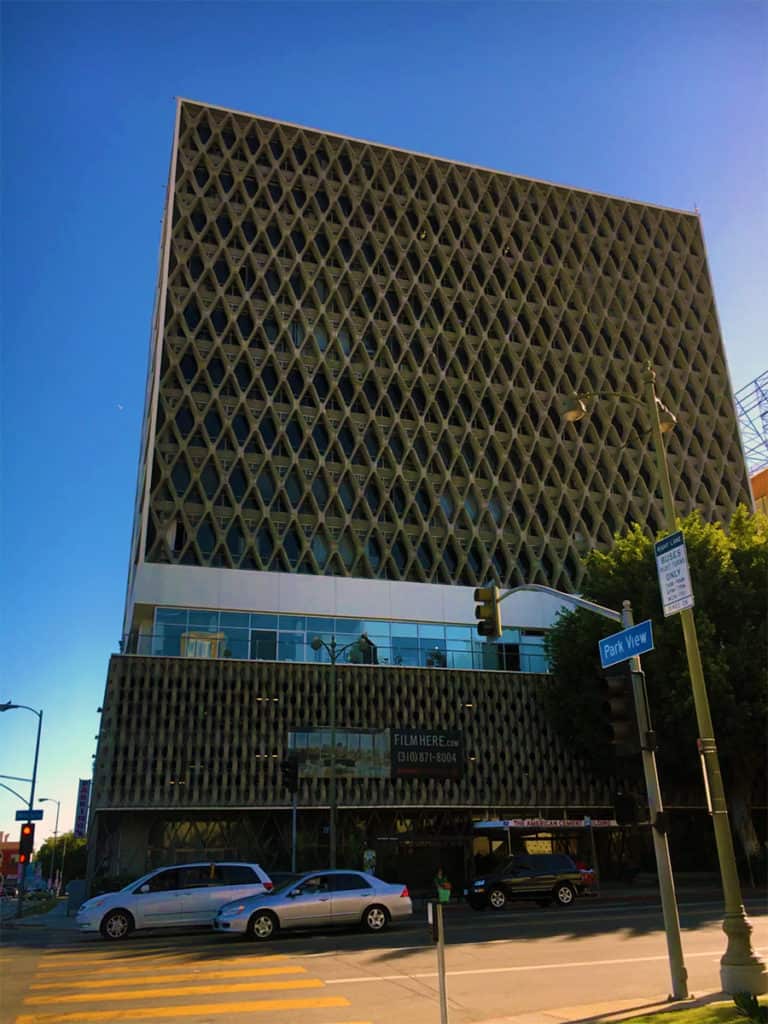
Truth in advertising at the American Cement Company Building (now the Concrete Studio Lofts) on Wilshire Boulevard at the western perimeter of MacArthur Park. Across the street is the ‘tent city’ of the homeless living in MacArthur Park. The homeless problem in Los Angeles might be the worst of any American city I’ve ever witnessed. It is disgraceful the City of Los Angeles/State of California has not capitalized on the ‘tiny house movement’ to tackle the homeless problem. The result is the distinctive urine aroma of MacArthur Park.

American Cement Company Building (now Concrete Studio Lofts) on Wilshire Boulevard in MacArthur Park area (Photo: Mark David Major).

False advertising at the Park Plaza Hotel across the street at the northwestern corner of MacArthur Park in Los Angeles. Everything about this building screams ‘courthouse,’ the building envelope (absent the sculptures) echoes the classical architecture of the Hall of Justice in Downtown Los Angeles. However, the Art Deco building designed by Curlett & Beelman was originally for the Benevolent and Protective Order of Elks as Elks Lodge No. 99. Today, the hotel is a Los Angeles Historic-Cultural Monument.

Park Plaza Hotel in MacArthur Park area of Los Angeles (Photo: Mark David Major).

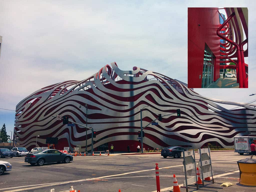
Pretend deconstructivism in Kohn Pedersen Fox’s facade design for  the Petersen Automotive Museum along Museum Row of the Miracle Mile on Wilshire Boulevard in La Brea, Los Angeles. It is a big red box building with vertical, metal sliding covered by a false ‘piggly wiggly’ facade. The building is dramatic from faraway but extremely disappointing up close, especially the big red parking garage at the back, which creates a blank wall along the long length of a full urban block on South Fairfax Avenue.

Petersen Automotive Museum on Museum Row of the Miracle Mile of Wilshire Boulevard in La Brea, Los Angeles (Photo: Mark David Major).

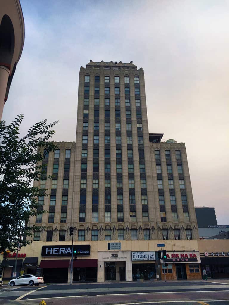
A common theme of historic buildings in Los Angeles is gorgeous (often Art Deco) high-rise buildings with converted or attached ground level retail units at the base. There is nothing wrong with the impulse but it is often accomplished so poorly (in terms of design) that it is akin to the most beautiful woman who ever lived (BTW, that would be Audrey Hepburn) garishly painting her toe nails like a common street whore. There is a lot of this type of ‘architectural whoring’ going on in Los Angeles.

Art Deco building on Wilshire Boulevard in Koreatown (Photo: Mark David Major).

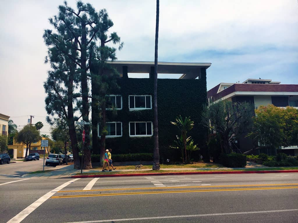
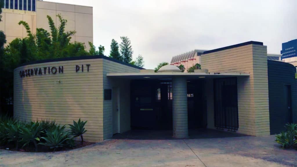
We conclude this eclectic photo essay of Los Angeles Architecture with some cools things: a ‘green wall’ along the street facade of an Modernist apartment building in Beverly Hills and the Art Deco styling of the building typology for the Observation Pit Building at the La Brea Tar Pits, which was recently reopened after being closed for twenty years.

‘Green wall’ along the street facade of an apartment building in Beverly Hills (Photo: Mark David Major).
Art Deco styling of the building typology for the Observation Pit Building at the La Brea Tar Pits (Photo: Mark David Major).
Share the knowledge!
Share

PHOTO ESSAY | Downtown Los Angeles

There are few cities in the world more perplexing than Los Angeles. The reasons are many. The Outlaw Urbanist will take a closer look at some of those reasons in a multi-part, photo essay series. Today, we begin with Downtown L.A., which uniquely combines fascination and frustration for any architect, urban designer, and planner with a good conscience.

Downtown L.A. could be incredible urbanism. In fact, it should be incredible urbanism. Instead, it comes across as lazy. Downtown L.A. is alive but not necessarily well. It has ‘good bones’ including some stunning pre-World War II buildings. However, Downtown L.A. desperately needs large doses of TLDC (tender, loving design care), which appears somewhat lacking at the moment.

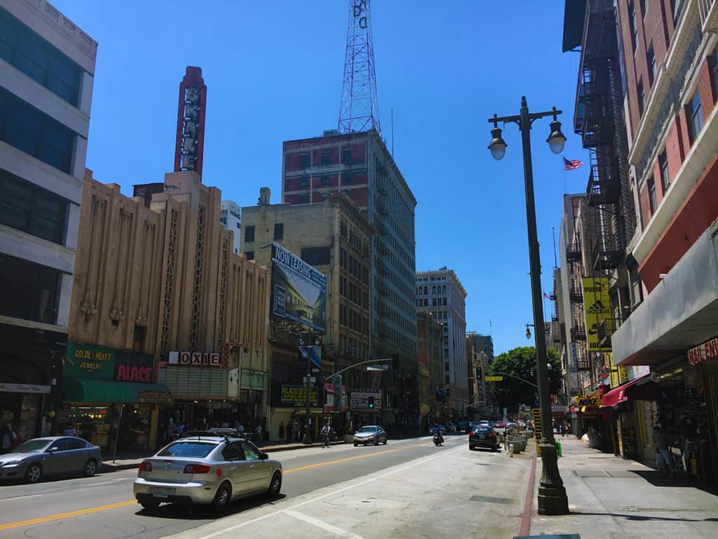
View along S. Broadway in Downtown L.A. (Photo: Mark David Major).

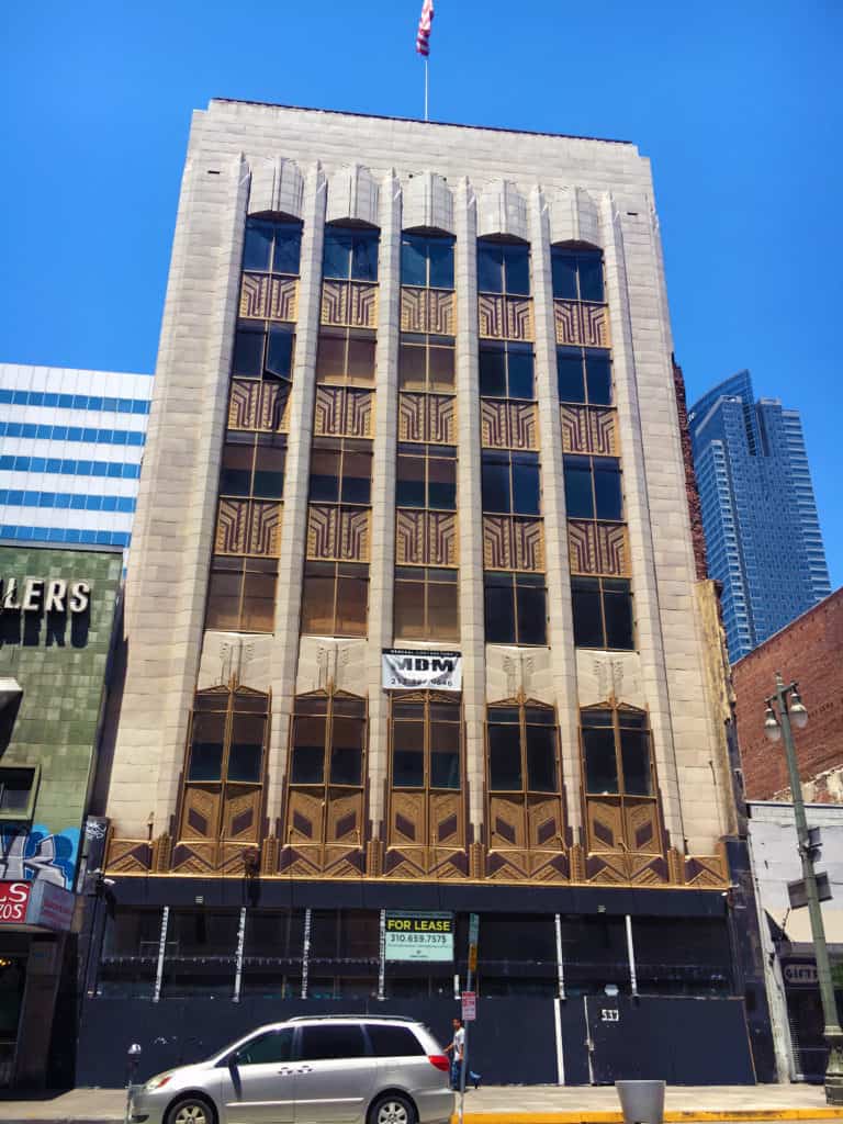
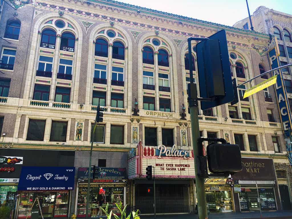
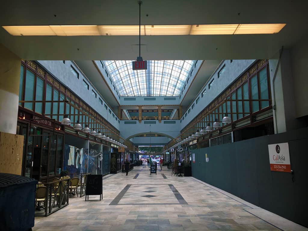
There were actually a LOT of people in Downtown L.A. on a sunny, warm Sunday afternoon, especially to the south in the Jewelry District. The street level of many buildings has been converted into small, retail units. However, it is haphazardly done for the most part. On one hand, it is good to see the people and retail units. On the other hand, it is such low rent quality that it deters from the innate advantages of the building space above. There are a lot of historic buildings in Downtown L.A. BEGGING for rehabilitation. A few renovations are progressing but not nearly enough. It is deeply frustrating. A lot of the new buildings are design disasters that most often successfully promulgate blank walls in downtown.

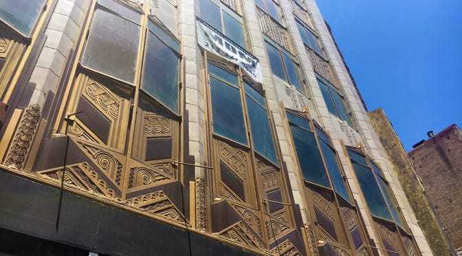
Pre-World War II building in the process of renovation (Photo: Mark David Major).
Conversion of ground level entry space into small, low quality retail units at the historic Palace Theater building in Downtown L.A. (Photo: Mark David Major).

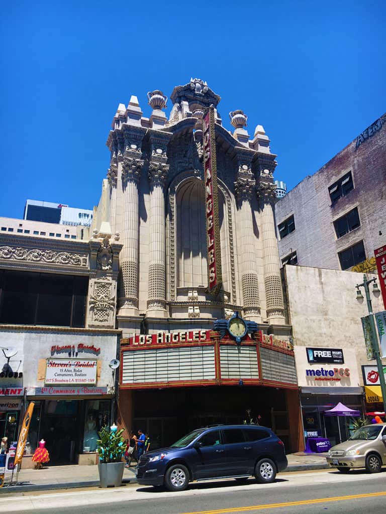
Given the history and money surrounding the film industry in Los Angeles, you would think residents and the city would take more care in rehabilitating the plenitude of old historic movie theaters but most often it appears to have been mindlessly done (e.g. Palace Theater above and Los Angeles Theater below) on a ‘cash in’ basis only.

Conversion of ground level entry space into small, low quality retail units at the historic Los Angeles Theater building in Downtown L.A. (Photo: Mark David Major).
Internal street arcade in the Jewelry District of Downtown L.A. (Photo: Mark David Major).

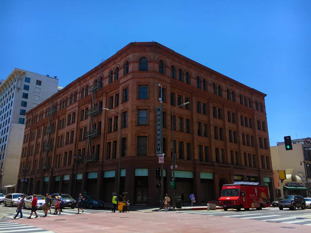
The gorgeous Bradbury Building (below) in Downtown L.A. was designed by Sumner Hunt and designated an architectural landmark in 1977. Its interior and rooftop were the settings for the climatic scenes of Ridley Scott’s science fiction classic Blade Runner (1982).

Bradbury Building designed by Sumner Hunt in Downtown L.A. (Photo: Mark David Major).

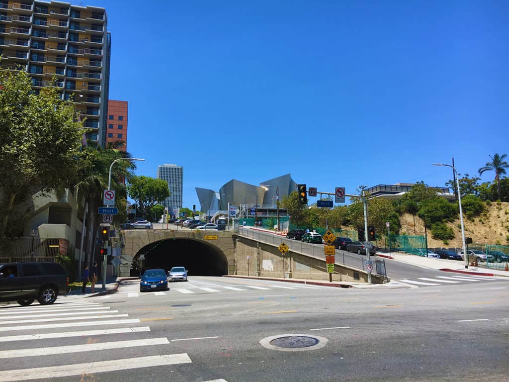
The government sector to the north in Downtown L.A. effectively demonstrates the danger of single-use districts. Whereas the Jewelry District was populated and lively on a Sunday afternoon, the government sector was deader than a graveyard, except for the cars racing through the area.

Distant view of the Disney Concert Hall designed by Frank Gehry in Downtown L.A. (Photo: Mark David Major).
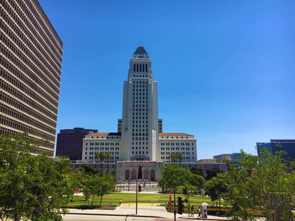
View of Los Angeles City Hall in Downtown L.A. (Photo: Mark David Major).

Los Angeles City Hall (above) was the exterior for the Daily Planet in the old Adventures of Superman series from the 1950s. The O.J. Simpson criminal trial occurred in the building to the left in 1994-95.

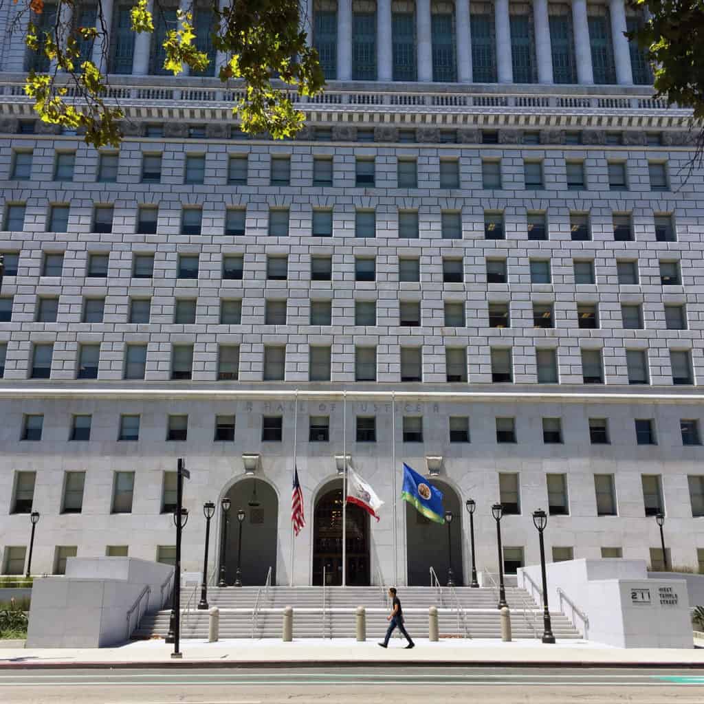
Hall of Justice in Downtown L.A. (Photo: Mark David Major).

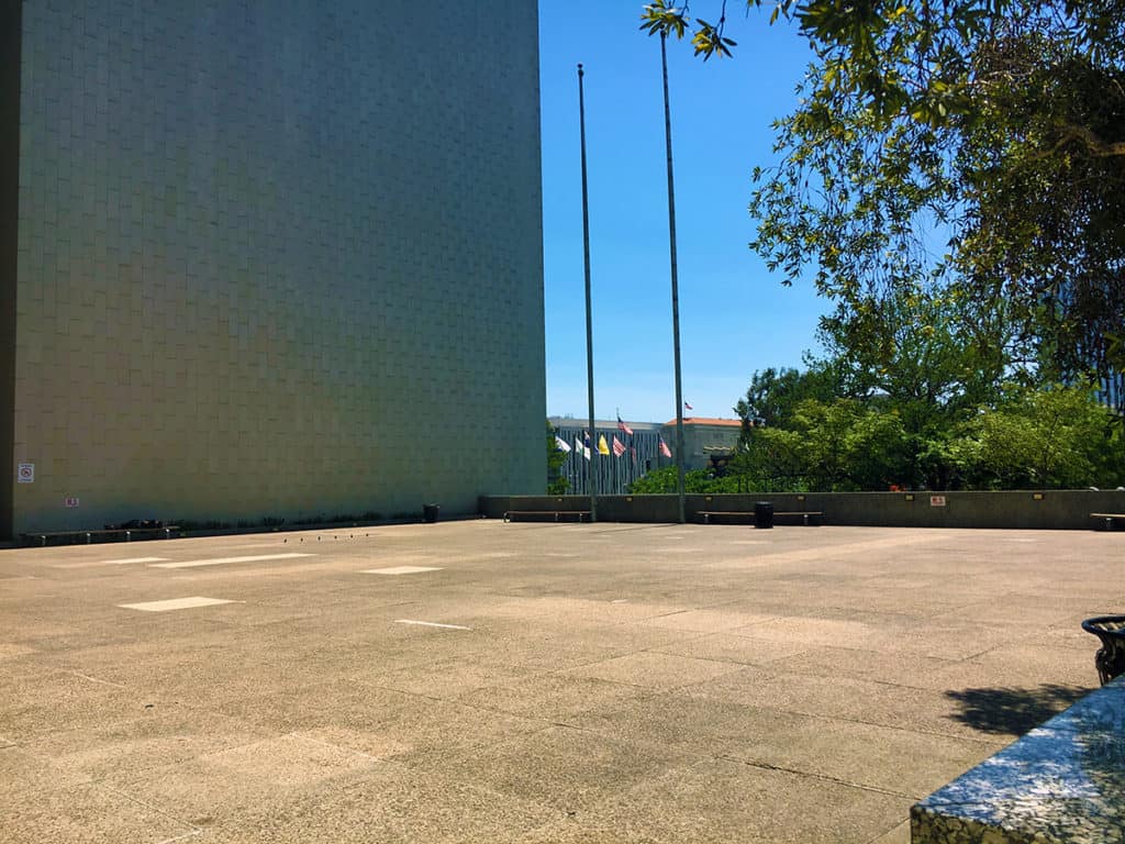
The Modernist building where the Los Angeles County Department of Regional Planning is housed in the government sector has a plaza attached to it, working hard at being as empty as the day it first opened, no doubt. The ironic symbolism seems appropriate.

Modernist plaza attached to the Administration building containing the Los Angeles County Department of Regional Planning in Downtown L.A. (Photo: Mark David Major).
Share the knowledge!
Share