Tag Archives: Money

Planning Naked | April 2017

Planning Naked | April 2017
Special Issue on Transportation
by Dr. Mark David Major, AICP, CNU-A

The previous issue of Planning Magazine (March 2017) gave me an excruciating, migraine headache and I definitely lost my temper while writing Planning Naked. I watched about one year’s worth of slow but steady progress in the editorial/word choices of the American Planning Association go out the window in a hysterical, reactionary response to the election of President Donald Trump; assuming these Planning Magazine articles are queued out a couple of months in advance. The fault is not Trump’s but the ‘establishment’ using any excuse (however, flimsy) to assert the dominant planning paradigm of the status quo for the last 70 years, which can be simply summarized as ‘Cars, Money, and Bureaucracy.’ I don’t have much hope for this April 2017 Special Issue on Transportation doing much to alleviate my professional concerns since the special issue on this very topic two years ago was an unmitigated disaster; especially the cover of vehicular road signs, which still irritates me. Let us see what this issue has in store for us…

A car is still a car. On the cover is the “front of a Waymo driverless car at a Google event last December in San Francisco (see pp. 5). So yeah, ‘transportation is cars’ is once again the front and center visual for APA’s Planning Magazine special issue on transportation. I can hear their objections to this observation, “But, but, but, but we have articles about bike-sharing and mention pedestrians and walking and rail and nature.” Yes, you do but the graphics and digging into the substance of the content only illustrates how APA ‘talks the talk’, ‘drives the drive’, and even ‘drives the talk’ but refuses to ever ‘walk the talk’ when the rubber meets the road. OK, there are a LOT of mixed metaphors about lip service in there but you know what I mean.

Ditch the word transportation. Maybe Planning Magazine could start with something simple like changing the title of this annual issue to “Special Issue on Mobility” or “…on Movement”? Just a thought…

Oh, chase the shiny object. “The Road Less Traveled” by James M. Drinan, JD (From the Desk of APA’s Executive Officer, pp. 7) sets the tone for APA as a professional organization chasing the ‘next shiny object’ that just so happens to pass across its field of vision. The advertisement photographs of planners playing in the exhibit’s area of national planning conference (prior on pp. 2-3) only reinforces the idea: Computers! Pinball machines! Free promotional pamphlets! Up, close, and personal with a drone! Virtual reality! Projector graphics and ice cream scoops?!? (Not sure about that last one) In any case, for this issue, it means new “disruptive transportation technologies” and “calls for infrastructure investment” (translation: there is “bipartisan support” to give us money), which can be linked to “economic development principles (jobs!).” Ahem, how about better understanding the road most travel by most people first? All of the evidence suggests APA is still clueless about that.

Cars, money, and bureaucracy. All-inclusive including the inside/outside of the front and back covers, this issue is 56 pages long. About 65% is really about cars, money, and protecting/promoting the bureaucracy/regulatory regime of planners. The issue pays lip service to other issues but…

Good News! You can be an Outlaw, too. The “New Hampshire Greenlights Granny Flats Statewide” article by Madeline Bodin (News Section, pp. 13) is great news! However, it is extremely disturbing that “the New Hampshire planning community was mixed on [the law].” Of course, the planners and municipalities initially opposing the law introduced a condition requiring that granny flats be ‘owner-occupied’, which is an insidious attempt to limit affordable, rental housing for lower income and young people. The Outlaw Urbanist would like to encourage all New Hampshire homeowners to violate this law immediately and continually since the ‘owner-occupied’ provision is essentially unenforceable. We are all outlaws now! “Lord I never drew first, But I drew first blood, I’m no one’s son, Call me young gun…”

So that happened… The “Zoning and ADA Compliance” article by Robin Paul Malloy (Legal Lessons on pp. 14) is an inoffensive reminder for people who might fall short in common sense, basic decency, and good manners.

I’ll pass, thanks. “Here Come the Robot Cars” by Tim Chapin, Lindsay Stevens, and Jeremy Crute (pp. 15-21). Full disclosure: I have known Lindsay Stevens since 2003. She is a friend. I have also met Tim Chapin, who invited me to guest lecture at Florida State University in Fall 2008. I don’t know Jeremy Crute. Out of respect for Lindsay, I am not going to comment on this article about autonomous vehicles (i.e. driverless vehicles) based on a study conducted on behalf of the Florida Department of Transportation.

I love the smell of sarcasm in the morning. Q&A section about “Disruption: Bike-Share” (pp. 24-25) in which Planning Magazine’s Editor-in-Chief, Meghan Stromberg interviews Jon Terbush of Zagster, a venture-funded startup company based in Cambridge, Massachusetts that designs, builds, and operates bike-sharing programs. I absolutely LOVE Terbush’s response to Stromberg’s question, “What are the minimum requirements for bike share?” Terbush responds, “Well, I’d still say the vision is the most important thing.” You can feel Terbush’s sarcasm dripping off the page after receiving such a backward ‘trapped-in-the-box’ type of question. Well done, Mr. Terbush. You smacked down APA and Planning Magazine even if they seemed blissfully unaware of it.

You can do those things that are ‘generic’ to all cities. The Q&A section “Disruption: Ride Share” (pp. 26-27) is a straightforward discussion about profiteering on the share services associated with the automobile… as if ‘unlicensed taxi services’ haven’t been around for decades (such as in London). That is essentially what companies such as Uber and Lyft are, i.e. they are circumventing government regulations (nay, restrictions) on labor in the same way zoning out granny flats restricts affordable housing and owners’ ability to profit on their property without the blessings of government. In any case, Andrew Salzberg’s closing comment is great advice, namely to “focus on things that are eternally true.” Well said, sir.

Oh, parking, you’re so fine, parking’s so fine, it blows my mind! Oh, parking! Ahem, four pages about parking with all sorts of buzzwords designed to promulgate the status quo. “Parking is an asset for cities,” “It plays a vital role (in making money, I translated the ‘code’ for you here but the “Driven by Technology” insert makes it clear),” it is “an important planning resource,” and so on and so forth. I was especially amazed to read how parking is “helping to reduce roadway congestion.” Along the way, the editors implicitly promote the decades-long myth of every Main Street shop owner, namely ‘Main Street would survive if we only had more parking.’ Planning Magazine does not say that, of course, but instead tells us people “will avoid public parking” if you charge too much for it. They do not mean people might walk or use a bike. The little 1” x 3.5” insert for The High Cost of Free Parking by Donald Shoup within the context of this article is quaint. See: equal time (<sarcasm).

Insidiously lies the crown. At first glance, “Connecting the Dots” by Greg Griffin (pp. 32-39) seems like it is promoting the bike share concept. However, by tying bike sharing to inequity issues it is actually undercutting it. This is ironic considering the equity and standard of living impacts of not owning a car are much, much worse and pervasive in American society. This article is insidious because the key underlying issue is American settlements have been building large rectangular blocks, expanded road widths, and consuming land for centuries, which the automobile has only accentuated over the last century or so. It is the spread-out physical nature of the American settlement itself, which generates many of these inequity issues. However, by ignoring the real issue (planning and land consumption), Planning Magazine can use the inequity issue to undercut the bike share concept. Not overtly, you understand, but by throwing up ‘cautionary’ impediments along the way in the regulatory regime.

See: APA mentioned rail. Planning Magazine pauses in “Rail Relationship” by Raymond Besho (pp. 40-42) to remind us that freight rail traffic is worth a lot of money, too. They then prescribe solutions to promote rail freight at the expense of livability for human beings in settlements; all in the name of “safety.” Trains killed 265 people in 2016 (Source: Federal Railroad Administration). Wow, it is an epidemic! Automobiles kill more than 30,000 people each year. Perspective, people.

In closing. I want to close out this version of Planning Naked by repeating the opening line of the “Cultivating Stronger Connections with the Natural World” article by Timothy Beatley (pp. 49-50):

“Too often nature seems abstract and far away, difficult to know and touch in any visceral way.”

I would like you to think about that statement. I mean, I want you to think really hard about the opening line of this article in a national magazine of a national organization dedicated to the ‘art and science of designing cities.’ I hope you do not laugh too hard when you realize the statement is patently absurd.

At least, this time I kept my temper and I did not get a headache. This represents progress of a certain kind, I suppose.

Planning Naked is an article with observations and comments about a recent issue of Planning: The Magazine of the American Planning Association.

Share the knowledge!
Share

PHOTO ESSAY | Oddballs and Curiosities in Los Angeles

There are few cities in the world more perplexing than Los Angeles. The reasons are many. The Outlaw Urbanist will take a closer look at some of the reasons in a multi-part, photo essay series. Today, we look at oddballs and curiosities in Los Angeles. If you dare to walk in Los Angeles (let’s face it: if you dare, you will have to walk a lot as the price paid), you never know what you might find in the City of Angels.

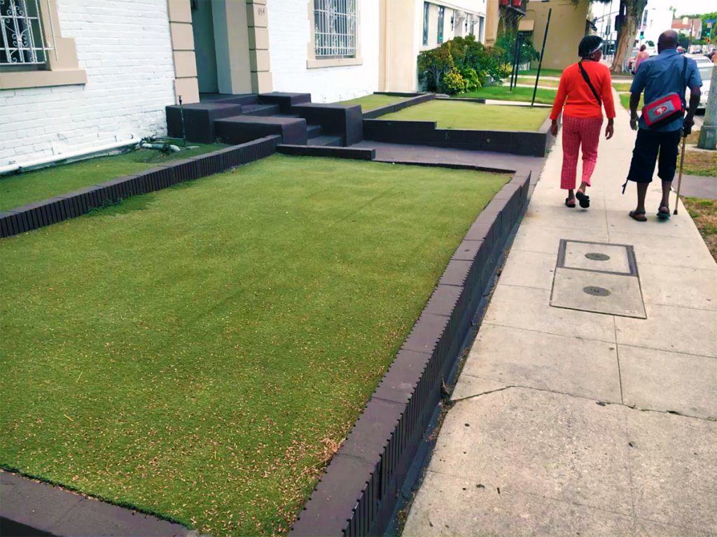
Los Angeles has been in the midst of a drought for nearly five years now. The evidence of ‘brown lawns’ is everywhere as well as a few, industrious solutions such as in front of this apartment building where AstroTurf serves as a grass substitute.

IMG_2866
‘Forever green’ AstroTurf law in front of a Los Angeles apartment building (Photo: Mark David Major).

By all appearances, this ‘rock garden’ in front of a Wells Fargo building on Wilshire Boulevard is not in response to the long-term California drought but represents a purposeful landscape design choice. To say it is ugly is an understatement. You can also physically feel the temperature increase in proximity to this rock garden (which is much bigger than shown here). It should be filed under “What Were You Thinking?”

IMG_2919
Rock garden (courtesy of Home Depot?) in front of a Wells Fargo building on Wilshire Boulevard, Los Angeles (Photo: Mark David Major).

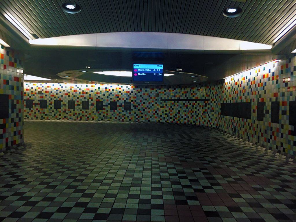
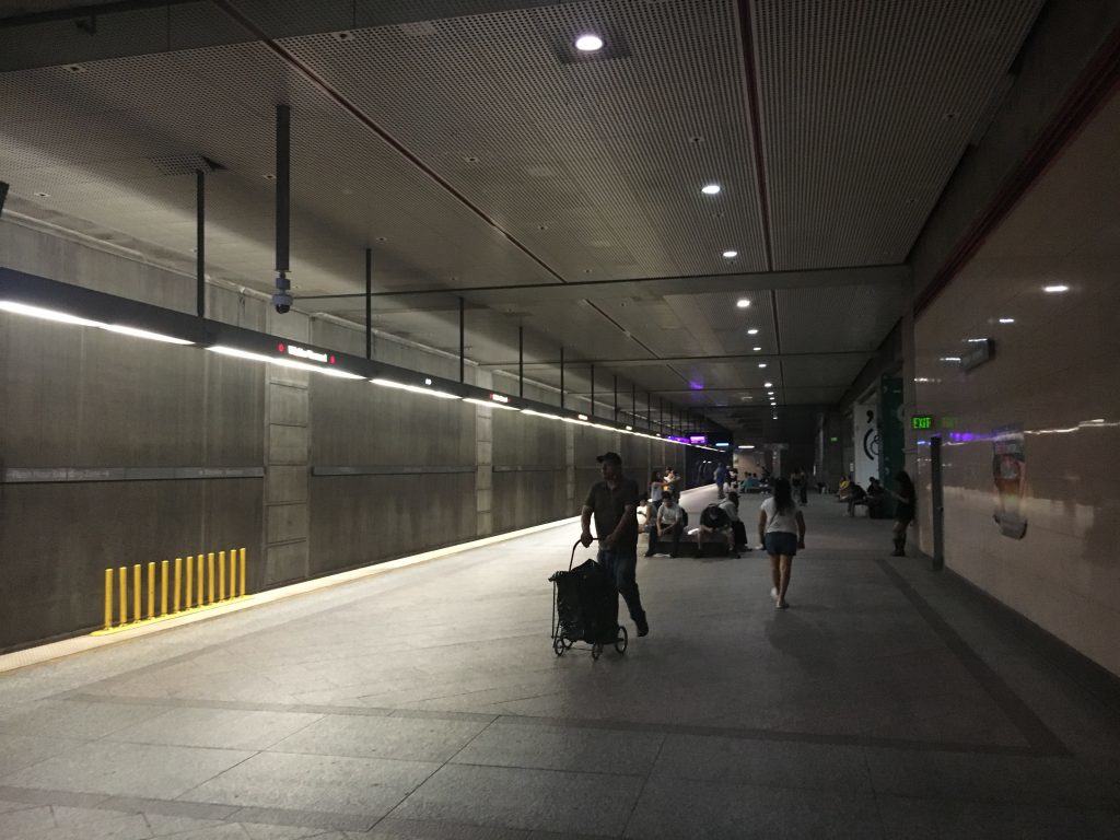
For the most part, the Los Angeles Metro is impressive and growing. This seems to include putting in the hard work of stations in the right locations as opposed to only conveniently available ones. However, there were a few, odd things about the L.A. Metro. The stations I used did not have above-ground buildings but rather large stairways/escalators opening up to street level with associated signage. This makes the station entrances difficult to see from a distance, for example compared to the distinctive, red tile buildings of the traditional London Underground stations or the most flamboyant designs of its newer stations. The lighting in these underground stations is incredibly subdued. The purpose of the ‘romantic lighting’ is unclear since it tends to render a somewhat unsafe feeling to these underground spaces  (even though the stations seemed perfectly safe). I noticed the same subdued lighting at some downtown underground stations on the St. Louis MetroLink. The brighter lighting in stations on the London Underground is preferable in my opinion.

IMG_3056
East Hollywood Metro station in Los Angeles (Photo: Mark David Major).

The other noticeable thing about these L.A. Metro stations is the manifest lack of advertising on the walls. There are gobs and gobs of wall space, which are left completely unused. It is unclear why the L.A. Metro would forego the additional revenue stream of advertising in their stations to help offset the operating costs, especially if they control where and how that advertising is located. It is a bizarre choice, especially in a city where the film industry thrives (e.g. movie posters). London Underground generates significant revenue from advertising in their stations, on platforms and along escalators. Why leave all of that money on the table in L.A.? It doesn’t make any sense to me.

IMG_3025
Wilshre Boulevard Metro station in Los Angeles (Photo: Mark David Major).

Nothing destroys the street frontage quicker than a continuous row of garage doors such as this recently constructed apartment/condominium building in Mid Wilshire. Ahem.

IMG_3024
A row of garage doors for a newer apartment building in Mid Wilshire, Los Angeles (Photo: Mark David Major).

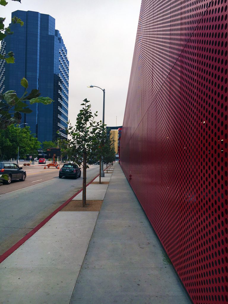
Or the continuous blank wall of a massive parking garage such as this one behind the Petersen Automotive Museum along South Fairfax Avenue. The pitiful – almost apologetic – street trees do very little to mediate for this massive blank wall. Walking around L.A., I reached the point where I swore “if I see one more insensitively designed parking garage, I’m going to scream.” I was screaming a lot after that ill-advised vow.

IMG_2910
The blank wall along South Fairfax Avenue is a massive parking garage behind the Petersen Automotive Museum on Wilshire Boulevard in Los Angeles (Photo: Mark David Major).

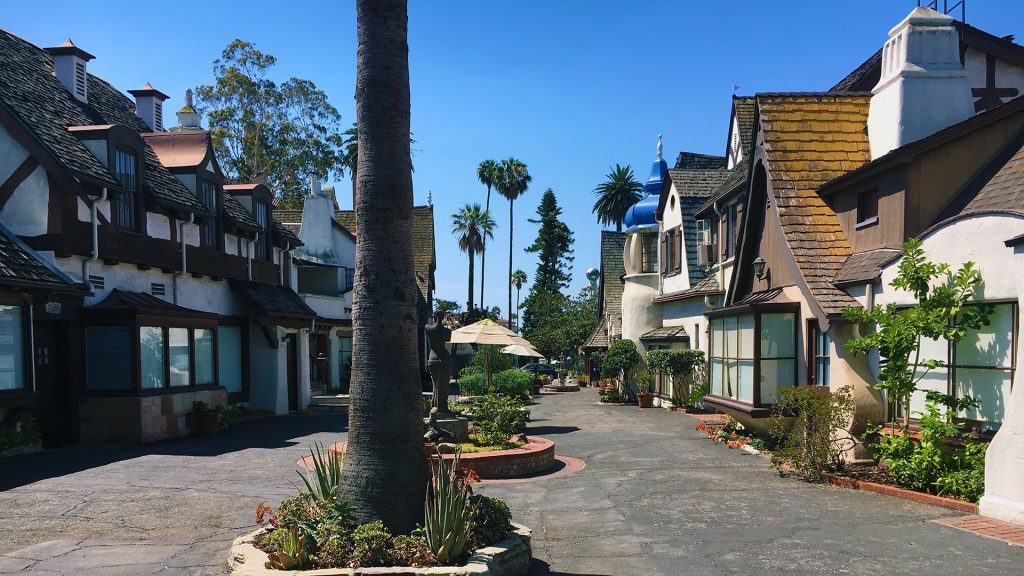
There are some interesting (current and past) rehabilitation projects in Los Angeles. For example, this conversion of what appears to be an extremely old motor inn (or perhaps hotel bungalows) into an apartment/condominium complex one block south of Hollywood Boulevard in Hollywood.

IMG_3036
Apartment/condominium complex one block south of Hollywood Boulevard in Hollywood, Los Angeles (Photo: Mark David Major).

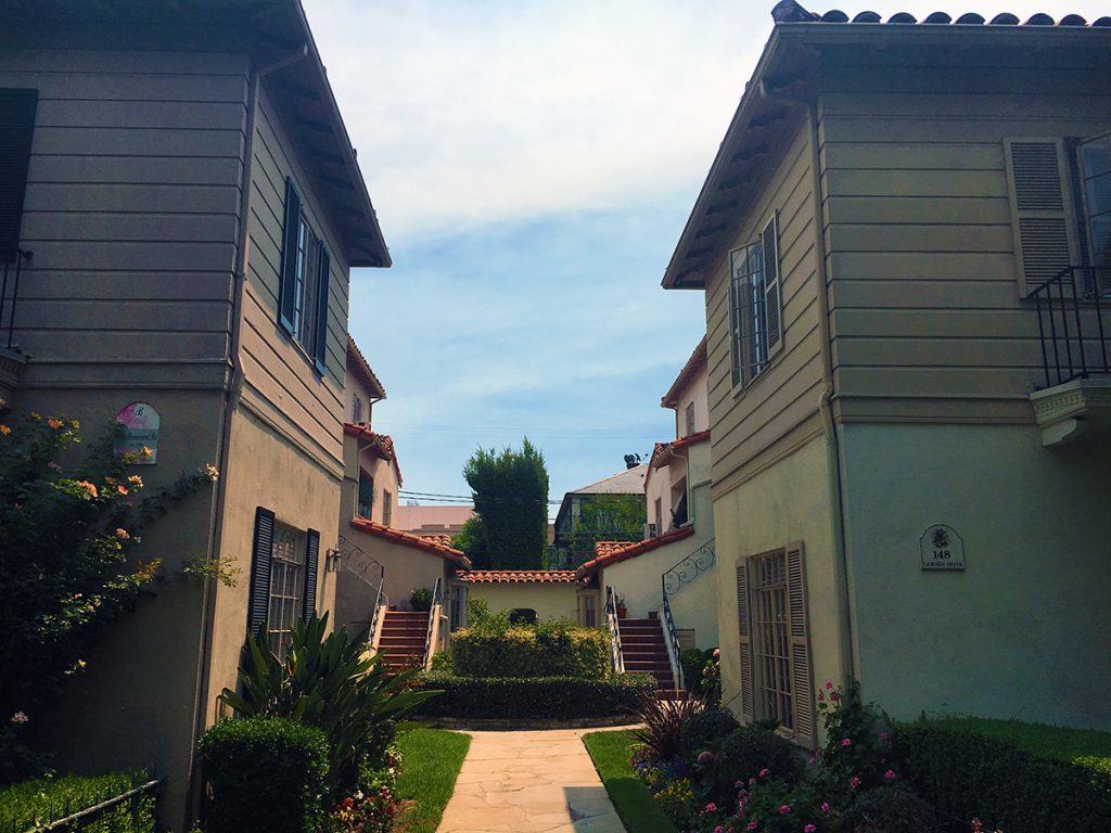
This adaptive re-use serves as quite a contrast to the standard, courtyard apartment building typology found in many neighborhoods of Los Angeles such as this one in La Brea.

IMG_2947
Typical courtyard apartment building in La Brea, Los Angeles (Photo: Mark David Major).

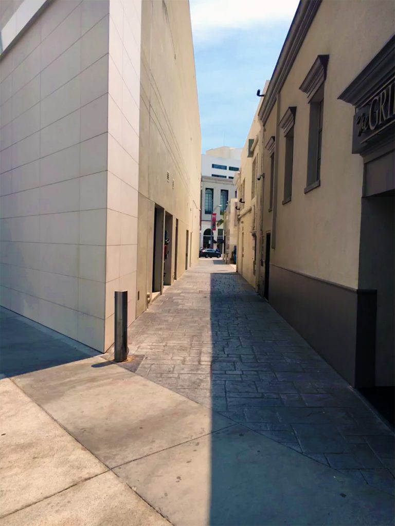
The coolest alley in Beverly Hills (yes, they have alleys in Beverly Hills, quite a lot of them) is located between Dayton Place and Rodeo Drive (at the far end of this photograph). This alley is called Fred Hayman Place. Fred Hayman was known as the ‘Godfather of Rodeo Drive.’ To the right, is The Grill on the Alley restaurant.

IMG_2951
Fred Hayman Place alley between Dayton Place and Rodeo Drive (Photo: Mark David Major).

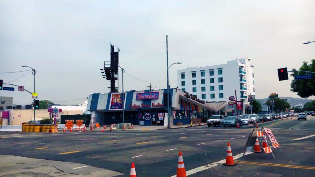
One of the most charming buildings along Wilshire Boulevard is Bernie’s Coffee Shop (formerly Johnie’s Coffee Shop) at the northwest corner of South Fairfax Avenue. It is more interesting than the Peterson Automotive Museum sitting on the opposite corner. Wikipedia even attributes a style to this type of building called Googie architecture, described as a form of modern architecture, which is a subcategory of futurist architecture influenced by car culture, jets, the Space Age, and the Atomic Age (Source: Wikipedia). Personally, I’ve never heard of this architectural style. It only looks like an old Denny’s Restaurant. In any case, it is listed as a Los Angeles Historic-Cultural Monument. The building has appeared in several movies including Volcano, The Big Lebowski, Reservoir Dogs, American History X and Gone in 60 Seconds. You might be able to tell from this photo the owners of Bernie’s Coffee Shop were ‘feeling the bern’ for Democrat Bernie Sanders at the time.

IMG_2909
Bernie’s Coffee Shop (formerly Johnie’s Coffee Shop) at the northwest corner of South Fairfax Avenue and Wilshire Boulevard in Los Angeles (Photo: Mark David Major).

We conclude today’s essay with a great find, a discovery made only possible by doing the unthinkable: walking a lot. The largest section of the Berlin Wall outside of Germany is located in Los Angeles in front of the Sprüth Magers Art Gallery on Wilshire Boulevard. You would think its proximity across the street from the heavily-visited Los Angeles County Museum of Art would mean this section of the Berlin Wall was easily-found and visited a lot. However, it was deserted most of the day. Most everyone ignored the history located a short walk just across the street from them.

IMG_2898


Share the knowledge!
Share

Planning Naked | June 2016

Planning Naked | June 2016
by Dr. Mark David Major, AICP, CNU-A, The Outlaw Urbanist contributor

Your (hopefully) hilarious guide to everything about the latest issue of APA’s Planning Magazine.


The Rise of the Aqua Planner. “Water Everywhere” in From the Desk of APA’s Executive Director section by James M. Drinan (pp. 3) discusses the intense focus on water issues during sessions of the recent APA National Conference. While the subject of water management and resources is, of course, important, especially in light of rapid urbanization and population growth around the world, I can’t figure out if the APA was being intentionally ironic, cleverly subversive, or just plain clueless by setting this conversation in Phoenix, Arizona. A city on the edge of an arid desert that gets a lot of its water from the Colorado River and probably should not exist at all based the precepts of generic function. It suspiciously sounds like APA is more interested in creating another specialized planning silo – the Aqua Planner.

June. 2016. A date. Which will live. In infamy. APA is finally forced to publish the obituary of Robert Moses’ ideas in “Farewell, Robert Moses Parkway North” by Tara Nurin (pp. 6). More like ‘good riddance’ since the real infamy is it took a quarter of a century for this project to get off the ground.

The Advance of Shared Space. “Chicago Neighborhood Puts Pedestrians First” by Allen Zeyher (pp. 7) details the shared space conversion of a three-block stretch of Argyle Street in Chicago. Pedestrians First? Isn’t that slogan some sort of right-wing synthesis of vehophobia (“fear of driving”) and xenophobia (“fear of outsiders”)? Brad McCauley at Site Design Group, Ltd. offers the absolutely priceless quote of the article: “in pedestrian-heavy corridors, it’s a no-brainer to reclaim space that was formerly given over to cars,” which implicitly confirms our suspicion that the overwhelming majority of urban planners do not possess a brain. Perhaps a trip to Emerald City to see the Wizard is in order?

States lead. Federal hampers. Oh wait, State hampers, too. At first glance, there is more evidence in the News Brief section (pp. 7) that there isn’t any problem the Federal government won’t try to regulate its way out of (e.g. more EPA requirements) whereas it is the States that are really leading (e.g. Colorado Supreme Courts overturns local fracking ban)… except for the last news item about the Texas Department of Transportation adding ‘informal’ lanes by using inside shoulders during rush hour for motorists to double average speeds and produce “smooth sailing.” That’s called medicating the symptoms, not curing the disease. At least, TexDOT have their ‘evidence’ for another costly lane widening project. Let’s be honest, motorists were probably already using the inside shoulders and TexDOT merely acknowledged the fait accompli.

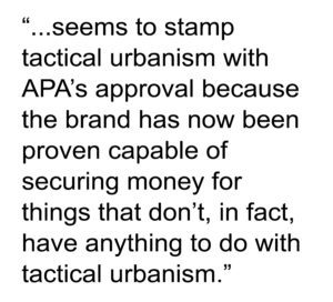
Speaking of fait accompli. “Tactical Urbanism Goes Mainstream” by Jake Blumgart in the News and Legal Lessons section (pp. 8) seems to stamp tactical urbanism with APA’s approval because the brand has now been proven capable of securing money for things that don’t, in fact, have anything to do with tactical urbanism. The Philadelphia example cited in the article is for pool amenity improvements, not tactical urbanism. The $184,080 granted in Detroit isn’t for tactical urbanism, it’s nominally ‘planning for tactical urbanism’ but the first project discussed is – yes, you guessed it – pool amenity improvements. It’s disturbing how concepts get twisted to mean almost anything you want when the money gets involved in the United States.

Real Reporting. In “Scalia’s Land-Use Legacy,” William Fulton briefly reviews the legacy of the recently deceased Supreme Court justice Antonin Scalia on land use law for the Legal Lessons section (pp. 9). It is a well-written, objective piece about, primarily, the Nollan and Lucas decisions. Fulton discusses their legal importance and Scalia’s intellectual role in crafting the majority decisions. The article is informative while blessedly free of ‘hidden’ agendas or positions. Ah, real reporting!

Tsk-tsk. Aaaaaarrrrrrrggggggghhhhhh. “Mixed Income, Mixed Results” by Craig Guillot (pp. 10-17) discusses the combination, for good or ill, of market rate and targeted affordable housing in developments. Housing policies in the United States from the Federal level to State and local government has been completely ass-backwards ever since the 1949 Housing Act and APA has been – and continues to be – complicit in perpetuating this ass-backwardness. All of the evidence you need is this quote, “Brennan says funding has been a barrier,” which again boils everything down to ‘give us more money.’ Giullot’s article therefore ably covers all of the problems this ass-backwards approach entails and reaps without ever addressing the core problem that everyone is basically talking out of their ass when it comes to housing. The short answer is found in the scale of developments, build-out times, land appreciation, and recognizing that a city does not ever, ever, ever remain statically frozen in time or character. The purposeful convolution of this issue is frustrating beyond belief and a direct consequence of early 20th century Euclidean zoning and suburban land tenure theories. But, by all means, continue to fiddle with market and affordable housing percentages and waste the next 50 years as well.

Here’s Your Consolidation Prize. “Separated City” by Lee R. Epstein (pp. 18-23) about Capetown in South Africa is actually a really interesting, informative article. Epstein seems to skip over the fact (or maybe, I missed it) that cities like Capetown actually represent traditional urban patterns in most of the world where lower income people live at the edges (e.g. suburbs) and higher income people live in the center. In contrast, the American urban model became inverted due to suburbanization during the post-war period. However, what’s really suspicious is how this story on Capetown immediately follows Guillot’s article about mixed income neighborhood planning efforts in US cities. Am I being paranoid that this article represents a consolidation prize to make American urban planners feel better about themselves (“See, it could be worse. Just look at Capetown, South Africa”)? Maybe, maybe not.

My God! Real Science in Planning Magazine! The use of biometrics to track human eye movement in the built environment is not new (perhaps it’s new to the APA and/or Americans). It’s been around for a while now – being worked on at University College London using virtual reality 20 years ago – in one form or another. It’s a fascinating area of research about the built environment but we need to be careful to fully appreciate the implications and not assume it’s an issue of quantity [“No wonder visitors from around the world like walking through Venice or Copenhagen — there’s so much (our emphasis) there to stimulate our sensory system, no matter one’s native language, culture, or personal history”]. There is a LOT of meat in this subject, too much to go into here but you can look at some of the work of Dr. Ruth Conroy Dalton at the Northumbria University and Dr. Beatrix Emo, Cahir of Cognitive Science at ETH Zurich. The key takeaway from the article for architects and planners right now is this quote: “I realized how people are really attracted to people.”

My God! Housing Sanity in Planning Magazine! Finally, someone articulates a reasonable perspective about the issues of housing in the Viewpoint section, “The New Home Ownership Reality” by Professor Anthony Nelson (pp. 48) of the University of Arizona. Professor Nelson does not implicitly tackle the house size part of the equation (e.g. tiny houses/small house movement) but any discussion about affordability has to begin with rental housing and ownership of affordably sized homes. Professor Nelson’s Viewpoint article is a good place to start.

Planning Naked is an article with observations and comments about a recent issue of Planning: The Magazine of the American Planning Association.

Share the knowledge!
Share

NOW AVAILABLE | Housing and Modern Corporatism

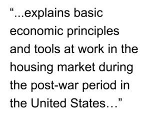
Housing and Modern Corporatism: Inside the Doomsday Machine explains basic economic principles and tools at work in the housing market during the post-war period in the United States with an emphasis on the cumulative origins and causes of the 2008 financial crisis. The course covers the role of: purposefully opaque, financial instruments; mistakes in political and regulatory policy; naked, greedy (even fraudulent and/or corrupt) self-interest in the marketplace; and the unspoken, self-deluding assumptions underlying the housing and real estate market, which collectively sparked the Great Recession from 2008 until ‘to be determined’. The course is tailored for architecture, urban design and planning professionals, students, and others engaged in creating built environments to better understand the impact of these often unseen, poorly understood forces at work on their livelihood and the future of our cities (2.0 hour course).
Key concepts: capitalization, credit, money, housing, mortgage bonds, reserve currency, securitization, value.

Instructor: Dr. Mark David Major, AICP, CNU-A

Check here to purchase this course ($14.99), which includes an one-hour video presentation and PDFs of the course supplementary materials and slide handout.

Note: We are beta-testing with these initial course offerings so if you have any issues accessing the course material, please do not hesitate to contact us at [email protected]. Thank you!

Share the knowledge!
Share

NOW AVAILABLE | The Hidden Corruption of Regular Grids

The Hidden Corruption of Regular Grids discusses the remarkable progress space syntax has made in research and practice around the world over the last 40 years. However, this is not the case in the United States. Space syntax remains on the fringes of American planning and development. This is odd since there seems to be several inherent advantages for widespread application of space syntax in an American context, i.e. ongoing large-scale urban growth, an established research program at one of the country’s leading universities, and seemingly ‘natural’ allies in professional practice. The course covers the financial, institutional, and legal hurdles/pitfalls confronting space syntax in the American market, especially in the private sector. Using a series of ‘back-of-the-napkin’ financial calculations common to the American development process, the course demonstrates how these challenges can transform into a distinct advantage for advocating the cause of the space syntax in the United States. The course concludes by discussing the enormous challenges and opportunities for space syntax in America today (1.0 hour course).

Key concepts: finances, land use law, professional practice, planning, development, and space syntax.

Instructor: Dr. Mark David Major, AICP, CNU-A

Click here to purchase this course ($9.99), which includes an one-hour video presentation and PDFs of the published article and slide handout.

NOTE: This course is geared towards the space syntax community and people interested in its application in the United States. However, there is actually very little space syntax in the course since it primarily discusses the legal and financial hurdles in the American real estate development process for space syntax and similar scientific approaches. Even if you are not familiar with space syntax, then the subject matter should not be considered a deterrent.

Note: We are beta-testing with these initial course offerings so if you have any issues accessing the course material, please do not hesitate to contact us at [email protected]. Thank you!

Share the knowledge!
Share