On Space | The Geometrical City
by Dr. Mark David Major, AICP, CNU-A
The geometrical city exists in and across time and space, a quantitative and describable pattern finitely persistent in its stability and infinitely malleable in its qualitative flexibility. The spatial geometry of the city flows, never halting and without beginning, it merges together into an intricate network of limitless possibilities and strategic offerings that guide the weary traveler to his destination. It is a tradition rooted in the instinctive nature of our being, stretching back into shadowy mists of the past and striding forward into the enchanted light of a promised future, bounded by the essential truth of living on a tiny sphere floating, awashed at the edges of a universal shore. The geometric city is the hearth of the community, the fertile land gathers around it, providing both sustenance to and sustaining from the urban ideal. At its center lies a sacred space, a place to gather for all, where insider and outsider mingle and exchange freely of their valued time and goods. This is the true Pilgrims’ pride of America, that which can be independently traced to worlds and cultures of Antiquity from east to west, south to north, following the path we emerged from African jungles to cross plains and rivers, the mountains and oceans. The geometrical city is the economy of the community, goods and services are exchanged in space and carried forth into the larger, unfamiliar world.  It welcomes and reassures, it is questions with answers, offering solvable riddles to the observant and the observed.
19th century America represents the urban fruition of a geometrical order, a full expression of the possibilities for street, block, square, and plan in the geometrical city. In the virgin land of this milieu, the geometrical city attains its Renaissance ideal, ultimately a Spanish model of the rational city, relentless in its magnificence as a tapestry, woven by individual hands into a common entity, holistic and worthy of an ancestral past from which it sprouted. Until, at last, radial parts emerge from within or reach forth from center-to-edge to bring a structural wonder to the urban spectacle. The formal and informal, planned and unplanned, coincide in the spatial beauty of the rationally urbane, all shaped within a Jeffersonian framework leaving marks on the landscape to this day. 20th century America demands the ruination of the geometric city in its heedless pursuit of state control and private profit; the faceless bureaucrat and masked capitalist hidden beneath self-serving rubrics, all in the name of an artificial (public and personal) welfare, which taunts the instinctive nature of urban dwelling. Stability is exchanged for unpredictability, the malleable for the rigid, the persistent for the ephemeral, and a natural pattern for the awkwardly contrived forever haunted by an unnatural entropy. It is a doctrine that demands more and more at the expense of less and less (quantity and cost) whilst ignoring the concept of the better and the best (quality). It becomes an irrational anti-city.
On Space is a regular series of philosophical posts from The Outlaw Urbanist. These short articles (usually about 500 words) are in draft form so ideas, suggestions, thoughts and constructive criticism are welcome.

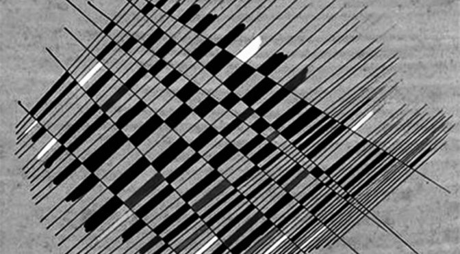


 The clay colored background gives a clearer sense of how the shapes seem to form a city skyline of intense color and light. Klee uses pops of yellow to bring the eye in and break up the browns everywhere else. This oil on canvas painting has a complex array of triangular figures to provide an imaginary metropolis of shapes. The touch of realism, angles, and its use of color creates a city of geometric shapes. Paul Klee’s imaginary works continue to inspire and intrigue (Source: Totally History). Klee’s Castle and Sun, in particular, is regularly used by teachers for early education in artistic technique. At that age, school children (and perhaps their teachers) are unaware of the subtly complicated and innovative beauty of this painting by Klee.
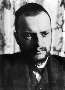 About Paul Klee
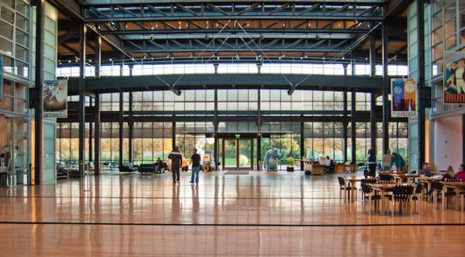

 “Steve had the firm belief that the right kind of building can do great things for a culture,” said Pixar’s president Ed Catmull… (John) Lasseter had originally wanted a traditional Hollywood studio, with separate buildings for various projects and bungalows for development teams. But the Disney folks said they didn’t like their new campus because the teams felt isolated, and Jobs agreed. In fact he decided they should go to the other extreme: one huge building around a central atrium designed to encourage random encounters. Despite being a denizen of the digital world, or maybe because he knew all too well its isolating potential, Jobs was a strong believer in face-to-face meetings.
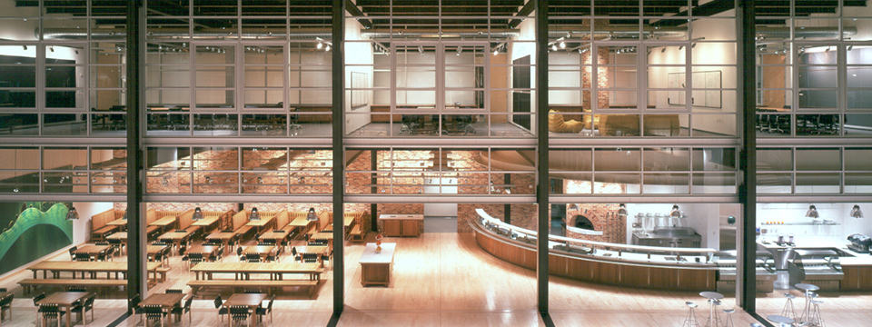 “There’s a temptation in our networked age to think that ideas can be developed by email and iChat,” he said. “That’s crazy. Creativity comes from spontaneous meetings, from random discussions. You run into someone, you ask what they’re doing, you say ‘Wow.” and soon you’re cooking up all sorts of ideas.” So he had the Pixar building designed to promote encounters and unplanned collaborations. “If a building doesn’t encourage that, you’ll lose a lot of innovation and the magic that’s sparked by serendipity,” he said. “So we designed the building to make people get out of their offices and mingle in the central atrium with people they might not otherwise see…” “Steve’s theory worked from day one,” Lasseter recalled. “I kept running into people I hadn’t seen in months. I’ve never seen a building that promoted collaboration and creativity as well as this one.”
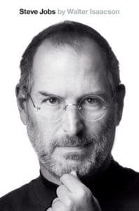
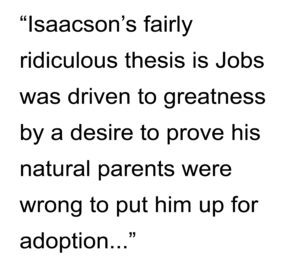 There are many useful, some wonderful insights (usually originating from Jobs himself) contained within, so it is well worth your time to read. In the end, what shines through in the book, despite its problems, is the genius and greatness of Steve Jobs.
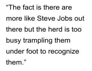 Was Steve Jobs perfect? No, he was human. Personally, I never asked for Apple products to be perfect. I only asked that Apple products be the best in the world and, usually, they were. I never asked Steve Jobs to be anything than what he was: a brilliant businessman, an insight artist, and a (sometimes) source and (often) shepherd of technological innovation. In the end, what was remarkable about Steve Jobs was not that he changed the world but he changed the world in the face of the ‘conventional wisdom’, which is often polite code for the stupidity of the consensus. Frankly, I prefer to live in Jobs’ reality. Along the way, he lived a remarkable life. Surely, that is enough. The world seems smaller without Steve Jobs in it. We have Jobs’ Apple to thank for it but it is also a testament to the legacy of Steve Jobs. He will be missed.