Urban Patterns | Chicago, Illinois USA

“Come on, babe, Why don’t we paint the town? And all that jazz.
I’m gonna rouge my knees, And roll my stockings down,
And all that jazz.
Start the car, I know a whoopee spot, Where the gin is cold,
But the piano’s hot! It’s just a noisy hall, Where there’s a nightly brawl,
And all that jazz.”

— Bob Fosse’s Chicago: The Musical

Urban Patterns | Chicago, Illinois USA
by Dr. Mark David Major, AICP, CNU-A

Chicago is the third-most populous city in the United States with over 2.7 million residents. It is also the most populous city in both the state of Illinois and the Midwestern United States. It is the county seat of Cook County. The Chicago metropolitan area often referred to as “Chicagoland” has nearly 10 million people. It is the third-largest metropolis in the United States (after New York and Los Angeles). In terms of wealth and economy, Chicago is considered one of the most important business centers in the world. The town of Chicago was organized in 1833 with a population of about 200 people near a portage between the Great Lakes and the Mississippi River watershed. Within seven years it grew to more than 4,000 people. In mid-1835, the first public land sales began. The City of Chicago was incorporated in 1837. For several decades, Chicago was the fastest growing city in the world. Chicago was one of the five largest cities in the world by 1900. Before the growth of new Chinese cities during the early 21st century, the urban growth of Chicago during the 19th century was largely unprecedented in human history (Source: Wikipedia and The Syntax of City Space: American Urban Grids).
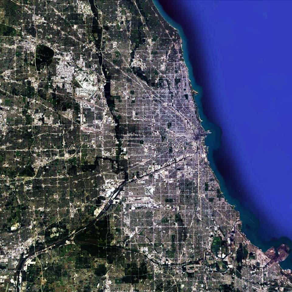
Satellite view, 90km, Metropolitan Chicago, Illinois, USA, Google Earth
Satellite view from 90km of Metropolitan Chicago, Illinois in the USA (Source: Google Earth).

Chicago has the most pervasively-realized regular grid in the world. In fact, the scale of the regular grid in Chicago is so massive that it is almost impossible to truly appreciate its scale. From one extreme to the other, it is probably the size of southeast England or twice the size of the European country of Luxembourg. However, it is only by examining the Chicago urban pattern at this scale that we can truly appreciate that there is a distinctive center-to-edge logic to the metropolitan region; most notably along the alignment of the Chicago River/Stevenson Expressway from the Loop in a southwest direction out of the area. This center-to-edge logic is replicated at the large-scale in the northern metropolitan region as well along the alignment of old Indian trails, which were incorporated into the urban fabric as paved roads; most notably a series of diagonal streets associated with the Northwest Highway out of town towards the state of Wisconsin.
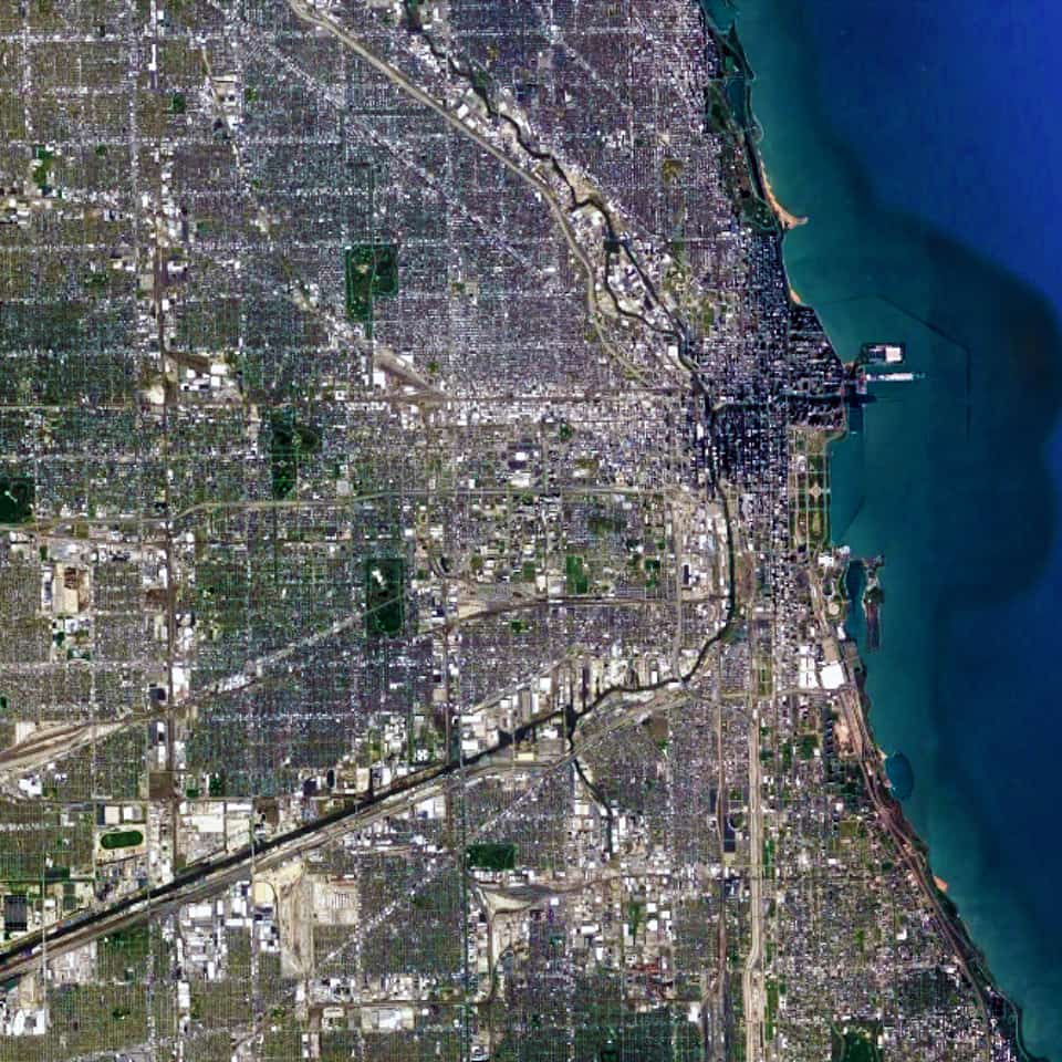
Satellite view, 25 km, Chicago, Illinois, USA, Google Earth
Satellite view from 25 km of Chicago, Illinois in the USA (Source: Google Earth).

When we zoom in on the Chicago urban pattern, the crucial role of the Chicago River as a water-based transportation artery in the city becomes much more obvious. So does the multitude of skyscrapers in the central business district of the Loop (north and west of Grant Park at the shoreline of Lake Michigan). We can also see the large building footprints of Industrial land uses gathered around the entire length of the Chicago River from the southeast into the center of the city and then northward. All of these topographical, geographical, and infrastructure components are woven together within the ‘relentless’ regular gridiron layout, which serves to privilege downtown Chicago (and, in particular, The Loop) within the larger urban pattern of metropolitan Chicago. This barely begins to scratch the surface of why the Chicago grid plays such a significant role in its magnificence as one of the world’s greatest urban patterns.

Urban Patterns is a series of posts from The Outlaw Urbanist presenting interesting examples of terrestrial patterns shaped by human intervention in the urban landscape over time.

Share the knowledge!
Share

MORESO | Generational Shame in David Lynch’s Twin Peaks

MORESO | Generational Shame in David Lynch’s Twin Peaks
by Dr. Mark David Major, AICP, CNU-A

Most reviewers and fans are heralding “Gotta Light?”, episode eight of Mark Frost/David Lynch’s Twin Peaks: The Return (or Season 3 for us nerds) on Showtime, as the most ambitious and weirdest WTF hour in television history; rightly so. As with all things David Lynch, “Gotta Light?” has invited widespread theorizing on the Internet about what all of the symbolism might mean. However, everyone so far seems to miss a potent, alternative interpretation about what Twin Peaks has really been about all along; namely, Lynch’s generational shame as a Baby Boomer. Think about it.

WARNING, SOME SPOILERS AHEAD IF YOU HAVE NOT SEEN EPISODE EIGHT, “GOTTA LIGHT?”

atom bomb, explosion, New Mexico, Twin Peaks, CGIPeople point out the similarities between the more abstract, middle section of “Gotta Light?” – when Lynch takes us into the heart of a mushroom cloud at the 1945 climax of the Manhattan Project, which the episode title and request of the Woodsman to strangers repeatedly evoke – to the closing ten minutes of Stanley Kubrick’s 2001: A Space Odyssey. They point the obvious anti-thesis between Arthur C. Clarke/Kubrick’s optimistic vision (“My God, it’s full of stars.”) versus Lynch’s more pessimistic one (‘My God, it’s full of blood’ literally and metaphorically). According to Lynch’s vision, evil in the form of the spirit “Bob” was born in 1945 with the first atomic detonation. Of course, Lynch implies such a thing while adopting the quintessential Baby Boomer attitude, i.e. nothing important happen before 1945, it is all about ‘me’ (us), and so forth. Such is the nature of Baby Boomers.

Laura Palmer, Twin PeaksHowever, this symbolism also offers a clue for viewers to understand that Twin Peaks might have always been about Lynch’s Baby Boomer shame.

Really, the cultural phenomenon of Twin Peaks is due to one thing: Laura Palmer (Sheryl Lee); specifically, the haunting image in the opening scenes of the first episode, e.g. a dead, beautiful young girl wrapped in plastic.

Prom Photograph, Laura Palmer, Twin PeaksWho was Laura Palmer? She was the promising, archetypal image of Generation X? The straight-A student, Prom Queen, and volunteer for the less fortunate (‘Meals on Wheels’, Audrey’s brother) with a secret life and troubled psyche due, of course, to her Baby Boomer parents.
Who murdered her? Her Baby Boomer father, Leland Palmer, who was possessed by the evil spirit “Bob”, who we now know (thanks to “Gotta Light?”) was born in the fires of the atomic denotation in 1945, e.g. the chronological origins of the Baby Boomers themselves.

There’s more. Typically, the most important Generation X characters of the original series (Shelley, Donna, James, Audrey, Maddie, even Bobby Briggs and Laura herself) are good, innocent, or misunderstood. Shelley’s abusive husband, Leo Johnson, doesn’t fit but we’re never sure if he is a young Baby Boomer or the oldest of the Generation X characters. The Baby Boomer characters are divided into good (Ed Hurley, Norma, Sheriff Truman), eccentric (Gordon Cole, Hawk, Andy & Lucy, Log Lady, Nadine, Pete, Sarah Palmer), and nefarious/evil (Leland Palmer, Ben and Jerry Horne, Catherine Martell, the Renaults, Windom Earle, and so forth).

Indeed, David Lynch’s Twin Peaks character Gordon Cole is famously hard-of-hearing. Basically, he is representative of an entire generation.

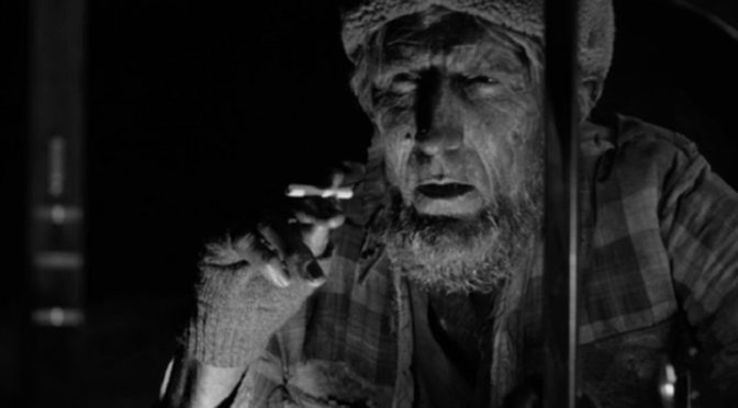
Finally, in the opening scenes of “Gotta Light?” (before everything gets really weird), we witness the murder of Cooper’s doppelganger. The Woodsmen (see header image) appear and engage in a strange ritual, apparently extracting the evil spirit of ‘Bob” as a fetal orb from the body of DoppelCooper. This bloody scene reeks of abortion imagery. Abortion, of course, is one of the most enduring legacies of the Baby Boomers via the Roe v. Wade decision. Lynch’s symbolism in this scene is ambiguous, to say the least. The Woodsmen’s abortion of “Bob” seems to bring DoppelCooper back to life, i.e. children of Baby Boomers (i.e. Generation X) are evil and abortion ‘saves’ lives. However, the character Ray (who shot DoppelCooper) observes this ritual in absolute, moral horror. This ritual apparently allows the evil spirit “Bob” to endure in the Twin Peaks universe, which can’t be a good thing.
In response, the (presumedly) benevolent beings watching over the events of 1945 create a golden orb, which contains the face of Laura Palmer. Because the image of the Earth is black and white, we assume this golden orb was sent to Earth in the same time period as the ‘birth’ of the evil spirit Bob in 1945. However, this is a leap of logic (if such a thing can be said about Twin Peaks). We know that time, as we understand it, has no meaning in the White Lodge (probably the setting during this golden orb scene) and Black Lodge. Does this golden orb represent the inherent promise of Generation X, which Baby Boomers still endeavor to squander, even murder today?

There is much in the episode “Gotta Light?”, in particular, and Twin Peaks, in general, to suggest David Lynch is attempting to express the collective shame of his entire generation for fü©king over so much, including an entire generation of their promising, unwanted ‘latchkey kids’.

Moreso is a new series of short ruminations or thoughts of the moment, usually of less than 500 words, from The Outlaw Urbanist.

Share the knowledge!
Share

MORESO | A Tyranny of Criminals

The tree of liberty must be refreshed from time to time with the blood of patriots and tyrants.” – Thomas Jefferson

When there are so many laws that everyone is a criminal, then we are living in a tyranny. Have you gone seven miles per hour over the speed limit? You are a criminal. Have you watched copyrighted material without paying its owner? You are a criminal. When you were 18, did you had sex with someone who was 16 or 17? Congratulations, you are a sexual offender. Have you jaywalked? You are a criminal. The insidious genius of a tyranny is convincing the people that their status as criminals is in their own best interests.
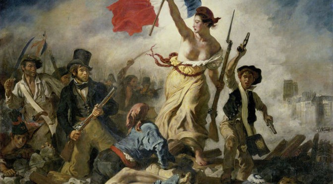
About the image
Liberty Leading the People (La Liberté guidant le peuple in French) is a painting by Eugène Delacroix commemorating the July Revolution of 1830, which toppled King Charles X of France. A woman personifying the concept and the Goddess of Liberty leads the people forward over a barricade and the bodies of the fallen, holding the tricolor flag of the French Revolution in one hand and brandishing a bayonetted musket with the other.

Moreso is a new series of short ruminations or thoughts of the moment, usually of less than 500 words, from The Outlaw Urbanist.

Share the knowledge!
Share

PHOTO ESSAY | Country Club Plaza | Kansas City MO

PHOTO ESSAY | Country Club Plaza | Kansas City MO
Photographs by Dr. Mark David Major, AICP, CNU-A

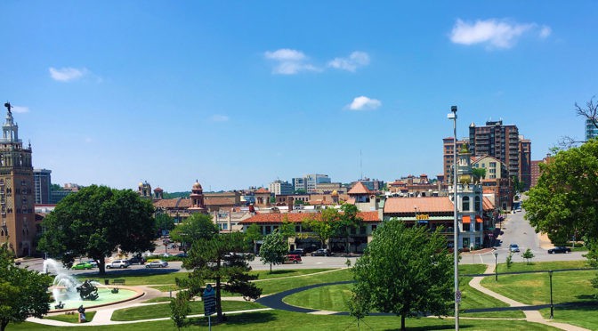
Opened in 1923, Country Club Plaza is a privately owned American shopping center in the Country Club District of Kansas City, Missouri. The center consists of 18 separate buildings representing 804,000 square feet of retail space and 468,000 square feet of office space. The standalone buildings are built in a distinctive Seville Spain theme and are on different blocks mostly west of Main Street and north of Brush Creek, which blends into the Country Club neighborhood around it. The area as a whole is often simply called the “The Plaza” (Source: Wikipedia).

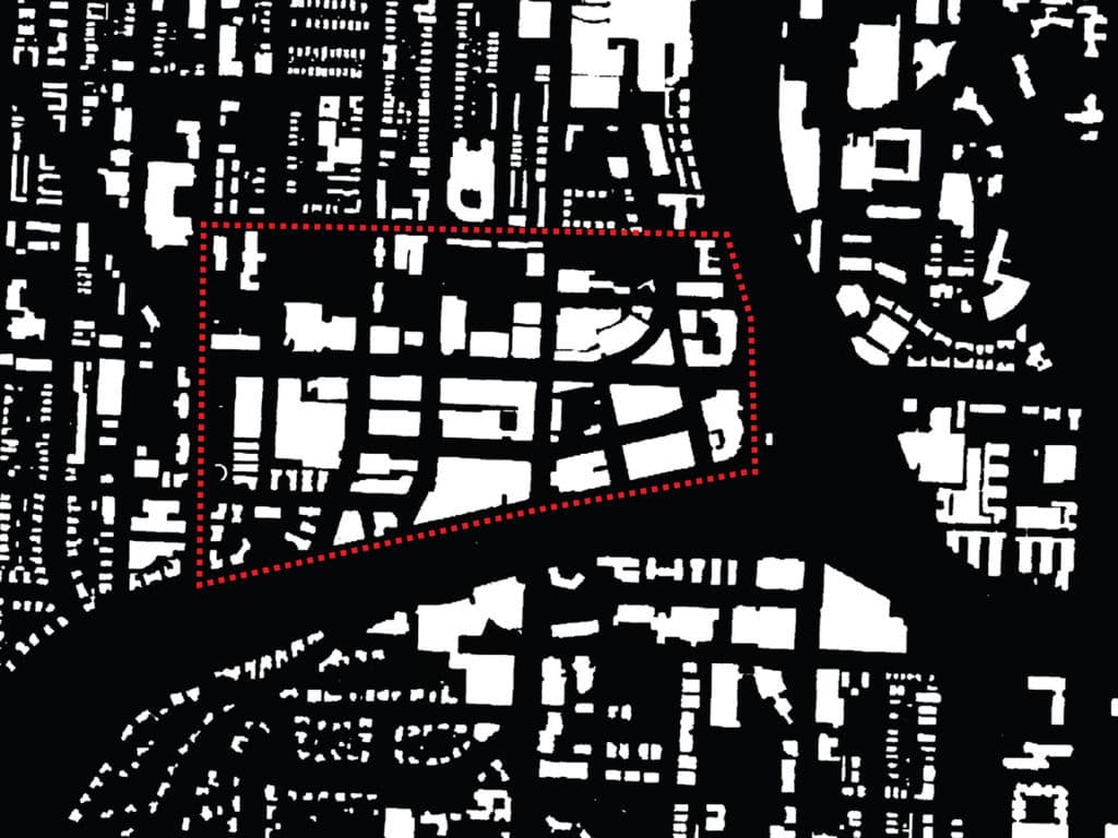
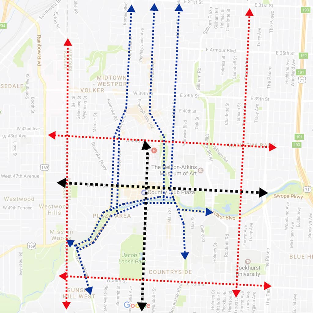
It is all-too-easy to examine the figure ground of building footprints (top, above) and conclude that Country Club Plaza is defined by ‘strong edges,’ especially to the south (Brush Creek) and east (Mill Creek Park). However, this is misleading and less important than the relationship of ‘edge streets’ to the larger context of Kansas City in all directions. In fact, the spatial logic of the Plaza area (and Country Club Plaza, in particular) is simple, yet quite sophisticated. A central cross-axis (cardo and decumanus) defines the local catchment area (in black, see below).

Central cross-axis defining the local area relationship and the layered ‘edge streets’ defining the larger contextual relationship to Kansas City in all directions.

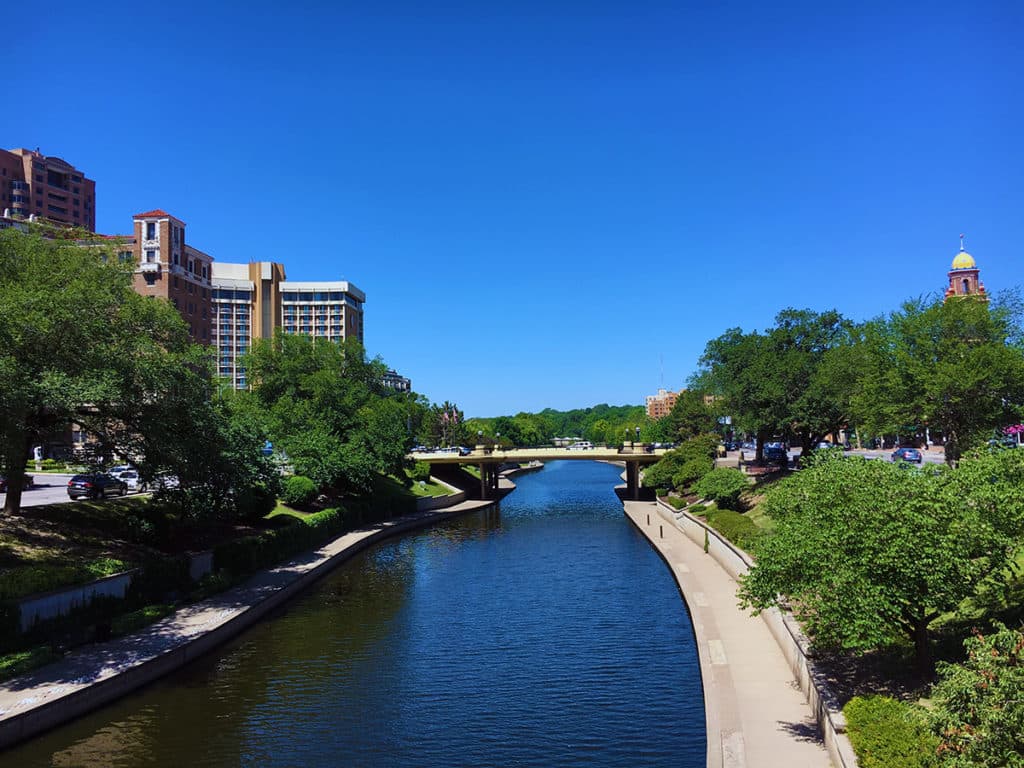
A series of sequential ‘edge streets’ defined the relationship to the larger Kansas City context with the one closest to Country Club Plaza tending to split along the southern, eastern and western edges (in blue) for the purposes of traffic management. This includes Ward Parkway running parallel along both sides of Brush Creek (see below).

View along Brush Creek looking westward (Photograph: Mark David Major).

A series of major streets (in red, see above) farther afield – West 43rd Street to the north, State Line Road to the west, Gillman Road to the west, and West 55th Street to the south – define another edge to the Plaza area. It is this second edge that is the more important one for Country Club Plaza to access a regional catchment area since the cross-axis of the local catchment area reaches to each of these edge streets, helping to structure of the relationship of Country Club Plaza within a much larger area. The Plaza neighborhood itself then uses a series of streets of low/moderate length and connectivity within the interstitial areas formed by this classical morphology to generate its distinctiveness at different scales of movement (automobile, walking/biking) within Kansas City.

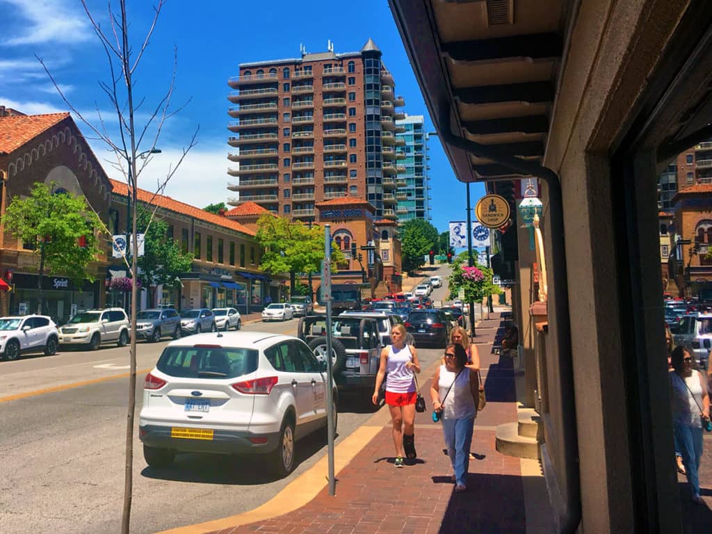
Looking north along Broadway at the corner of Nichols Road (Photograph: Mark David Major).

Plentiful on-street, short-term parking (2 hours or less) helps to slow down the traffic on the streets within Country Club Plaza itself though some road section improvements (central landscape medians instead of continuous left turn lanes) might prove more beneficial for the area over the long term.

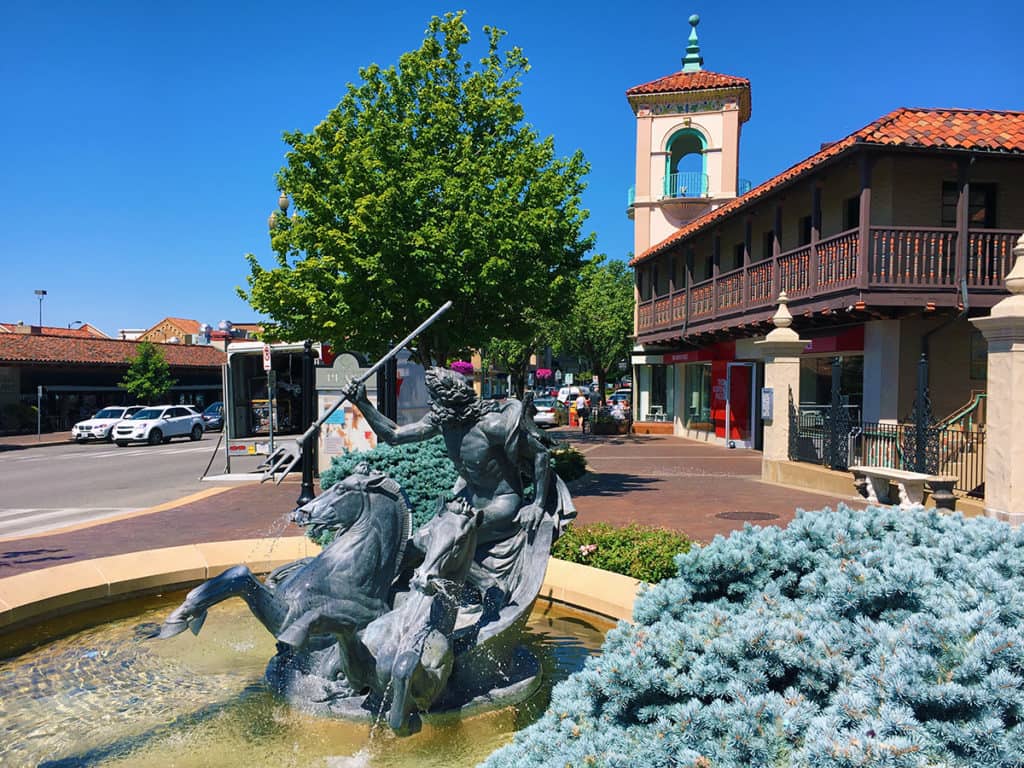
Looking west along 47th Street at the corner of Wornall Road in the small public space associated with the Neptune Fountain (Photograph: Mark David Major).
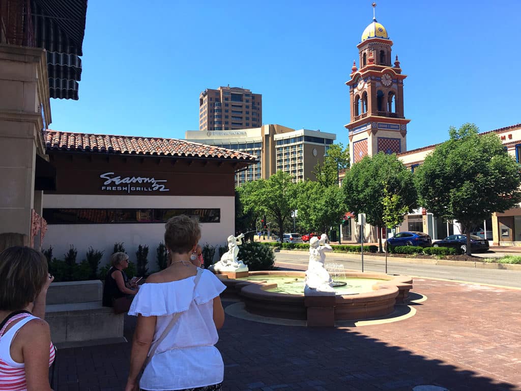
Looking southwest along Broadway towards Brush Creek from the small square associated with what is called the Mermaid Fountain (technically, the fountain depicts sirens, as indicated by the ancient megaphones they are holding) (Photograph: Mark David Major).
Looking west through the small public square at the southwest corner of Pennslyvania Avenue and Nichols Road. I call this “Penguin Square” because of the three bronze statues of penguins at its center (Photograph: Mark David Major).
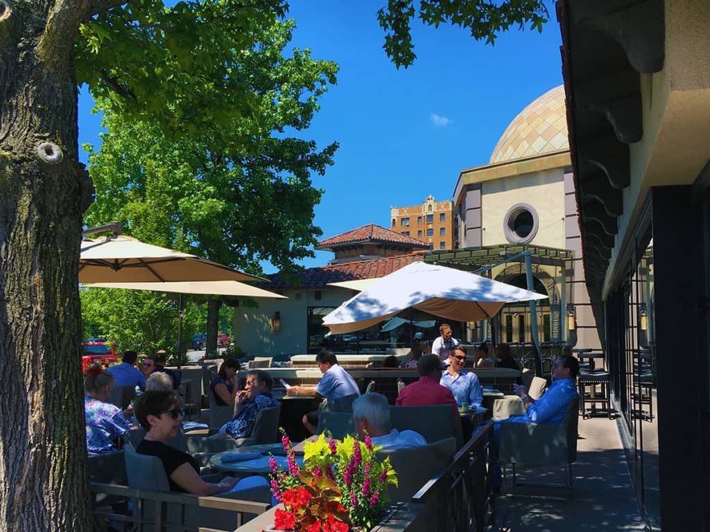
Looking west across the outdoor patio for the Gram & Dunn restaurant at the corner of Pennsylvania Avenue and Ward Parkway across the street from Brush Creek (Photograph: Mark David Major).
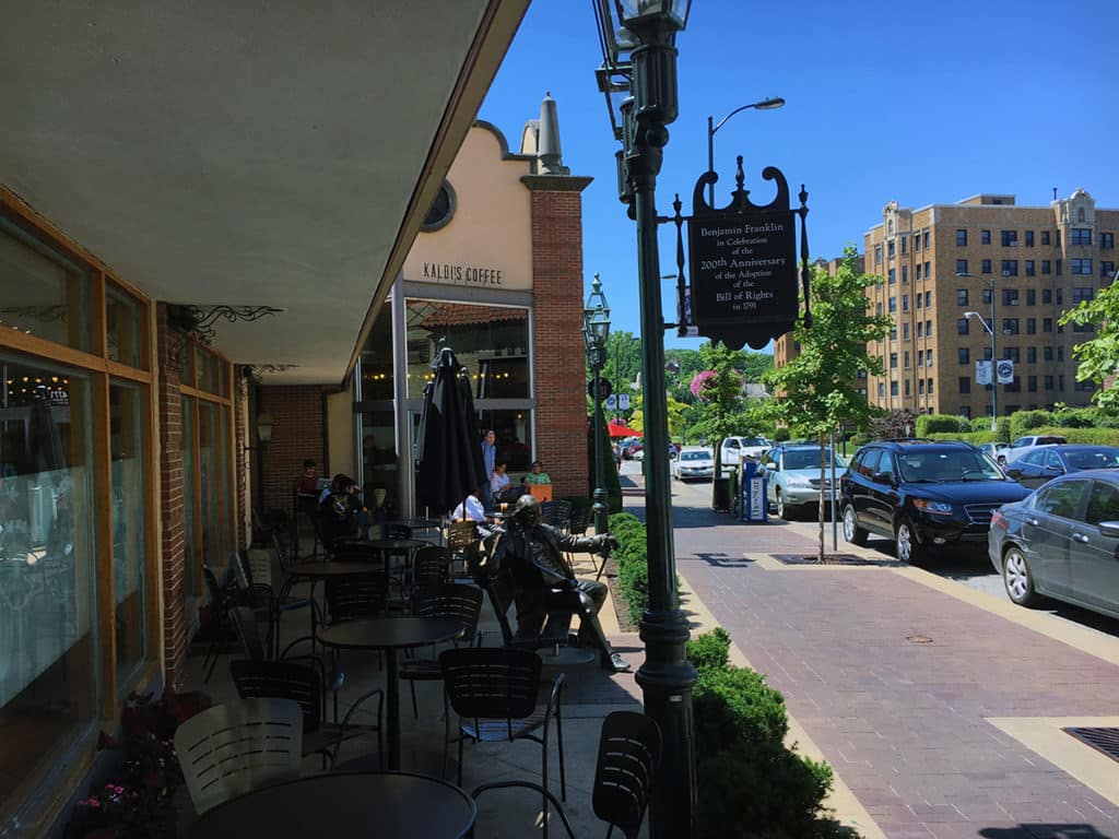
Looking south down Jefferson Street through the outdoor eating plaza of Kaldi’s Coffee at the corner with Nichols Road (Photograph: Mark David Major).

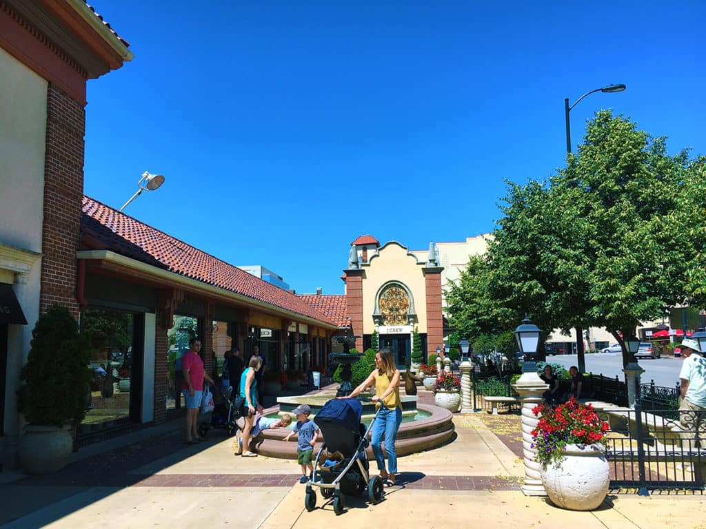
Country Club Plaza makes very clever use of public squares and plazas (often in conjunction with fountains, for which the area is renowned) by turning over some of its most valuable parcels (street corners or “100% location”, according to William Whyte) for public uses. Some of these street corner spaces also operate as outdoor patio seating for restaurants and coffee shops. Most are quite successful, which emphasizes the greater importance of ‘people watching’ than the enclosure of space for a successful public square.

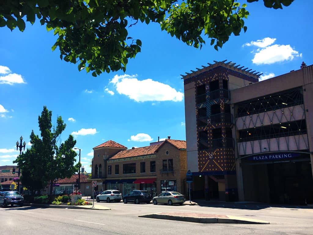
Streetside entry to interior parking building on Nichols Road near the corner of Broadway (Photograph: Mark David Major).

As pointed out by numerous New Urbanists over the years, Country Club Plaza provides for a generous allocation of off-street parking by ‘burying’ parking structures within the center of urban blocks. This is necessary due to the lack of an extensive rail transit system in Kansas City. The KC Streetcar, opened in 2016, has a limited route in downtown Kansas City. However, once that rail transit system expands, then Country Club Plaza would be an ideal candidate for a station; preferably in the central block, which is mostly composed of off-street parking and smallish, single-story retail space along the street frontage at this time (right of the photo below).

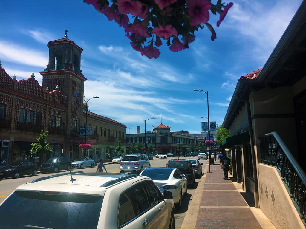
Looking west along Nichols Road at the corner of Central Street outside of Starbuck’s Coffee (Photograph: Mark David Major).
Share the knowledge!
Share

Planning Naked | May 2017

Planning Naked | May 2017
by Dr. Mark David Major, AICP, CNU-A

Your (hopefully hilarious) guide to most everything about the latest issue of APA’s Planning Magazine. It is a tale of two issues for May 2017. “It was the best of times, it was the worst of times, it was the age of wisdom, it was the age of foolishness…” Strange, that seems familiar.

“Oops, did I say too much? Something to think about…” James M. Drinan, JD seems to reveal way more about the professional organization’s underlying, flawed assumptions than he probably intended for the From the Desk of APA’s Chief Executive Officer article (pp. 5) of this issue. In fact, it is all there in the title, “How Do We Shape the New Normal?” Think about that for a moment. APA’s goal is not any sort of objective knowledge or the scientific truth about cities, which would have universal application regardless of whichever political party held power. Instead, by virtue of what is left unsaid, it represents something that is subjective, open to change and manipulation for the circumstances. It is an agenda that has to be ‘shaped’ to the political philosophy of the party in power; albeit, apparently only at the Federal level. This confirms APA is not a ‘neutral’ entity but a partisan one (big surprise, right). Other professional organizations have been supplanted by competitors for similar reasons in the past. Did I say too much?

Planners who forget to, you know, plan ahead. “Lessons Learned from the Oroville Spillway” (pp. 11-12 in the News Section) tries to turn lemons into lemonade. Short summary: some planners and engineers forgot to plan ahead and anticipate alternative scenarios associated with the damn and its spillway, which, if anything, shows a lack of imagination. It appears to be an example of government planning at its finest. Yes, that last comment is sarcastic.

Where’s all of the affordable housing? “Shipping-Container Homes Pose Zoning Challenges for Municipalities” (pp. 12 in the News Section) demonstrates why affordable housing is a nationwide problem as local governments impose regulatory controls on (potentially affordable) alternative housing solutions in order to artificially inflate local property values (tax revenues and sales profits in real estate for fun). Here is a little mental exercise: remove the issue of zoning out of the equation and the name of this article becomes only “Shipping-Container Homes for Municipalities.” That sounds promising…

Wait, Bourbon Street isn’t car-free already? Which was my biggest shock about the “New Orleans Ponders a Car-Free Bourbon Street” (pp. 13 in the News Section) article. Nice of APA to advertise just how far behind the United States really is when it comes to catering for pedestrians. People say cynicism is not a solution but it is hard to read a news item like this one without becoming a cynic.

Our devious plan to regulate Airbnb and its like out of existence. Here is the not-so-secret plan of APA, government regulators, and real estate industry members – representing the ‘suburban model’ perpetuation of the status quo over the last 70 years – in “Regulating Short-Term Rentals” by Edward Sullivan (Legal Lessons on pp. 14). Resist! The longer Airbnb and other share services prevail (even to the point of permanency), then the more hope there is for the future of our cities. Fight the power! Be a short-term rental outlaw! That statement is probably enough for me to be charged with inciting illegal activities in some jurisdictions.
A breath of fresh air. Finally, some solid reporting and writing in the three feature articles, “Immersive Technologies” by Emily Schlickman and Anya Domlesky (pp. 16-21), “Mapping for the Masses” by Jonathan Lerner (pp. 22-27), and “Dark Skies, Bright Future” by Allen Best (pp. 28-33). All of these articles (generalizing here) discuss the potential of their particular subject, their strengths and weaknesses, and even the possible shortcomings in the future. In 15 years as a member of APA, these three articles represent one of the best sequences in Planning Magazine during that time. 18 pages of pure bliss; more like this, please.

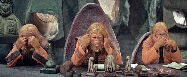
Then, we come to the low point for the May 2017 issue of Planning Magazine: National Planning Awards. News Flash APA! I strongly believe Daniel Burnham and Pierre L’Enfant would be deeply embarrassed to have their names associated with APA’s National Planning Awards in general and with these ‘winners’ in particular. Let’s skip over the irony that Burnham was an architect and L’Enfant was an engineer. I mean, what is APA going to do; name an award after Robert Moses. How embarrassing would that be? Moses sucked and everyone knows it now. Also, have you noticed APA does not (apparently) have a national planning award named after Jane Jacobs. APA’s Standing Committee for the Refutation of Jane Jacobs (see below) must be still hard at work.

Anyway, I do not want to spend too much time on these so-called awards. Judging by the full-page insert on pp. 48-49 practically begging for more entrants as well as the low quality of recent winners, it seems relatively clear that APA’s National Planning Awards are experiencing some problems staying afloat just like APA’s Planners Press. Or wait, should I have not said something about the failure and announced closure of Planners Press? Next time, maybe publish better books (just a suggestion).

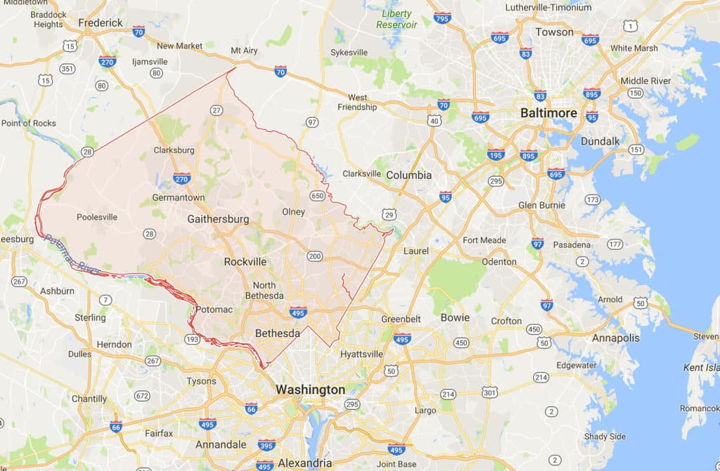
Have you ever noticed when APA is embarrassed, Planning Magazine does not show any plans or satellite views of particular projects? I mean, it is almost like they do not want you to know that they are writing hosannas and/or handing out awards for suburban sprawl. Let us take one example, the 2017 National Planning Excellence Award for a Planning Landmark winner: Montgomery County, Maryland. Where is Montgomery County, you ask? It is to the immediate north/west of Washington, D.C. and to the near-immediate south/west of Baltimore, Maryland. Looks like an obvious location for high-density, urbanized in-fill between two growing metropolitan regions. You know, planning and design with foresight.

Google Maps view of Montgomery County, Maryland showing its intermediate, suburban location between Washington, D.C. to the south and Baltimore to the north. (Source: Google Maps).
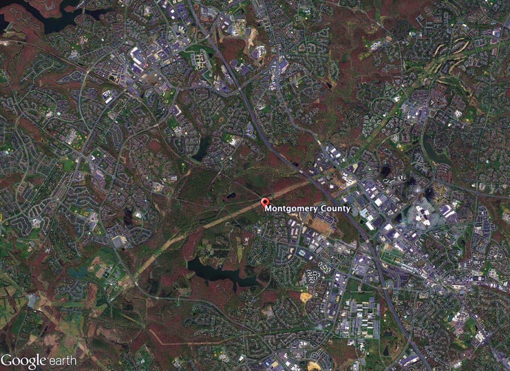
Satellite view of Montgomery County, Maryland from 15 km (Source: Google Earth).

But wait, what is this? Gee, that looks like extensive physical evidence of suburban sprawl development patterns. The configuration of the ‘protected’ agricultural land is conversely that of the direction of the development patterns for Washington, D.C. from the southeast (the nearest urban center) to the northwest. Wait, it is possible this is part of a green belt for Washington, D.C.? Strange, I don’t recall the project description mentioning that information. Didn’t the Centre for Transport Studies at University College London demonstrate in the late 1990s that the effect of green belts was to increase auto-commuting travel miles, levels of carbon emissions, and suburban sprawl patterns (see The London Society’s refutation of green sprawl here). That is embarrassing. Not only is APA over two decades behind on this issue but they are actually still giving out awards for flawed policies perpetuating suburban sprawl.

But that’s OK. By implementing policies such as transfer of development rights (TDR) to protect agricultural lands, maybe Montgomery County dramatically increased density in its buildable areas. What is the average population density in Montgomery County, Maryland today? 3.2 people per acre. Mm, average population density for New York City (the ‘unicorn’ of American planning, I think it is far to say) is 43.8 people per acre. New York Ctiy is neary 14 times denser than Montgomery County, Maryland.

To paraphrase Britney Spears: oops, they did it again.

Planning Naked is an article with observations and comments about a recent issue of Planning: The Magazine of the American Planning Association.

Share the knowledge!
Share

Blogging about architecture, urbanism, and culture…

Share