Tag Archives: Art

FROM THE VAULT | Creative Confessions | Paul Klee

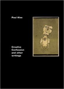
FROM THE VAULT | Creative Confessions and other writings by Paul Klee
by Dr. Mark David Major, AICP, CNU-A, The Outlaw Urbanist contributor

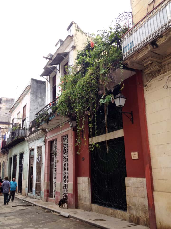
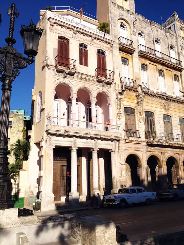
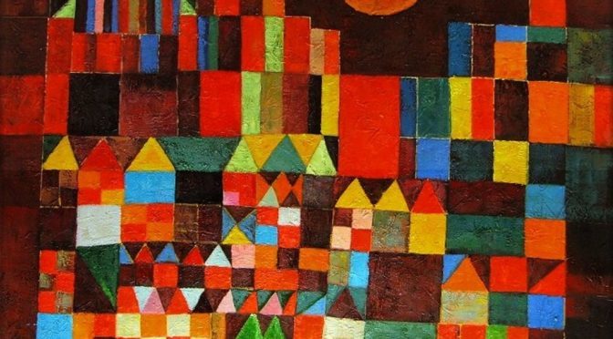
Creative Confessions is a series of short essays (vignettes, really) by Modern abstract artist Paul Klee (1879-1940) on art and composition, which the artist wrote while teaching at the Bauhaus in Germany during the 1920s with a postscript essay by the editor, Matthew Gale. In this, it is a thought-provoking read that can be managed in a single sitting (in a real sense: perfect for the Internet Era). It is stuffed full with quotes that have direct bearing on composition in art (“art does not reproduce the visible; rather, it makes visible”). However, Klee’s vignettes also carry (perhaps indirect) importance for composition in architecture and urban planning. For example, “a tendency towards the abstract is inherent in linear expression” when you think of this concept in terms of movement in the city. When Klee discusses “the formal elements of graphic art are the dot, line, plane, and space – the last three charged with energy of various kind”, we can easily translate this into built environment terms (dot=location, line=axis of movement, plane=convex space, and space itself is self-explanatory). Klee means this in terms of the energy of artistic gesture but we can also easily understand how these things in an urban environment are similarly ‘charged with energy’ in terms of movement, avoidance, and encounter.

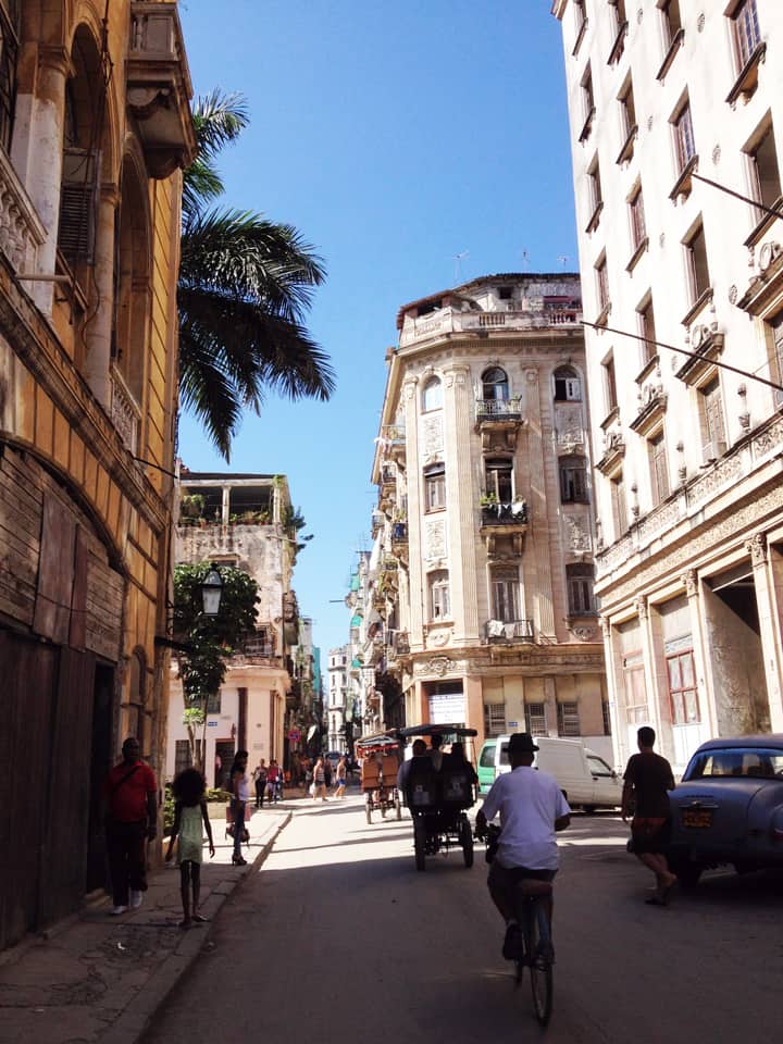
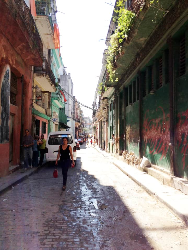
Indeed, it is easy to make transitions such as these from art to architecture/planning since Klee himself tends to express these ideas in terms of movement/counter movement in encounter and vision, i.e. a journey across “an unploughed field” or crossing a “river” or “walking across the deck of a steamer”, which are described in terms of linear expression. Klee’s explicitly acknowledges this, arguing that “movement is the source of all change” and “space, too, is a temporal concept.” “When a dot begins to move and becomes a line, this require time.” In planning terms, we can think of this as our location in space changing by the action of our movement and thus our experience of space evolves with that movement. This is not only expressed in terms of geospatial reality but also in time since we, as human beings, are bound in space and time.

“Movement is the basic datum” of the universe, Klee tells us. In understanding this (in art as well as the science of urbanism), we can “reveal the reality that is behind visible things”.  Klee argues “the object grows beyond its appearance through our knowledge that the thing is more than its outward aspect suggests”. Indeed, in discussing art, is Klee begins to tap into the inherent nature of observation and science itself.

Creative Confessions and other writings
by Paul Klee (Matthew Gale, Editor and Postscript)
32 pages
Tate; Act edition (May 6, 2014), London UK

You can purchase Creative Confessions and other writings from Amazon here.


Check out the Artsy.net Paul Klee page here.

From the Vault is a series from the Outlaw Urbanist in which we review art, architectural and urban design texts, with an emphasis on the obscure and forgotten, found in second-hand bookstores.

Share the knowledge!
Share

Bathe in New Light | The City in Art

Rejcel Harbert’s Under Neons (2010), 16″ x 20″, acrylic on stretched canvas, Art by Rejcel.

Bathe in New Light | The City in Art
By Dr. Mark David Major, AICP, CNU-A

Neon, noun, ne·on, ˈnē-ˌän – a colorless odorless mostly inert gaseous element that is found in minute amounts in air and used in electric lamps. From the Greek, neuter of neos new, first Known Use: 1898.

Art is rarely or merely about the physical representation of the thing but instead about light, shadow and reflection as represented in counter pose to the physical reality of the thing itself.

The Arnolfini Portrait by Jan van Eyck (1434) Copyright © The National Gallery, London.

This is a widespread tradition that can be traced back to long before Modernism with artists such as Leonardo da Vinci, Caravaggio, and Jan van Eyck. For example, Jan van Eyck’s The Arnolfini Portrait  (1434, National Gallery, London) where the artist paints his own reflection in the mirror located on the back wall behind his subjects (see below).

In Under Neons, Harbert paints the city as bathed in neon light, as if physicality of the thing itself did not have an objective existence until awash in shadows and reflections birthed by the light itself. In the same tradition as Georgia O’Keefe’s Radiator Building-Night, New York (1927) and Harbert’s The Blue City (2012), the artist encourages us to see the city in a new and different way; not merely as a physical entity but also as an abstract reality bathed in its all-consuming light. This is given urgent power by the artist through the use of primary colors (reds, yellows, and blues) and blacks/whites, which hint at Piet Mondrian’s famous abstract paintings of New York. However, the control and preciseness found Mondrian’s abstract formalism is sacrificed in favor of a kinetic energy – of vibrant motion – painted in the light and dark of the city. Of course, Under Neons immediately suggests the city we most associate with neon spectacle: Las Vegas. However, this could be any city. This could be our city, given life anew in the light.

About Rejcel Harbert
Rejcel Harbert has over ten years of experience as the owner of Art by Rejcel, where she sells photographic services, paintings, and abstract and expressionistic acrylic arts. She received her bachelor of arts in business, economics, and Spanish from Jacksonville University in 2001. She is a member of the Business Fraternity Alpha Kappa Psi, the Honor Society Phi Kappa Phi, and received an award from the Women’s Business Organization for Achievement. Ms. Harbert does religious volunteer work including construction and repair work for community members in need. For more information on Art by Rejcel, visit www.rejcel.com.

The City in Art is a series by The Outlaw Urbanist. The purpose is to present and discuss artistic depictions of the city that can help us, as professionals, learn to better see the city in ways that are invisible to others. Before the 20th century, most artistic representations of the city broadly fell into, more or less, three categories: literalism, pastoral romanticism, and impressionism, or some variation thereof. Generally, these artistic representations of the city lack a certain amount of substantive interest for the modern world. The City in Art series places particular emphasis on art and photography from the dawn of the 20th century to the present day.

Share the knowledge!
Share

Poor Richard Volume 2 is Now Available

Poor Richard, An Almanac for Architects and Planners (2013) offered anew proverbs and witticisms about the architecture, urban design and planning of our cities. It was hailed as a “worthwhile”, “hilariously righteous epitome” for its “genius, extraordinary wit, passion for good design, and mastery of the history of planning” in “following both Benjamin Franklin and Ambrose Bierce” (Review by Harold Henderson, Planning Magazine, February 2014 and Foreword by Julia Starr Sanford to Poor Richard, An Almanac for Architects and Planners).

Poor Richard, Another Almanac for Architects and Planners (Volume 2) brings together more common sense proverbs, astute observations, and general rules of thumb for anyone interested in the future of our cities. In doing so, author Mark David Major again draws from a dizzyingly array of sources for inspiration including the artistic movements of Modernism, obscure African, European and Oriental proverbs, and even the Old and New Testaments. These witticisms are often eloquent, sometimes biting, and always insightful; even occasionally bizarre in the absence of deeper thought. They offer a valuable resource for the entire year, daily reminders for everyone involved in the building of our cities about their better angels and warning against the worse demons of human nature. The clear message of Poor Richard, Another Almanac for Architects and Planners, with foreword by Steve Mouzon (author of The Original Green), is we can do better for our cities and we must do better for our cities.

Purchase you print of digital version today!

Poor Richard, Another Almanac for Architects and Planners (Volume 2)
by Mark David Major, Foreword by Steve Mouzon
140 pages with black and white illustrations.

Available in print from Amazon, CreateSpace, and other online retailers.

Available on iBooks from the Apple iTunes Store and Kindle in the Kindle Store.

For the best digital eBook experience, the author recommends purchasing the iBook version of the book.

Share the knowledge!
Share

Poor Richard 1.0 | Now Available on Kindle

Poor Richard, AN Almanac for Architects and Planners (2013) offered anew proverbs and witticisms about the architecture, urban design and planning of our cities. It was hailed as a “worthwhile”, “hilariously righteous epitome” for its “genius, extraordinary wit, passion for good design, and mastery of the history of planning” in “following both Benjamin Franklin and Ambrose Bierce” (Review by Harold Henderson, Planning Magazine, February 2014 and Foreword by Julia Starr Sanford to Poor Richard, AN Almanac for Architects and Planners).

The first volume of the Poor Richard series is now available for purchase in the Kindle Store for $1.99 (prices may vary in Europe, South America, and the Far East, check the Kindle Store in your country for prices).

For the best digital eBook experience, the author recommends purchasing the iBook version of the book (see below).

Poor Richard, Volume 1 is also available in print from Amazon, CreateSpace, and other online retailers as well as iBooks from the Apple iTunes Store.

Coming Soon! Poor Richard, Volume 2!

Share the knowledge!
Share

PHOTO ESSAY | Havana, Cuba | Part 2

PHOTO ESSAY | Havana, Cuba | Part 2
Photographs by Concrete Blonde

Part 2 of a brief photographic essay of architecture and urban space in Havana, Cuba courtesy of Concrete Blonde. Again, the urban vocabulary of Havana is remarkably consistent: the street life of urban balconies, the use of balcony gardens in softening the urban streetscape, rooftop terraces, abundant use of urban sidewalk arcades, and the use of color.

Looking over a Havana neighborhood through an open window with the harbor in the distance.
Havana street life above and below, courtesy of a ground-level retail shop and second floor balconies.
A narrow shopping street in Havana, Cuba.
A lavishly-vegetated garden in the courtyard of a public building in Havana, Cuba.
Vegetation hanging from a second floor balcony soften the hard edges of the urban streetscape in Havana, Cuba.
Upper-level balconies introduce additional street constitution and casual surveillance of the street in the urban environment of Havana, Cuba.
Balconies and sidewalk arcades defining the street vocabulary of Havana, Cuba.
A street space well-used by pedestrians in Havana, Cuba.
A narrow street width in Havana, Cuba.
Finally, a light well made of empty bottles at a local restaurant in Havana, Cuba; included here only because it’s so ingeniously cool.
Share the knowledge!
Share