All posts by Administrator

Top 10 ‘Must See’ Documentary Films for Architects and Planners

Top 10 ‘Must See’ Documentary Films for Architects and Planners
by Dr. Mark David Major, AICP, CNU-A

Recently, The Outlaw Urbanist published the article “Top 10 ‘Must See’ Films for Architects and Planners” with reference to the influence of the built environment on film-grammars in support of cinematic narratives. However, there are other films (especially documentaries) worth seeing with a direct or indirect bearing on the built environment today. This is the purpose of today’s list of ‘must see’ documentary films for architects and planners. There are a lot of documentary films dedicated to specific architects. Most are vanity projects built on the ego of said architect, which lack much universal application for buildings or cities. You will not find such films on this list. The purpose of this list is value. What is informative and worth your time?
HONORABLE MENTION WITH WARNING LABEL
Inside Job (2010)
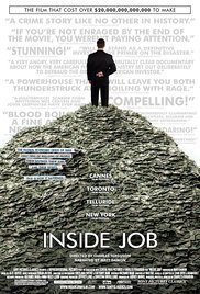
If you are well-informed, then there are interesting nuggets of information buried in the 2010 documentary Inside Job directed by Charles Ferguson with narration by Matt Damon (one of my favorite actors) about the housing crash and 2008 Financial Crisis. However, if you are uninformed or only casually acquainted with the facts (see below), then Inside Job is dangerous apologia propaganda for the left’s complicity in the cataclysmic events costing millions of people their jobs and homes. No one should be allowed to watch this film without first reading The Big Short: Inside the Doomsday Machine by Michael Lewis. Damon, his wife, and four daughters lived in an 8,890 square foot home (1,778 SF per person) in southern California at the time of filming. Yeah, sorry Matt, that’s being part of the problem, not the solution.

MUST SEE
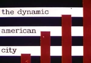
10. The Dynamic American City (1956)
This 25-minute 1956 educational film created by the U.S. Chamber of Commerce is worth viewing for contradictory reasons: 1) it gets everything wrong about vibrant urbanism; and, 2) it is a propaganda masterpiece on par with Leni Riefenstahl’s Triumph of the Will in using associative and dis-associative imagery and narration to hammer home its central message of ‘building up and out’ (it is right there in the Intro graphic) for making fast money in real estate built on the twin premises of slum clearing and suburbanization. If Joseph Goebbels had been an American developer, he would have been proud. For anyone with an ounce of common sense, it is like watching a car crash in real time: horrifying but you can’t take your eyes off it. Do you want to live in old stables or “on the frontier”? Even today, some Americans refuse to let go of the Big Lie in this film. You can watch it on YouTube here.
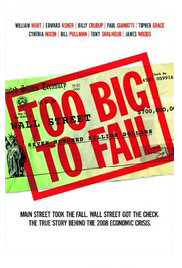
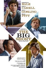
8/9. Too Big to Fail (2011)/The Big Short (2015)
These aren’t documentaries but dramatized accounts about the housing crash and 2008 Financial Crisis. Nonetheless, they are well done, littered with nuanced performances, and even-handed in providing public and private sector perspectives about events. They successfully manage the herculean task of being both entertaining and informative. Too Fail to Fail (2011) centers around Treasury Secretary Henry Paulson’s (William Hurt in an outstanding performance) actions to advert another Great Depression. The Big Short (2015) centers around a few people (all strong performances from Christian Bale, Ryan Gosling, and Steve Carell) in the financial sector who saw the approaching cliff, bet against the housing market and banks, and won big though not without a great deal of stress while encountering record levels of stupidity along the way. The latter is based on Michael Lewis’ The Big Short: Inside the Doomsday Machine, which we also thoroughly recommend.

7. Ben Building: Mussolini, Monuments, and Modernism (2016)
Part of Jonathan Meades’ (above) series of BBC Four documentaries (Jerry Building and Joe Building aka Nazi and Stalinist architecture, respectively) about architecture and planning under totalitarian regimes of the early 20th century, Ben Building: Mussolini, Monuments, and Modernism (2016) is the best in terms of quality and quantity of material. Simply put, Italian architects under Mussolini were doing much more interesting things in terms of design, which leads Meades to more even-handed commentary about his subject. The other two documentaries are worth seeing. The first suffers from a lack of existing/built examples (and typical British vitriol about all things German; Nazi or otherwise) and the second (Soviet) from an excess of questionable architectural taste. You can watch Ben Building on YouTube here before the BBC files a copyright infringement claim.
6. The Human Face of Big Data (2014)
This is a wide-ranging PBS documentary about the applications and implications of Big Data in the 21st century. As such, The Human Face of Big Data (2014) concentrates about half of its 56-minute running time on issues pertinent to cities, e.g. mapping social-economic data, Smart Cities, consumer tailoring, etc. Some of the researchers are missing – or fail to comment on – the obvious. For example, the documentary briefly shows data mapping of repeat offenders in Brooklyn NY, which is clearly mid-20th-century public housing to anyone familiar with Modernist building footprints. While it does not offer any definitive answers to the deeper questions raised by Big Data, it is still a useful exercise in asking questions about what it all might mean for you and our cities in the future. Watch the trailer below.
5. Super Skyscrapers: Building the Future (2014)
This is one episode in the 4-part series of PBS’ Super Skyscrapers (2014). The other episodes are interesting (mostly for their overkill in terms of design and engineering). However, this episode about the Leadenhall Building in the City of London designed by Rogers Stirk Harbour + Partners is a brilliant explanation about the way cutting-edge computer modeling and manufacturing processes are dramatically changing the construction industry in the 21st century. Due to the constrained site, every piece of this building was manufactured offsite and then transported in a precise order for assembly on-site, i.e. no concrete pour. The hydraulic shifting of the building by a few degrees into a vertical position is an especially jaw-dropping sequence. Watch this episode on YouTube before PBS files a copyright infringement claim here.
4. The Human Scale (2012)
This 2012 documentary is nominally about thinkers, architects, and urban planners discussing ways to increase human interaction in cities but, in particular, The Human Scale (2012) is about Danish architect Jan Gehl’s teaching and research about urbanism over the last four decades. In this, it veers a little too closely sometimes to the ‘myth of the architectural genius’ folie associated with most architectural documentary films. Ignore the hero worship and listen to what is being said about people and cities. There are plenty of common sense ideas and solutions contained in The Human Scale, which makes it must-see viewing for architects and planners.

3. Poynton Regenerated (2013)
This short 15-minute film features urban designer and movement specialist Ben Hamilton-Baillie explaining the existing, seemingly intractable traffic, pedestrian, and land use problems in the village center of Poynton, England. Then, he outlines a new, radical plan for a Shared Space design concept in the village center. Plan implementation and construction is a great success, though not without a lot of skepticism along the way. The film is good at explaining the basic premise of Shared Space, which is if you design for people being stupid, then they will tend to act stupid but if you design for people being smart, they will tend to be smart in self-regulating urban systems. A good measure of this film’s success is the way-out-of-proportion fear it has provoked in reaction. You can watch Poynton Regenerated on YouTube here.
2. The Pruitt-Igoe Myth (2011)
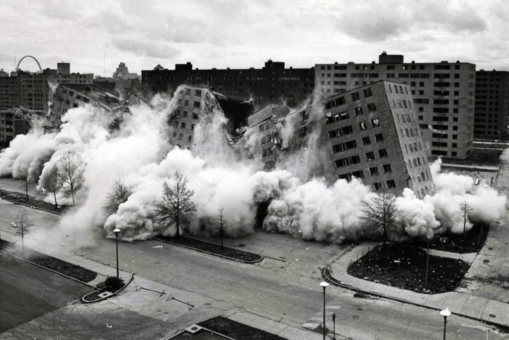
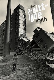
There were several issues (racism, regulatory failures, design and planning flaws, demographics, suburbanization, and so on and so on and so on) involved in the demise of the Pruitt-Igoe Public Housing Complex in St. Louis, Missouri, which led to its famous televised demolition in 1972. This 2011 documentary does a good job covering many of them. The testimony of former residents is enlightening, especially if you listen with a keen ear about their experiences in spatial terms to better understand how architectural design/planning played a role in the social malaise at Pruitt-Igoe. You do need to be careful about the testimony of former residents who were children at the time (in the section titled “Control”). It is clear they were not privy to their parents’ decisions at the time about securing government assistance though it does ably demonstrate how it appeared from the child’s point of view. This 1 1/2 hour documentary is definitely worth the time and demands your attention. You can watch The Pruitt-Igoe Myth on YouTube here.
1. The Social Life of Public Spaces (1980)
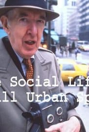
This 1980 documentary film written, directed, and starring William H. Whyte (based on his 1972 book of the same name) is still the most important documentary about architecture, urban design, and planning today. Like Jane Jacobs before him, Whyte does something that many people still oddly consider beneath them to better understand how people really use public space. He goes out and watches them. Radical, huh? Does Whyte get everything right? No, but he does get much right, which is more than most architects and planners can claim. You can watch The Social Life of Public Spaces on Vimeo here.

Share the knowledge!
Share

Pruitt-Igoe | A Photographic Essay

Pruitt-Igoe | A Photographic Essay
by Dr. Mark David Major, AICP, CNU-A

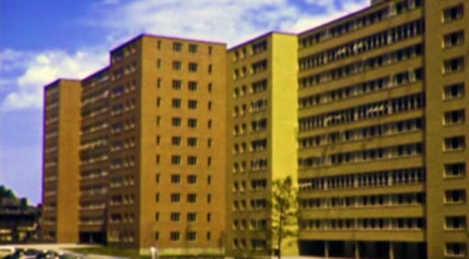
Today, we set a very specific task to promote our forthcoming, new course on The Outlaw Urbanist online learning platform: “A Failure of Modernism: ‘Excavating’ Pruitt-Igoe” (2.0 hour). Namely, create a photographic essay telling the story, in part, of the Pruitt-Igoe Public Housing Complex in St. Louis, Missouri using only ten photographs with shortish captions, i.e. no plans, maps, statistics, or computer models. Quite frankly, it is a near impossible task. Nonetheless, the photos are fascinating and there are plenty of informative links to related materials available in the captions so you can discover more about this (in)famous housing project.

Pruitt-Igoe is one of the most commonly cited examples of the failure of Modernism in the world. The televised demolition of Pruitt-Igoe residential towers in 1972 is one of the most iconic images of 20th-century architecture and planning (Photograph: The Pruitt-Igoe Myth Press Materials).

Opening circa 1954, Pruitt-Igoe was Federally-funded social housing constructed with 2,870 apartments for 13,000 people (228 people/acre) in thirty-three 11-story buildings on 57 acres with a housing density of 50 dwelling units per acre in north St. Louis (Photograph: Bettmann/Corbis via The Guardian).

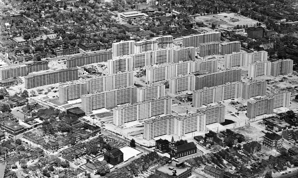
Pruitt-Igoe was a ‘hybrid design’ for a high-profile, strategic site. It incorporated Modernist principles (i.e. high-rises towers, separation of uses and building siting, stripped down aesthetics where ‘form follows function, etc.) utilizing a regular grid layout in the urban pattern of St. Louis, which was commonly planned on offsetting ‘smallish’ regular grids in a process of deformation, i.e. small for American cities, big for European ones (Photograph: U.S. Geological Survey via Wikipedia Commons).

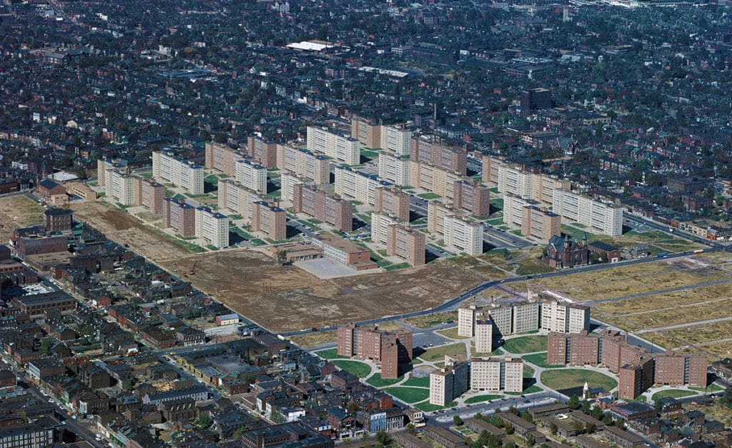
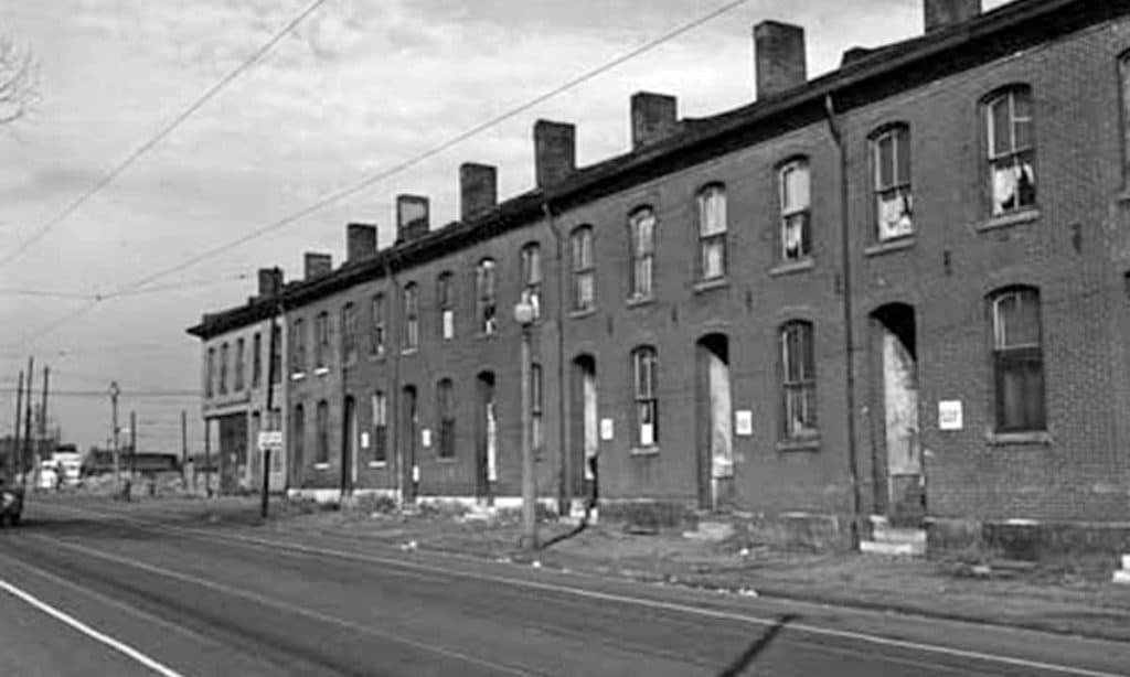
Pruitt-Igoe replaced 19th-century tenement housing, which was typical of the DeSoto-Carr neighborhood and many areas of St. Louis at the time. Survey of a 1938 Sanborn map indicates there were a minimum of 730 street-oriented dwelling entrances with minimal street setbacks on the site before Pruitt-Igoe, i.e. exclusive of buildings with deep setbacks, large (non-residential) footprints, alleyway-access, and vacant lots (Photograph: State Historical Society and Missouri/University of Missouri-St. Louis Archives).

The pilotis design feature partially ‘liberated’ the ground level for circulation routes, which crucially mediated inside to outside and vice versa, i.e. formal access to the elevator/stairwells in each tower and spatial distribution in the exterior spaces of the layout. The residential towers elevated dwelling entrances in section to internal corridors, effectively representing a complete elimination of front doors in the site (Photograph: Affordable Housing Institute).

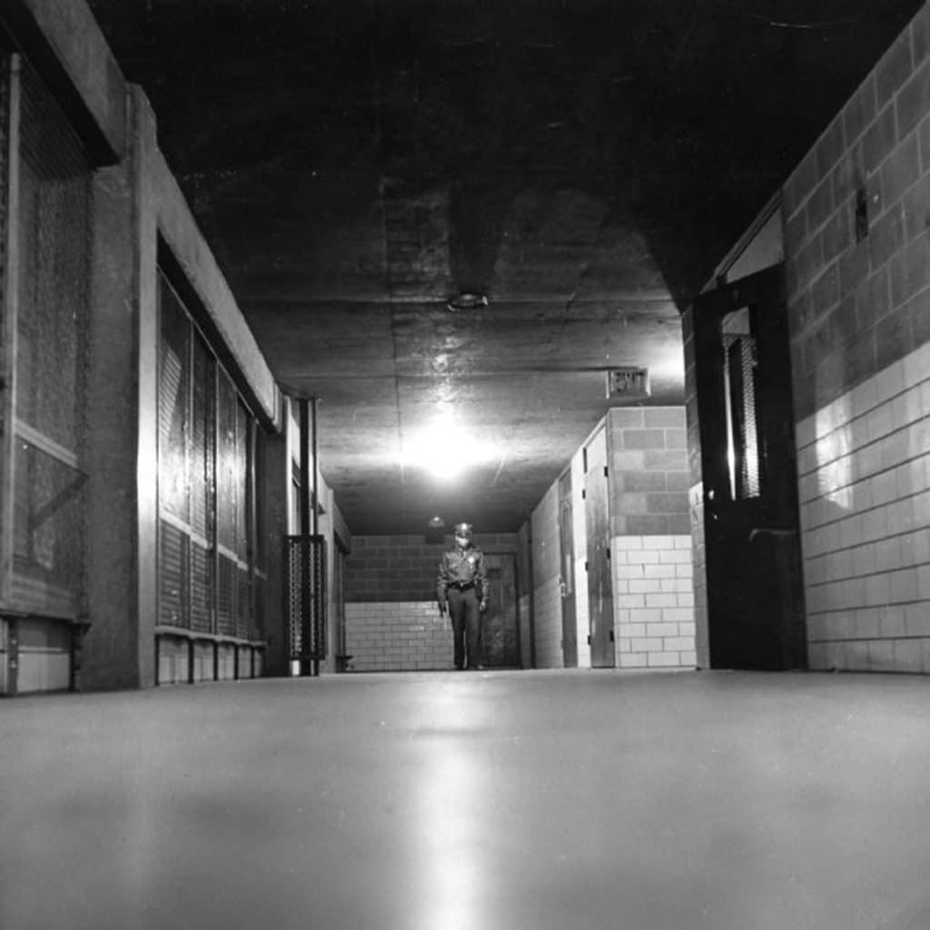
The cost-cutting inclusion of ‘skip-stop’ elevators only stopping at the 1st, 4th, 7th, and 10th floors forced most residents to use dark stairwells – principally designed as fire exits – to access the floors of their apartment. They were publicly accessible due to the uncontrolled pilotis design feature, which also provided access to multiple routes at ground level in an ‘easy to read and use’ layout. Collectively, this facilitated opportunity and escape for criminal activities, initially focused on the stairwells but later spreading to other spaces (Photograph: The Pruitt-Igoe Myth).

People must have quickly realized the opportunities inherent in the design and planning of the pilotis feature because intensive patrols of the buildings and grounds began shortly after Pruitt-Igoe opened, even before any welfare recipients were allowed to live there. Former residents indicate these stairwells/elevators were problematic spaces from the very beginning (Photograph: St. Louis Post-Dispatch).

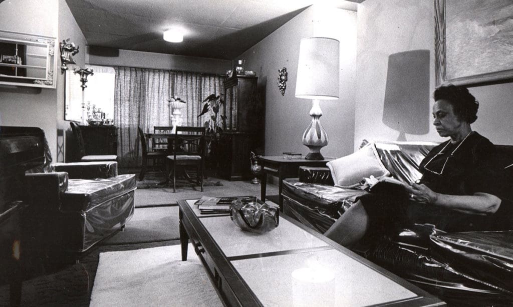
The number of unsupervised children in archival footage of Pruitt-Igoe is startling. ‘Baked-in’ problems of racism accentuated by many regulatory failures skewed Pruitt-Igoe’s demographics towards female-led households with children. Declining occupancy led to a ‘broken interface’ between adults and children. There were too few adults (especially males who belonged there) and too many children for too much space. Unsupervised children (especially teenagers) participated in petty vandalism, which worsened the perception of social malaise at Pruitt-Igoe (Photograph: The Pruitt-Igoe Myth).

There was an asymmetrical relationship (i.e. unequal) between the Vaughan (foreground) and Pruitt-Igoe (background) social housing in terms of formal access, horizontal and vertical scale, and spatial distribution. Nine strategic diagonal/gridline routes passing through, within or to the edge of Vaughan provided direct/adjacent access to every Pruitt-Igoe residential tower, suggesting the opening of Vaughan circa 1957-58 might have been complicit in Pruitt-Igoe’s social malaise (Photograph: U.S. Geological Survey).

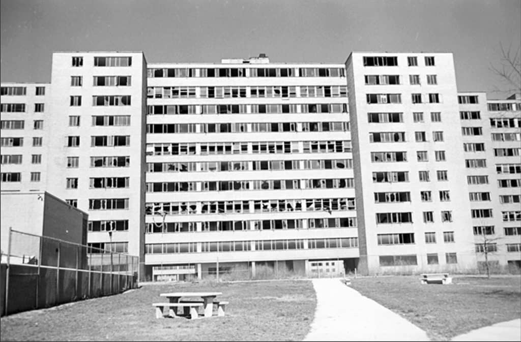
Social malaise accelerated at Pruitt-Igoe during the 1960s even as residents maintained some apartment interiors until a cataclysmic mechanical failure in 1968 (watch a 5-minute KMOX news report on YouTube here) led to a St. Louis Public Housing Authority order for phrased vacating of the premises in preparation for demolition. According to news reports/resident testimony, the worst, most violent criminal activities at Pruitt-Igoe occurred during this 5-year period from 1968-1972 (Photograph: Zuma Press/Alamy via The Guardian).

This photographic essay only begins to scratch the surface of the issues surrounding this housing project. There is MUCH MORE to the story of Pruitt-Igoe. Learn more by participating in our forthcoming, new course “A Failure of Modernism: ‘Excavating’ Pruitt-Igoe” when it becomes available!

Share the knowledge!
Share

Top 10 ‘Must See’ Films for Architects and Planners

Top 10 ‘Must See’ Films for Architects and Planners
by Dr. Mark David Major, AICP, CNU-A

The Outlaw Urbanist recently made available the six-hour Architecture and Film ($39.99) course series on its professional development and continuing education learning platform. The series is composed three 2-hour courses, which are also available as individual components: Do Architects Dream of Celluloid Buildings? ($14.99); The Architectural Competence in Cinema ($14.99); and, The Best of Both Worlds ($14.99). The course series is a wide-ranging discussion about architecture’s impact on cinema in the mise en scène (e.g. everything in the frame) of film-grammars, involving general rules for the depiction of built environments in support of cinematic narratives. The course series reviewed dozens of examples in film and television. The question naturally arises about what might be the most definitive examples of architecture’s impact on cinema. What is the essential ‘must-see’ list of films for architects and planners to see?
Without further ado, here is the Top 10 ‘Must-See’ Films for Architects and Planners…

Honorable Mention: Logan’s Run (1976)
Are you still confused about what a ‘smart city’ might really be? Four decades ago, the central premise of Logan’s Run was based on the premise of a smart city. The computers of the city control every significant aspect of the lives of its citizens including decisions of life and death… unless you become a runner. After Logan 5 and Jessica 6 escape the city, the film quickly loses pace. Ultimately, the story cannot bear the weight of its intriguing premise, which is why Logan’s Run barely missed the cut for this list. Logan and Jessica explore ‘outside’ for only a few days, then even they (much like the audience) can’t wait to get back to the city, if only on some ill-defined mission to undercut the society living there.

10. Inception (2010)
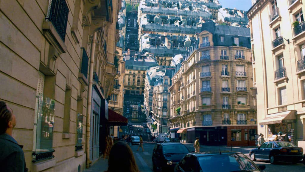
The most effective film to date to make use of Computer-generated imagery (CGI) manipulation of the built environment in order to convey a distortion of reality to the audience. In this case, it is the dream-within-dream premise of Christopher Nolan’s narrative. Marvel’s 2016 Doctor Strange deploys the same digital tricks, only more so. As cool as these visual effects are, the most effective consequence has been more realistic cinematic depictions of built environments generating their own gravity in ‘hard’ science fiction films with settings in space such as Interstellar, Elysium, Star Trek Beyond, and so on.

9. The Truman Show (1998)
One of the most comprehensive examples of filmmakers transforming a real place (New Urbanist resort town of Seaside, Florida) into the fictional setting of Seahaven, Florida, which is really a set in Hollywood, California for a reality television series watched by millions around the world. The payoff for the narrative and premise comes at the climax when Truman (played by Jim Carrey) sails to the outer wall of the set to escape his manufactured reality (see above). Pleasantville (1998) in the same year is also worth a look, if only for the joke about the common paradoxes associated with urban geography in cinema. Hollywood films that are basically about Hollywood itself always border on the edge of self-indulgence. Both The Truman Show and Pleasantville avoid this trap, for the most part.

8. Harry Potter (2001-2011)
The Harry Potter films had to walk a very fine line between real and fantastical settings. It is a testament to the genius of J.K. Rowling’s source novels and the creative talents of the filmmakers that the Harry Potter film series successfully navigates this line. The use of film-grammars involving cinematic built environments and spatial concepts play a large but subtle role in achieving this objective. Harry Potter offers a good example of historical juxtaposition and a very specific use for the abnormal scale film-grammar in architectural elements to support  the Harry Potter narrative.

7. “Q Who”, Star Trek: The Next Generation (1989)
There is a great advantage for extended narratives on television, especially for a franchise like Star Trek. There is more time for filmmakers to play with, even subvert well-established film-grammars when it comes to depictions of the built environment in service to the narrative. The problem is selectively choosing only one or two examples of these ‘world-building’ efforts, which are sometimes expansively and exhaustively developed over years, even decades in the case of Star Trek. The 1989 episode “Q Who” on Star Trek: The Next Generation is a good, stand-alone introduction to the larger Star Trek universe. Using the film-grammar of abnormal scale to convey narrative threat has never been done better before or since on Star Trek.

6. The Lord of the Rings (2001-2003)
Depictions of the built environment (primarily, historical juxtaposition) for the world-building of these films plays a crucial role in visually conveying important narrative information to the audience. There is a very tight, thematic structure associated with the built environment and nature in The Lord of the Rings, which is effective for supporting the protagonist and antagonist requirements of the narrative. The origins of this thematic structure can been traced right back to J.R.R. Tolkien’s source novels.

5. The Matrix (1999)
The definitive film about the potential allure and negative consequences of life inside a simulated environment. At its core, The Matrix is a sophisticated science fiction escape narrative. Its depictions of built environments are rudimentary for the most part, relying on real locations in Sydney, Australia though the filmmakers manage to make it look like a hyper-real amalgamation of Los Angeles and New York. The cinematic narrative soars when it comes to the visual effects associated with manipulating the simulated reality of the Matrix.

4. Star Wars: Episode 5: The Empire Strikes Back (1980)
When it comes to mise en scène in support of cinematic narratives, The Empire Strikes Back directed by Irvin Kershner might be the most perfect film ever made. Almost every scene conveys a rich amount of information to the audience through the use of background, middle ground and foreground in the frame. In fact, you might be able to watch The Empire Strikes Back absent its dialogue track – leaving John Williams’ crucial musical score in place – and still understand almost every nuance of story and characterization in the film. It is brilliant, plain and simple.

3. Game of Thrones (2011 – present)
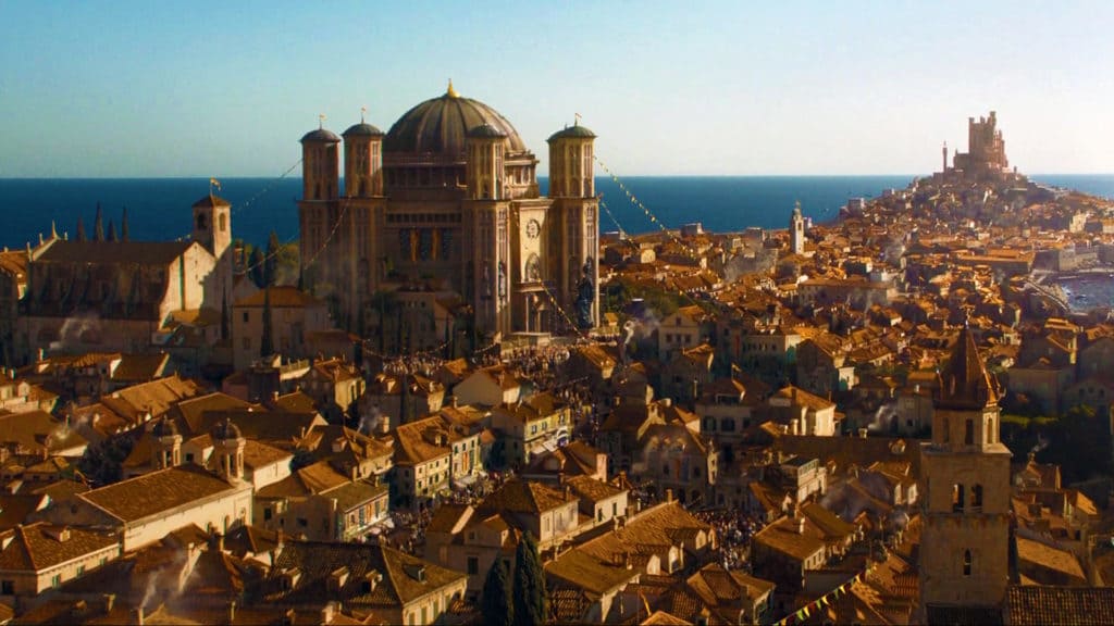
The extended narrative of this HBO series (only 10 episode per season so 60 episodes through six seasons though some run times extend beyond the standard one-hour format) is a master class for using the rules of film-grammars in world-building production design to support cinematic narratives. Mainly, this occurs with on-location filming and CGI enhancement of built environments to create the fantastical settings of Westeros and Essos. The filmmakers go far beyond George R.R. Martin’s source novels, which often rely on literary conventions (i.e. allowing readers’ imaginations to fill in the descriptive gaps). We can only hope the climax of the final two seasons of Game of Thrones deliver a satisfactory conclusion to the creative brilliance of the series to date.

It is always difficult to avoid ‘the usual suspects’ at the top of this list…

2. Blade Runner (1982)
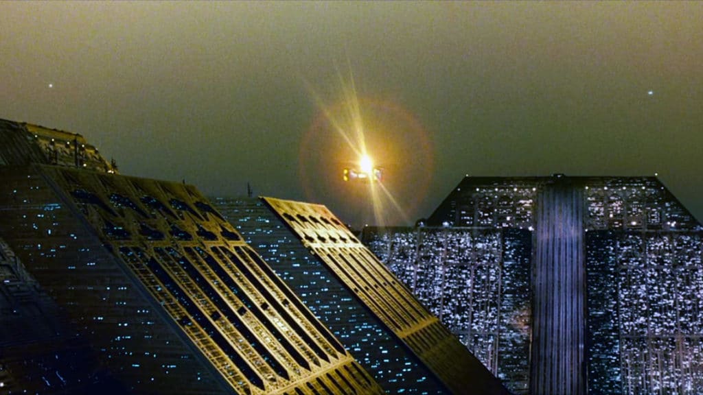
Ridley Scott was at the height of his creative powers as a filmmaker during the period coinciding with the release of Alien (1979), Blade Runner (1982) and the Apple “1984” television commercial. Blade Runner represents the ‘oxygen-depriving’ summit. Long before the CGI age, Blade Runner relied on ‘old school’ techniques of on-site location filming, constructed sets, physical modeling, lighting and set dressing to create the futuristic setting of Los Angeles in 2019. Architecture plays a starring role in the film right along with Harrison Ford, Sean Young, and Rutger Hauer. The narrative is tight and thought-provoking. The production design is outstanding. Scott’s use of mise en scène and ‘tried and trusted’ film-grammars to visually convey narrative information to the audience transforms the film into a deeply rich experience on several levels. Despite its reputation in architectural schools,  Blade Runner does not actually break the cinematic mold. It merely elevates it to unforeseen heights of artistic expression.

1. Metropolis (1927)
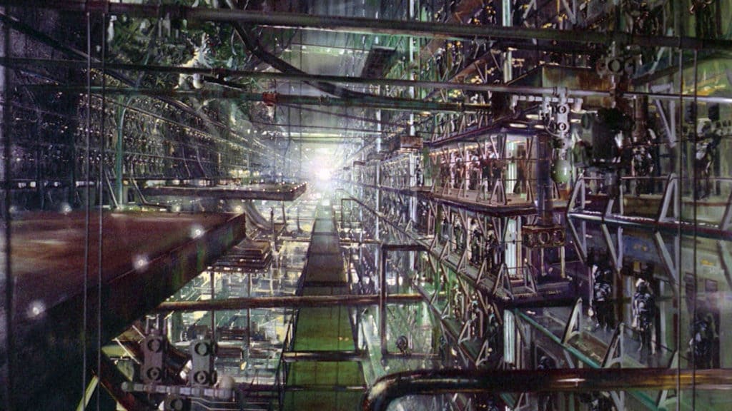
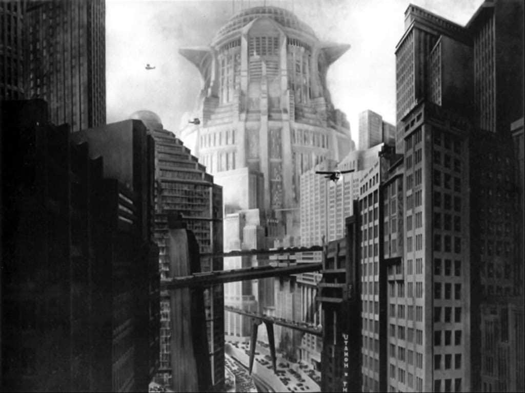
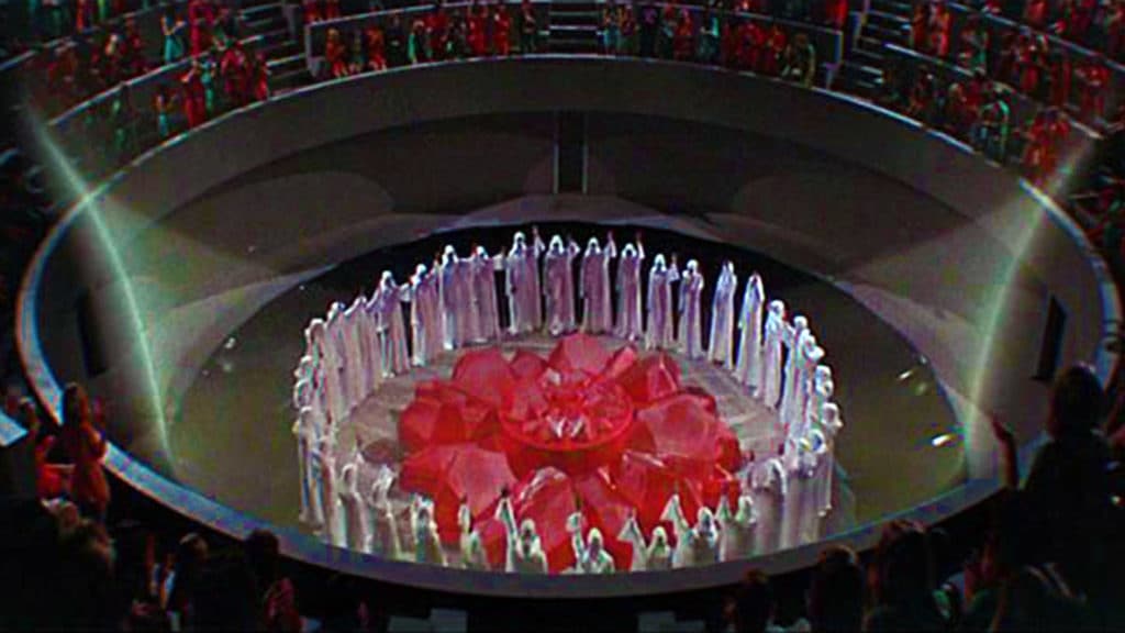
If Ridley Scott’s Blade Runner is the ‘Revelation’ for mise en scène and film-grammar depictions of the built environment, then Fritz Lang’s 1927 silent film classic Metropolis is the ‘Genesis’, especially for the science fiction genre. The (often-repeated) film-grammar of abnormal scale for conveying the antagonistic threat of the narrative began here (see above). In fact, a lot of the cinematic conventions most familiar to audiences (if only on a subconscious level) have their origins in Lang’s German Expressionist film. Blade Runner may have elevated the cinematic mold to unforeseen heights but Metropolis invented that mold.

Purchase the Architecture and Film course series here ($39.99)
Purchase Part 1, “Do Architects Dream of Celluloid Buildings?”, here ($14.99)
Purchase Part 2, “The Architectural Competence in Cinema”, here ($14.99)
Purchase Part 3, “The Best of Both Worlds”, here ($14.99)

Share the knowledge!
Share

RE-POST | 20 Must-Read Texts for Urban Planners (#1-10)

RE-POST | 20 Must-Read Texts for Urban Planners (#1-10)
by Dr. Mark David Major, AICP, CNU-A
(Originally posted January 28, 2013)

Here is Part 2 of the “20 Must-Read Texts for Urban Planners (#1-10)” article, originally posted on January 28, 2013. Read Top 20 ‘Must-Read’ Texts for Urban Planners (#11-20) here!

Plenty of Holiday gift ideas here!

10. “The Origin and Spread of the Grid-Pattern Town” (1946) by Dan Stanislawski
An old text, perhaps obscure to many and only familiar to a few, “The Origin and Spread of the Grid-Pattern Town” is one of the earliest and most thorough reviews of the evolution of regular grid town planning in the world. Yes, Stanislawski subscribes the spread of regular grid town planning to a process of historical diffusion, which Spiro Kostoff (see below) correctly points out nobody believes in any more. Despite this flaw, Stanislawski’s review is surprisingly comprehensive, for the most part. Stanislawski does seem to gloss over medieval town planning, see Maurice Beresford’s 1967 New Towns of the Middle Ages: Town Plantation in England, Wales and Gascony. However, some later writers ignore all together clear examples of regular grid planning in certain regions of the world (the Orient, for example). Stanislawski’s article is still a valuable resource today for any reader interested in the regular grid as long as they are careful about filtering out some of his misplaced – discredited today – ideas (for example, historical diffusion or the importance of Hippodamus). Available for download here with registration.

9. “Savannah and the Issue of Precedent: City Plan as Resource” (1993) by Stanford Anderson
John Reps in his historical narrative of American town planning (see below) is enchanted with the historical ward plan of Savannah, as are many architects, urban designers, and planners. Reps is equally mystified (and a little despondent) about why the Savannah plan was not more influential in the history of American town planning. In “Savannah and the Issue of Precedent: City Plan as Resource,” Anderson offers a succinct and brilliant analysis about how the ward plan of Savannah operated in terms of street alignments and building constitution working together to structure the outside-to-inside ‘assimilation’ of strangers into the town (principally in relation to the port). In generic terms, Savannah appears to be quite typical of a lot of waterfront settlements in American planning. However, its detailed specifications for squares and constitution is rigid, making it an inflexible model for early American town development (for example, compared to the flexibility of the Spanish Laws of the Indies model). Anderson’s article should be on the standard reading list for any academic program in planning. The article is available on Google Books here. It appears in the book Settlements in the Americas: Cross-Cultural Perspectives, which is available for purchase on Amazon here.

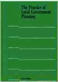
8. The Practice of Local Government Planning (2000)
It is one thing to complain about how planning works in the United States. However, it is hypocritical to complain without really understanding how planning works in the United States. The Practice of Local Government Planning offers a clear solution. For years, the various incarnations of the “green book” have been the go-to source for American planners to immerse themselves in the full scope of their profession in the United States. This Municipal Management Series book is the first one any planner will open when seeking to pass the AICP exam. It is comprehensive and detailed. Warning: it is a very, very dry read. It is also extremely careful to remain neutral when presenting a picture about the way things work, i.e. this is what it is, not this is the right way to do it. In this sense, it is value-free and empty at its core. Nonetheless, it remains an invaluable resource for any planner, or anyone wanting to understand planners. Available to purchase on Amazon here.

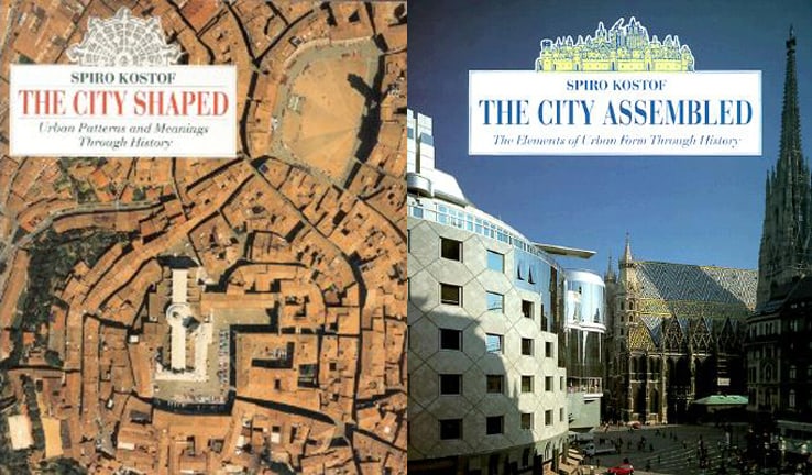
7. The City Assembled: The Elements of Urban Form Through History (1992) by Spiro Kostoff

6. The City Shaped: Urban Patterns and Meanings Through History (1991) by Spiro Kostoff

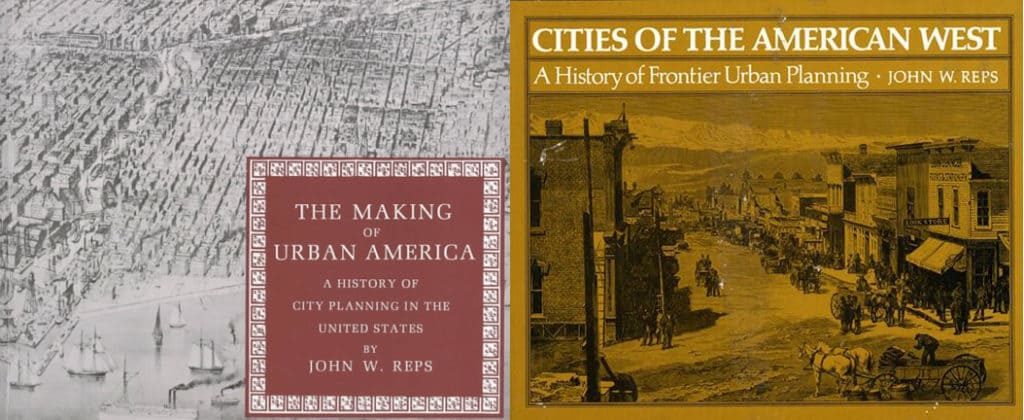
5. Cities of the American West: A History of Frontier Urban Planning (1979) by John W. Reps

4. The Making of Urban America: A History of City Planning in the United States (1965) by John W. Reps
Kostoff’s The City Shaped/The City Assembled are crucial books about the history of town planning in the world for any urban planner to have on their bookshelves. Reps’ The Making of Urban America/Cities of the American West about the history of town planning in the United States are crucial books for any urban planner to also have on their bookshelves. If an urban planner does not have these books on their bookshelves, it is reasonable to question the quality of said planner. There are other good historical narratives out there on the subject (Sibyl Moholy-Nagy’s The Matrix of Man or Eisner and Gallion’s The Urban Pattern, for example). However, Kostoff and Reps’ books are the most comprehensive and thorough for their particular subjects. All four books incorporate hundreds of plans/plats and photographs to tell the story of town planning in the United States and world at large. They also offer detailed historical information (especially Reps) about the people and events involved in building our cities. Sometimes they are insightful and sometimes they are mistaken. For example, despite his protestations about the dichotomy so prevalent in town planning, Kostoff remains firmly entrapped in that dichotomy, i.e. ‘organic’ and ‘regular’ cities. Reps correctly points out the historical importance of William Penn’s plan of Philadelphia but misstates the reasons, assigning to Philadelphia what should have more appropriately been given to the Nine Square Plan of New Haven and the Spanish Law of the Indies, which Kostoff correctly emphasizes (though we are discussing subtle but important degrees of difference instead of a chasm in thought between both writers). When he ventures away from historical narrative and facts into the realm of opinion, Reps is often prone to undervalue the functional power of regular grid. However, these are endlessly useful texts for anyone interested in cities. The collection of plans and other historical documents (e.g. bird’s eye views) are a wonderful resource for any planner to have readily at hand. Kostof books available for purchase from Amazon here and here. Reps books available for purchase from Amazon here and here.

3. Space is the Machine: A Configurational Theory of Architecture (1996) by Bill Hillier
A purist could argue that anyone interested in space syntax should start with The Social Logic of Space (1984) by Bill Hillier and Julienne Hanson. The Social Logic of Space is an important book where Hillier and Hanson spell out a lot of groundwork for the theoretical and mathematical foundations of space syntax. However, they do so to a level of detail that some readers might find off-putting. Even Hillier and Hanson admit one of its chapters is practically unreadable because it is so dry with mathematical set theory. If you want to learn about the space syntax approach and some of its early, important findings without getting bogged down in the detail, then you are better served by starting with Hillier’s Space is the Machine. Besides, Hillier is always careful about repeating the ‘big picture’ items that arose from The Social Logic of Space (beady ring settlements, restricted random process, and so on), so you won’t miss too much. For planners, the most important chapters in Space is the Machine are about cities as movement economies, whether architecture can cause social malaise, and the fundamental city. There are plenty of goodies for architects as well. Space is the Machine is a must-read for anyone serious about a scientific approach to the built environment. (NOTE: Original illustrations by yours truly). Available for paperback purchase on Amazon here. You can download the full book as a PDF here.

2. The City: Suggestions for Investigation of Human Behavior in the Urban Environment (1925) by Robert E. Park and Ernest W. Burgess
One of the planning profession’s biggest problems is the Chicago School (the sociologists Park and Burgess and their colleague, Homer Hoyt, see sector model of city growth, who together were the founders of human ecology) got so much right from the very beginning that there wasn’t anywhere for planning to go from there but downhill. Of course, planning theory proceeded to accomplish this downhill spiral with great vigor and spectacularly bad results (see the second half of the 20th century). With the advent of the computer processor, Park and Burgess’ approach may appear somewhat quaint to modern eyes. However, the essentials about cities are there. More importantly, Park and Burgess never divorce the socio-economic nature of the city from its physical form. They view them as intimately bound together. An important book and somewhat underrated in today’s world by planners, though it’s difficult to understand why or how that should be the case. Available to purchase on Amazon here.

1. The Death and Life of Great American Cities (1961) by Jane Jacobs
Big surprise, huh? These days it seems like anyone interested in cities is obsessed with Jane Jacobs, either in implementing and promoting her ideas or feverishly going to ridiculous lengths trying to refute them (one might call it Jacobs Derangement Syndrome). Indeed, this obsession in itself is a testament to the power of her book. Ironically, for its time, the most novel thing Jacobs did was she dared to look out her window and observe how things were really working out there on the street. It is a sad statement on the planning profession that this was somehow viewed as a sacrilege when the book was first published and, to a certain extent, this perception endures today. I mean, how dare she actually suggest we evaluate (and, by implication, take responsibility for) the social and economic consequences of our planning decisions. The Death and Life of Great American Cities is the essential book for any planner. Available to purchase on Amazon here.

There you go!

Share the knowledge!
Share

NOW AVAILABLE | The American City Track | Planetizen Courses

“The American City” Track (3.25 credits)
Many people see American cities as a radical departure in the history of town planning because of their planned nature based on the geometrical division of the land. However, other cities of the world also began as planned towns with geometric layouts so American cities are not completely unique. Why did the regular grid come to pervasively characterize American urbanism? Are American cities really different? “The American City” answers these questions and much more by exploring their urban morphology. In some ways, American cities are unique including a strong historical preference for geometric regularity in town planning, which endures to this day. However, in more important ways, American cities are still subject to the same processes linking street networks and human use found in all cities of the world.

Part 1: A Brief History of the Regular Grid
Part 2: The Invention of a New Scale
Part 3: Learning from the Grid
Part 4: Complexity and Pattern in the City

Featuring Dr. Mark David Major, AICP, CNU-A. Click here to purchase this Planetizen Courses track.

Share the knowledge!
Share