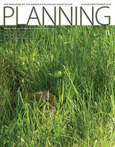
 Planning Naked | August & September 2016
by Dr. Mark David Major, AICP, CNU-A, The Outlaw Urbanist contributor
Hopefully, your hilarious guide to most everything about the latest issue of APA’s Planning Magazine
The August/September issue of Planning Magazine is a Special Issue about the Local Impacts of Federal Environment Policy. It is sure to induce a headache. Hold on tight, it’s going to be a bumpy post.
Congratulations, APA Executive Director! James M. Drinan finally wrote an editorial, “Share the Street” in the From the Desk of APA’s Executive Director section (pp. 3), to hit the right notes… mostly. I did chuckle about Mr. Drinan’s comment that shared space “may appear startling at first to the average citizen.” I think what he meant was the ‘average planner.’ “The everyday experience of navigating our streets is an opportunity for planners to apply lessons – from Chicago and elsewhere – to provide leadership in shaping our evolving culture.” I never thought I would read those words in an official capacity in Planning Magazine. Amen, brother! What is that I’m feeling? Could it be … hope? Nah.
A plague o’ both your houses! “Disaster by Design in Houston?” by Ryan Holeywell (pp. 10) in the News section briefly covers the arguments (pro and con) about the role of private development in contributing to the recent spate of flooding in the Houston, Texas area. Unfortunately, the agenda-driven, black and white perspective of both sides of the issue (regulatory-driven planners vs. profit-earning developers) is the only clear thing that comes across in the article. Perhaps this is a topic requiring more room in Planning Magazine in order to more thoroughly review the issue? I came away only disgusted.
Celebrate bureaucracy, not results. “NPS, 100 Years and Counting” by Jake Blumgart (pp. 11) in the News section summarizes some of the activities celebrating the 100-year anniversary of the National Park Service (NPS) established in 1916. However, the first national park, Yellowstone, was signed into law by President Ulysses S. Grant in 1872. Is the creation of a government bureaucracy really something to celebrate, I wonder? 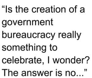 The answer is no, which is why half of this news brief is really about money, e.g. NPS doesn’t get enough money, NPS needs more money, how can NPS get more money, etc. It is a tiresome, old school type of Planning Magazine article.
Be afraid, be very afraid. In the News Briefs section (pp. 11), there’s this little tidbit of information. Home prices in seven U.S. cities climbed to record highs in April 2016 according to Standard & Poor’s/Case-Shiller’s National Home Price Index (as if S&P can be believed about anything); only 9.6 percent below the peak a decade ago. Fortunately, none of the cities listed were in Nevada or Florida. Should you be comforted or frightened? Not sure. Plan for the worse, hope for the best, I guess.
Last stand of Communism in the world. “Welcome to Cuba” by Katie Halloran (pp. 12) discusses some of the issues surrounding historical preservation and the rapid return of overseas/American tourism to Havana, Cuba. It is an interesting update but mostly lacking in specifics. There seems little doubt this is due to the opaque nature of Cuba’s communist government, which seems to be following the Chinese model of ‘opening its economy’ from 20 years ago. We hope the Cubans do not make the same mistakes as the Chinese when it comes to rapid urbanization. The differing demographic scenarios indicate Cuba has an unique opportunity to do better, given the right leadership.
Come ride my yo-yo, please. It is disconcerting when the first line of an article is blatantly false such as in “Reading Between the Lines” by Stephen D. Villavaso, JD, FAICP of the Legal Lesson section (pp. 13), which begins, “Since the 1920s, courts have regularly given clear signals to professional planners on how to plan better and, maybe more easily.” The offending words of this opening sentence are ‘clear’ and ‘better.’ The post-war disaster of American suburban sprawl and downtown decline tells a different story. It is even more disconcerting when the next sentence completely contradicts the first one so both sentences are rendered meaningless. Yeah, the author is an attorney. Having said that, Mr. Vilavaso’s review of the constitutional issues discussed in the dissent to the Baton Rouge case is enlightening. This includes Euclidean zoning restrictions of building use based on the definition of “family.” This issue sits at the crux of the problem arising because of AirBnB, i.e. unfettered expansion of land tenure rights under suburbanization (which Euclidean zoning is manifestly based and promulgated) and the property rights of homeowners to use their property at they see fit when there is little or no evidence of negative impact to neighboring properties. The final three paragraphs of this article is only a historical fluff recap (e.g. Kelo, Dolan). Ignore the nonsense at the beginning and the fluff at the end but definitely read the “Beyond the final ruling” section in the middle.
When government doesn’t work. “Before It’s Too Late” by Brian Barth (pp. 14-20) is planning masturbation at its worse. There is a well-established response to dramatic climate change in human history, which is thousands upon thousands of years old: people move. What this article makes clear is the massive amount of time, money and effort being wasted on unnecessarily studying the ‘climate refugee’ problem to death:
- Let’s do a study to see who is vulnerable;
- Let’s do a study to see where they might move;
- Let’s do a study to assess the environmental impact of a relocation;
- Let’s do a study of the flaws in the initial study;
- Let’s do a study of project costs;
- Let’s do a study about cultural loss;
- Let’s do a study about so on and so on…
All humans are ‘climate refugees.’ Otherwise, we would all be living in Africa right now (and not so many of us). Here’s the real kicker: “…the inherent challenge of navigating the dozens of local, state and federal agencies implicated in establishing a new community from scratch have kept the pace of relocation efforts at a slow slog.” This is a cause célèbre about how government is the problem, not the solution™ (1980, Ronald Reagan). The people who live in these villages will eventually solve this problem themselves because they will have no choice. Government bureaucrats and planners will continue to squeeze as much cash as they can out of the process until the solution happens on its own. The accompanying article “The Resettlement of Isle de Jean Charles” by Craig Guillot (pp. 21) about a relocation in Louisiana due to soil erosion even admits most models of relocation planning ‘have not done very well.”
When government works. “Good Habitats Pay Off” by Madeline Bolin (pp. 22-27) is a stark contrast to the previous article. Bolin’s article actually discusses alternative tools to full implementation of the Endangered Species Act (ESA) such as habitat mapping, Habitat Conservation Plans (HCP) and variations thereof. There is not a single mention about money. In fact, Bolin’s article effectively demonstrates how local, state and federal government can effectively work together with the private sector to implement environmental protection measures. It is informative, interesting and useful. The insert “Federal Environment Laws and Land Use” by Ms. Bolin (pp. 26) is a brief, useful checklist of relevant legislation.
I feel like I’m taking crazy pills. “The ‘If’ Game” by Allen Best (pp. 28-35) is when I lost my patience with this special issue of Planning Magazine, began to stop diligently reading and went into browse mode. However, the real kicker is in the next article “Is Nuclear Clean Power?” by Susannah Nesmith (pp. 36-39). Here is a short summary: 1) nuclear power is bad for habitats; 2) a potential problem disrupting local habitat is identified with an intake pipe at a nuclear power plant; 3) a solution is identified (e.g. installing a grate); 4) it takes the Federal government 8 YEARS to approve the grate installation: 5) ergo the problem with nuclear power is it destroys habitats. Does anyone else not notice the Federal bureaucracy prevented the installation of a solution for years that, at worst, would take a few weeks to implement, therefore the problem is not nuclear power but the Federal government?!?!
Save yourselves! It’s too late for me! Sorry readers, my sanity couldn’t take any more of the drivel in this special issue about the Local Impacts of Federal Environment Policy in Planning Magazine.
Planning Naked is an article with observations and comments about a recent issue of Planning: The Magazine of the American Planning Association.
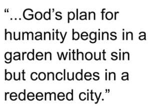 In The Old Testament, God was not anti-urban. Quite the opposite, there was evidence of God as the architect, designer, and planner. God’s plan for humanity begins in a garden without sin but concludes in a redeemed city. Christian writings of The New Testament intimately broaden and deepen this theme (1.25 hour course).

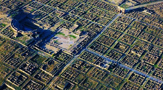
 The objective of this course is to understand how and why the regular grid has been a standard part of the town planning vocabulary around the world for nearly five millennia.
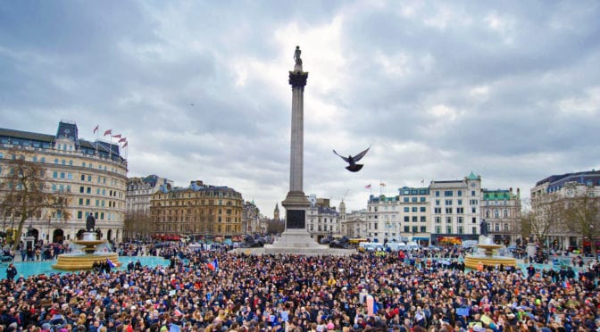
 Second, many crowd characteristics often represent only a dramatic, temporary intensification of everyday circumstances in urban conditions, which has implications for recent pedestrian-oriented design concepts such as shared space (2.0 hour course).

 Planning Naked | August & September 2016
 The answer is no, which is why half of this news brief is really about money, e.g. NPS doesn’t get enough money, NPS needs more money, how can NPS get more money, etc. It is a tiresome, old school type of Planning Magazine article.
